Challenge
Working with Turnitin and Microsoft; a couple colleagues and I took up the challenge to create a new user experience of Turnitin’s plagiarism grading tool onto the Windows 8 Store App Platform. What we set out to do was not just port the application, but to create an entirely new and innovative user experience following the Modern UI design patterns, and push them to their interaction limits.
Approach
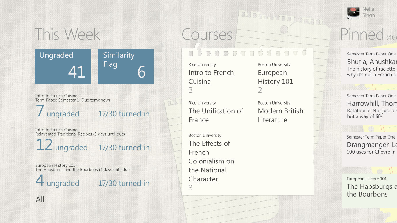
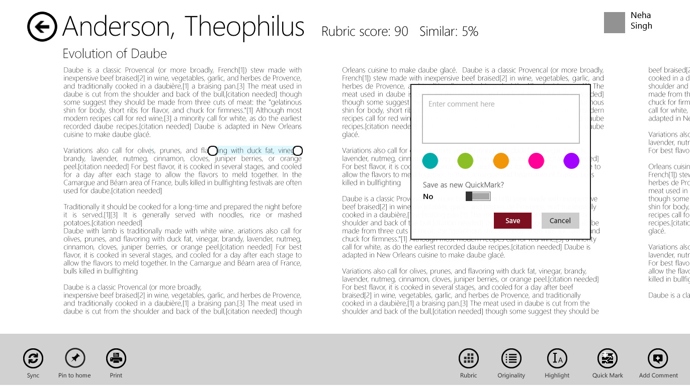
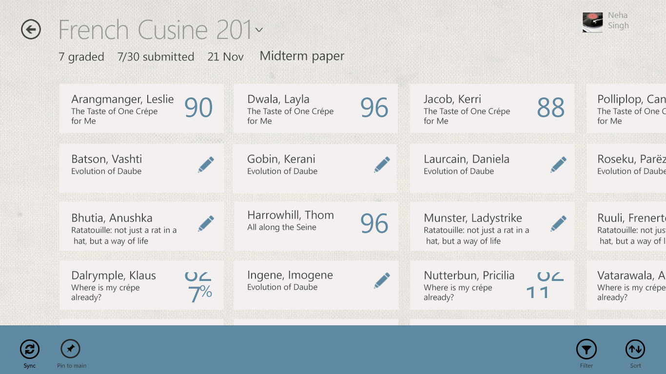
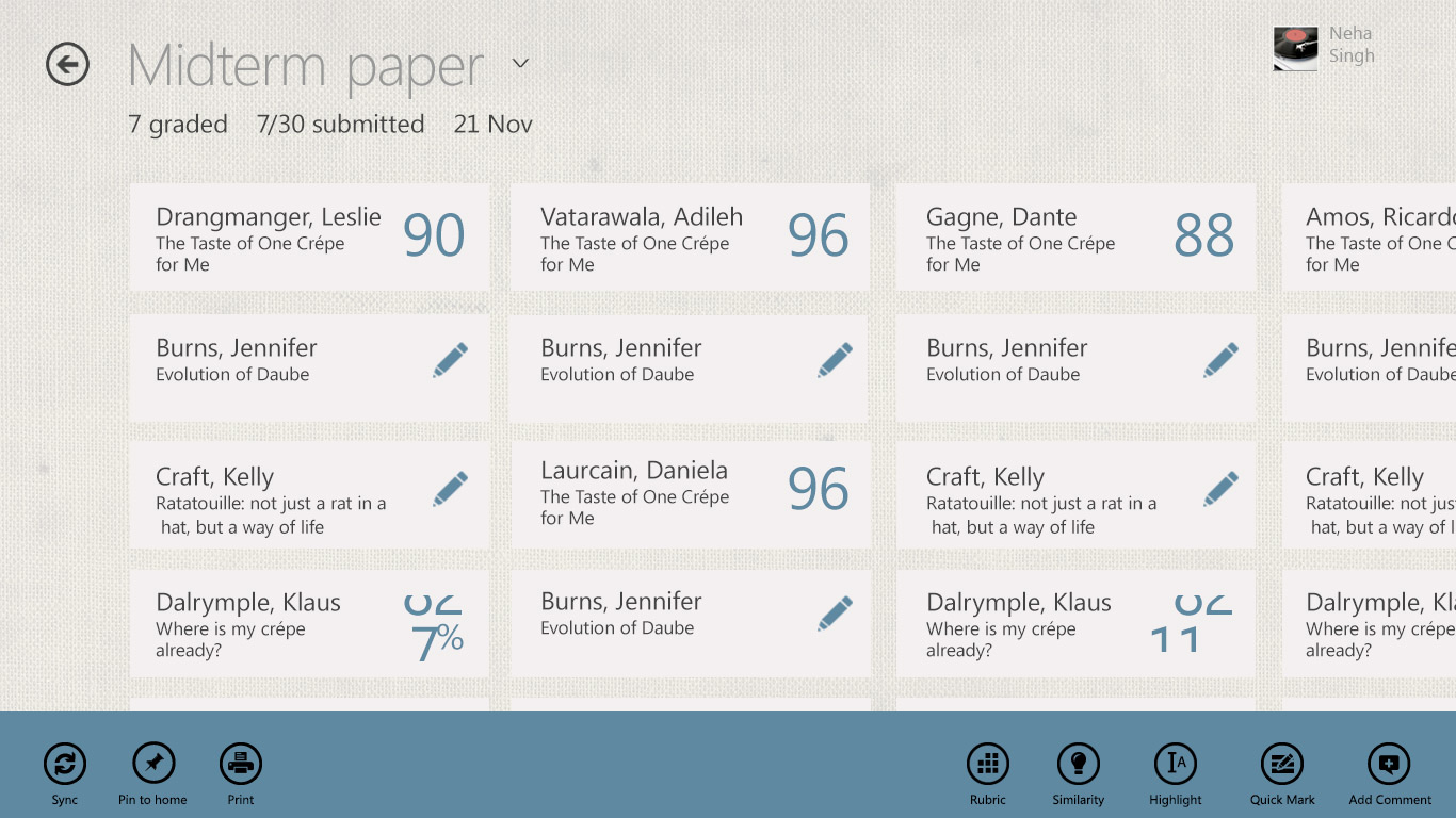
Our overall design decisions evolved over a few iterations through user evaluations with teachers and peers especially on the educator’s experience in interacting with the grading features and what kind of information we would bubble up on the Hub (Home) Page.
As I refined the wireframes following a design critique session with colleagues and end users, I change the Section page title to reflect the name of the class versus the name of the assignment. In this desing phase I incorporated some of the visual design from our design system.
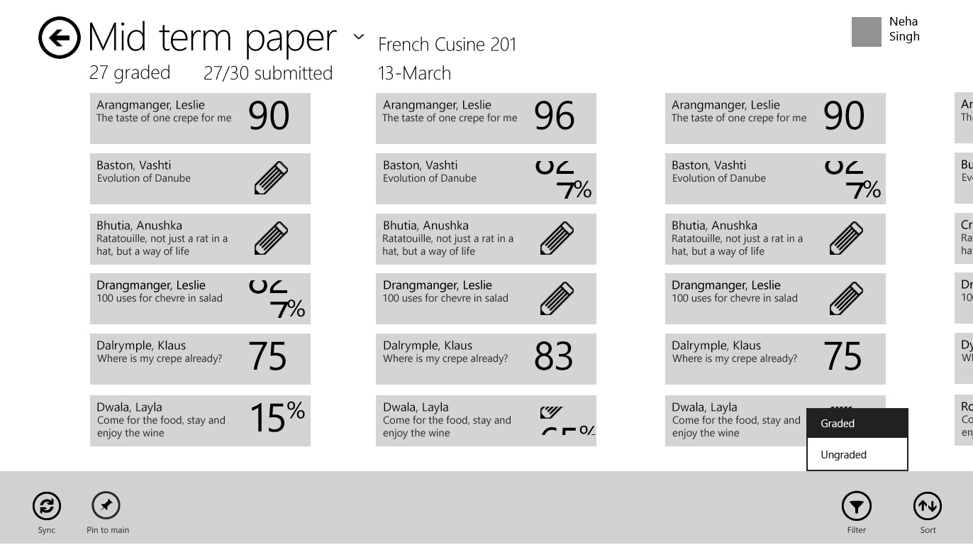
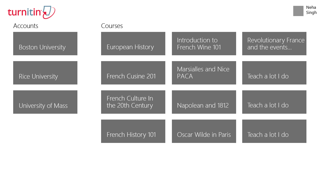
A couple other functional challenges were to consider how teachers work at different grade levels and institutions. For example, a university lecture might have posts at several institutions and they would need a way to quickly disseminate their classes and students.
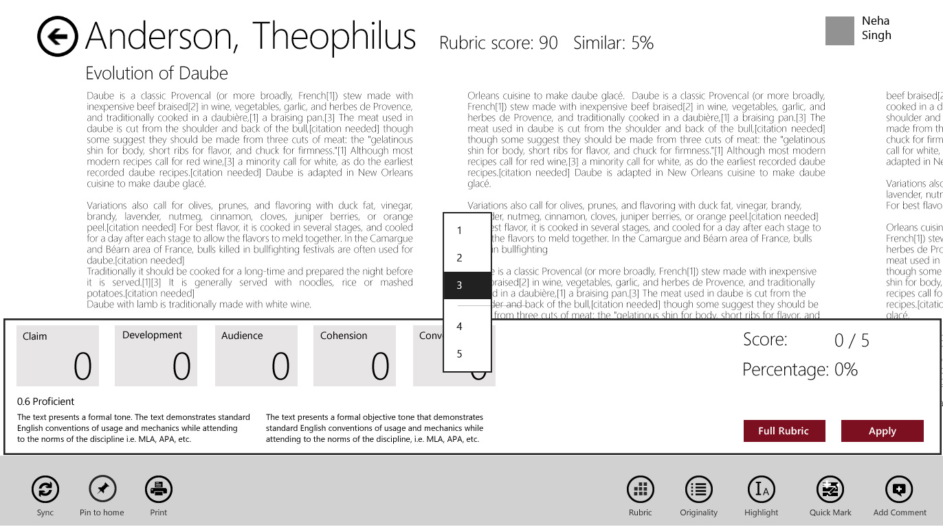
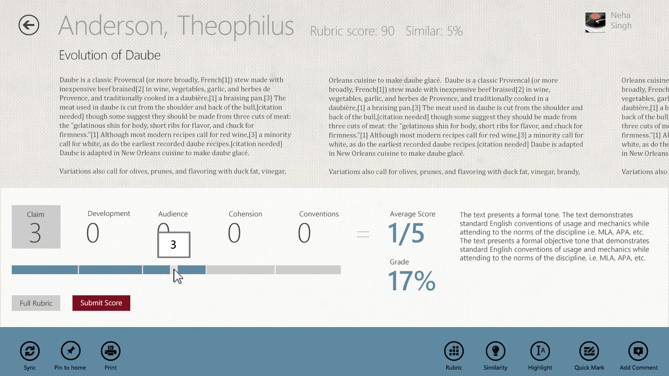
My colleagues visual design approach was to be authentic, with the feeling of a school desk, and keeping the Metro design philosophy of the visual UI not being distracting to the core features.
Of the many Modern UI projects I have worked on, this remains one of my favorite user experience projects in the Windows 8 Store App space.