

The Program
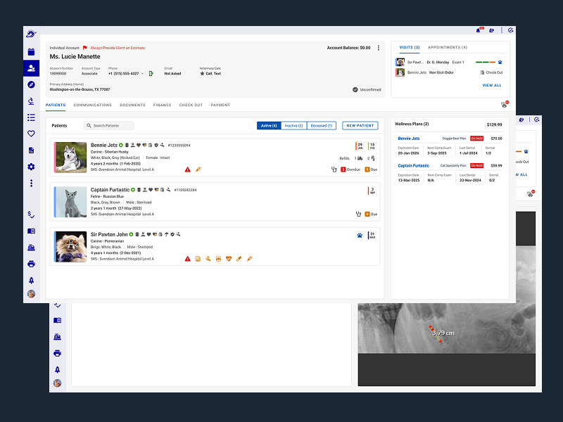
VCA is building a practice management application to support their North American veterinary practice and replace file and paper-based processes. I was one of two designers on the project hired by an organization that had VCA as a client. My design colleague was the visual designer, my role was interaction design and design strategy.
- Type: Enterprise SaaS
- Market: North America
- Team: 2 Product Managers • 1 Technical Product Manager • 2 Designers • 11 Software Developers
- Role On Feature: Senior Interaction Designer • User Research
- Timeframe: 1.5-year Agile rollout • 2012
The Challenge
In human healthcare, the client and the patient are the same person. In veterinary care they're not. The pet can't speak for itself, which adds an entirely different emotional layer to an already charged healthcare experience, one the design had to account for at every touchpoint.
I was also brought in to solve a trust problem. VCA had lost confidence in the team's UX capabilities and was close to cutting it from the contract. Rebuilding that relationship was as critical as the design.
The first feature I worked on was a pet boarding and hoteling flow, one of three major operational services VCA offers alongside Healthcare and Grooming.
What Success Looked Like
- Demonstrate we were the right fit for the UX portion of the project
- Reduce staff training and onboarding time
- Increase boarding price quote accuracy
- Improve check-in and check-out efficiency
- Increase boarding price quote accuracy
- Improve medical record accuracy across paper and digital systems
- Improve cage availability visibility and assignment
- Support species, weight, and breed-specific care requirements
What Changed
The boarding proof of concept worked. VCA restored confidence in the UX process, kept the engagement intact, and what started as a contract rescue became an ongoing >12 year partnership. By the end of the first 2 years I had grown the design team from just myself to four designers.
- -75%
reduction in staff training and onboarding time - -37%
reduction in average check-in time - +40%
improvement in boarding price quote accuracy - +52%
improvement in medical record accuracy over the previous paper system
How'd I get there?
Understanding the bigger picture with what's at stake
The VCA product VP was a student of Apple's design philosophy. Knowing that, I proposed two actions designed to speak directly to that values system: a field research strategy to demonstrate rigor, and a design proof of concept to show execution quality.
- Conduct a user research study with hospital staff
- Develop a design solution on one feature
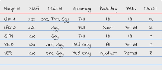
I visited five hospitals to immerse myself in day-to-day staff operations: four cats and dogs facilities spanning oncology, surgery, and emergency trauma, and one all-critters hospital treating mammals, amphibians, and reptiles that I included deliberately as a contrast case for boarding and procedure variety. I already had pet owner experience, now I needed to get into the mental state of a pet care professional. As the project evolved, I returned to each hospital as each new feature deserved fresh eyes in the field.
The Strategy
Starting With People
How Does a Veterinary Hospital Operate?
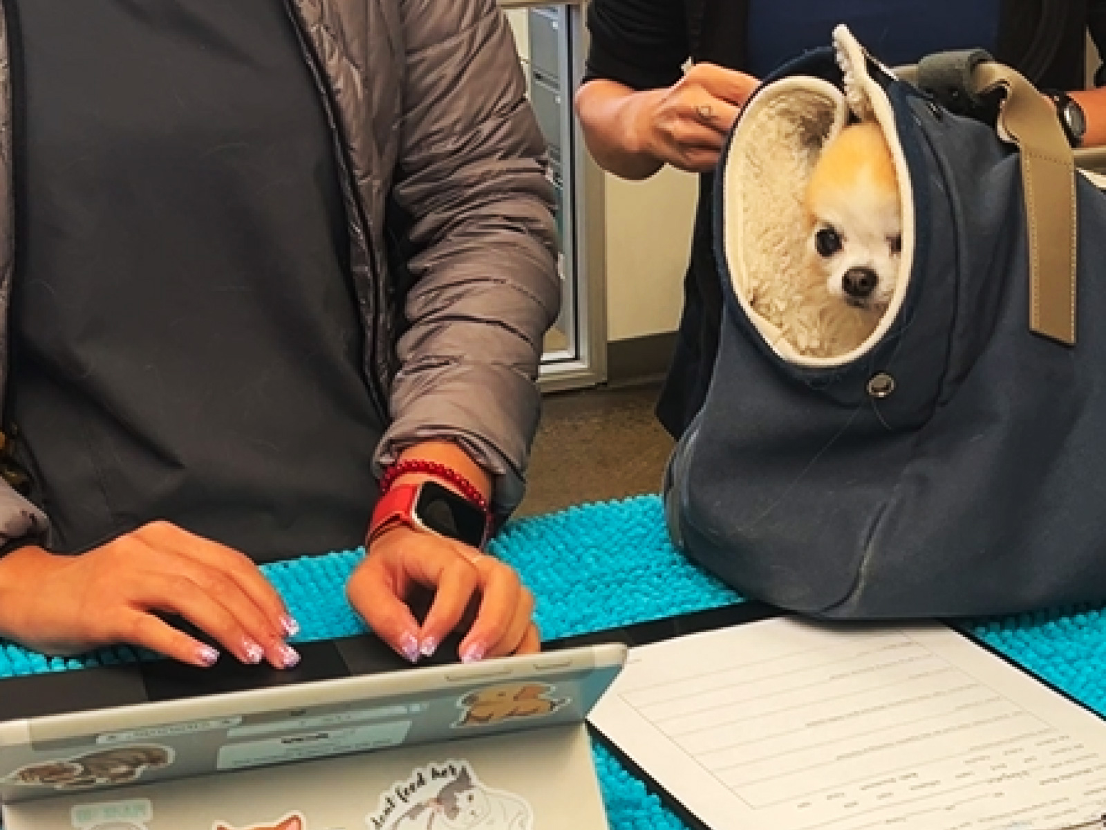
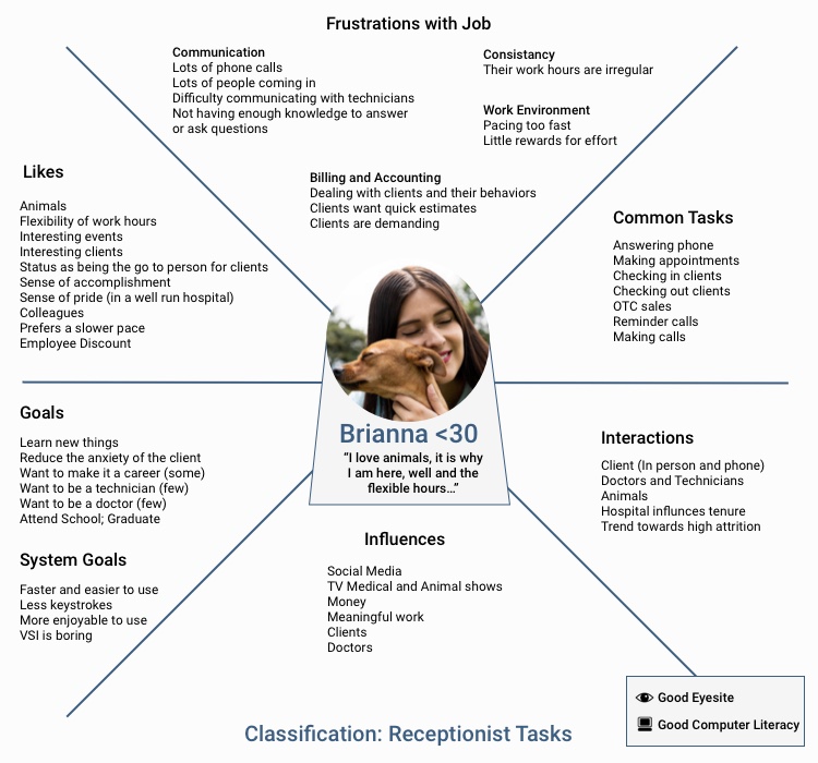
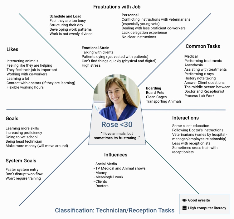
Observing and interviewing hospital staff on location to understand their duties and pain points across several different sized veterinarian hospital brands.
Deep Dive on the research methodology
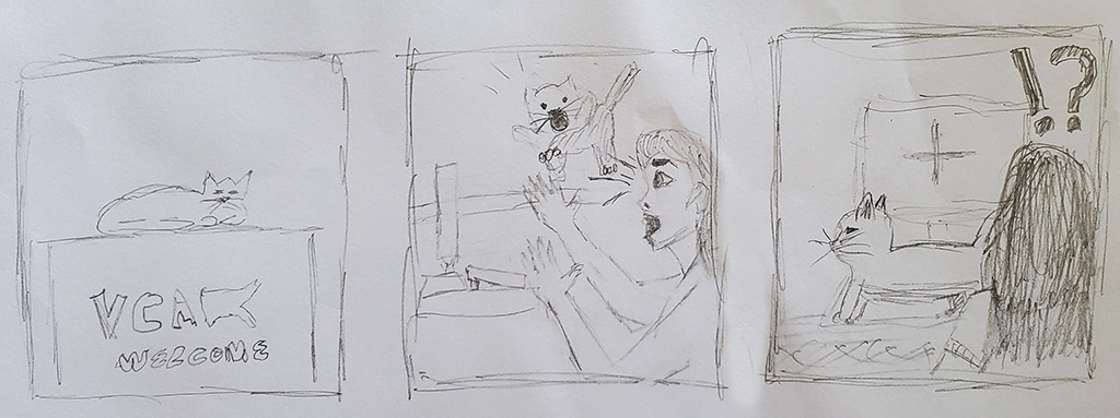
Pet Boarding
Documenting pet owner and pet touchpoints about how a patient (pet) is boarded and other discovery moments.
Two Types of Pet Owners
The Runaway:
This pet owner is trying to beat traffic or possibly flee the country. They come in and want to hand off their pet as soon as possible. They may cut the line, may be aggressive or agitated, and may just possibly abandon their pet without properly checking in.

The Melancholic:
This pet owner has a hard time letting their pet go. They may ask a lot of questions, may give a long list of care instructions, and may require reassurance, extra attention, and might need a nudge out the door to get on.
The Runaway:
This pet owner is trying to beat traffic or possibly flee the country. They come in and want to hand off their pet as soon as possible. They may cut the line, may be aggressive or agitated, and may just possibly abandon their pet without properly checking in.
The Melancholic:
This pet owner has a hard time letting their pet go. They may ask a lot of questions, may give a long list of care instructions, and may require reassurance, extra attention, and might need a nudge out the door to get on.
Pet Journey Map
Unlike cats, dogs do not travel light. They arrive with leashes, toys, their favorite treats, and a full dossier of behavioral instructions. Cats arrive with everything, nothing, or somewhere in between.
Once the pet is greeted and checked in, usually with a clipboard and signed form handed back from the owner, they are escorted to where they will be boarded. The cage location and care instructions for the pet is critical throughout the stay. Different hospitals have their own criteria for daily play time, mealtime, and what personal belongings they will accept based on the reason and length of the pet's stay.
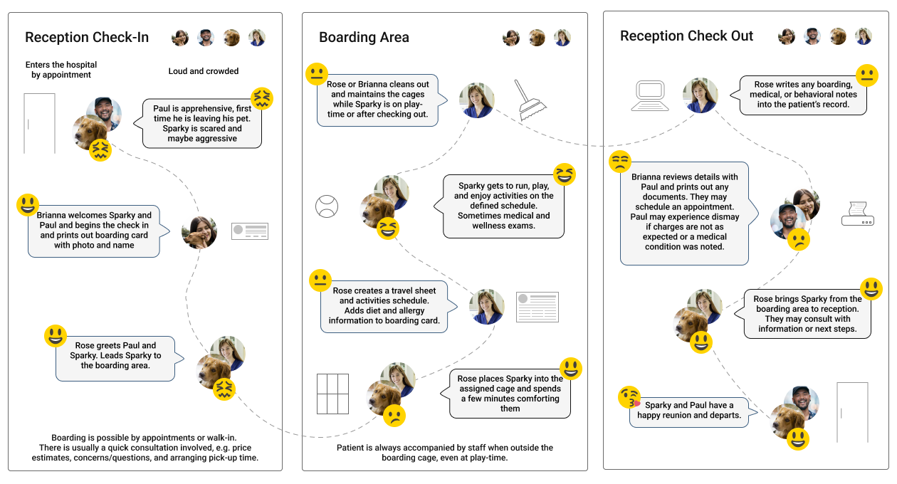
Outlining the Boarding Problem Statement
Hospital staff finds the current system tedious and limiting in functionality based on their current job responsibilities in providing accurate boarding quotes, determining boarding capacity, and efficiently identifying and checking in boarders and tracking their personal belongings and care schedule.
Execution
Quick Iterations To Build Confidence in the Process
Addressing the challenge of stakeholder confidence in the UX process, I borrowed from Lean UX principles and ran rapid design sessions on a whiteboard, with the entire team in the room. The result was immediate: stakeholders watched the process unfold in real time, asked questions, and weighed in as subject matter experts, getting a direct look at how I approached problems, not just the polished output.
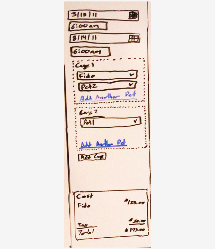
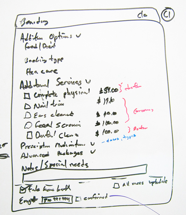
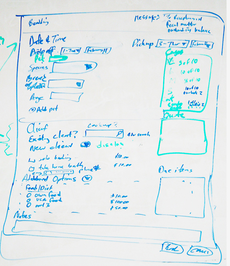
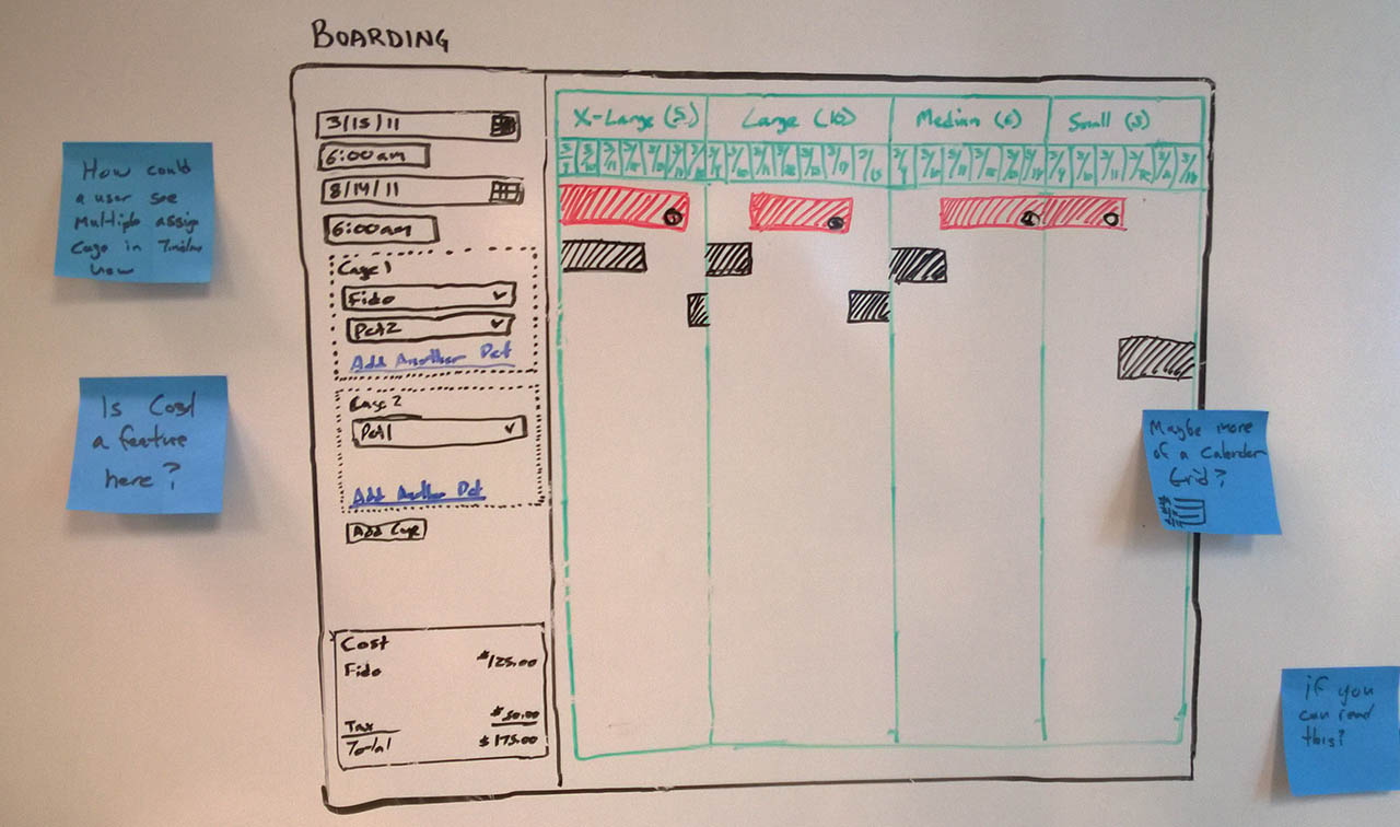
Final Artifact of the Whiteboard Sessions
Figures A1 through D1 show the evolution of a base boarding screen with the stakeholders and applying the data I collected from visiting the hospitals. It was more UI than UX at this stage. As it was focused on getting the core booking elements right: cage size, animal type, date and time, and cost estimate. D1 was the final version of this base screen, built around dog cages.
Two issues with the whiteboard sketch that I needed to address. The calendar was limited to only one week, and the second was the booking UI was limited to only one type of species cage and one cage.
Designing the Boarding Solution
Fixing the Whiteboarding Missed Opportunity
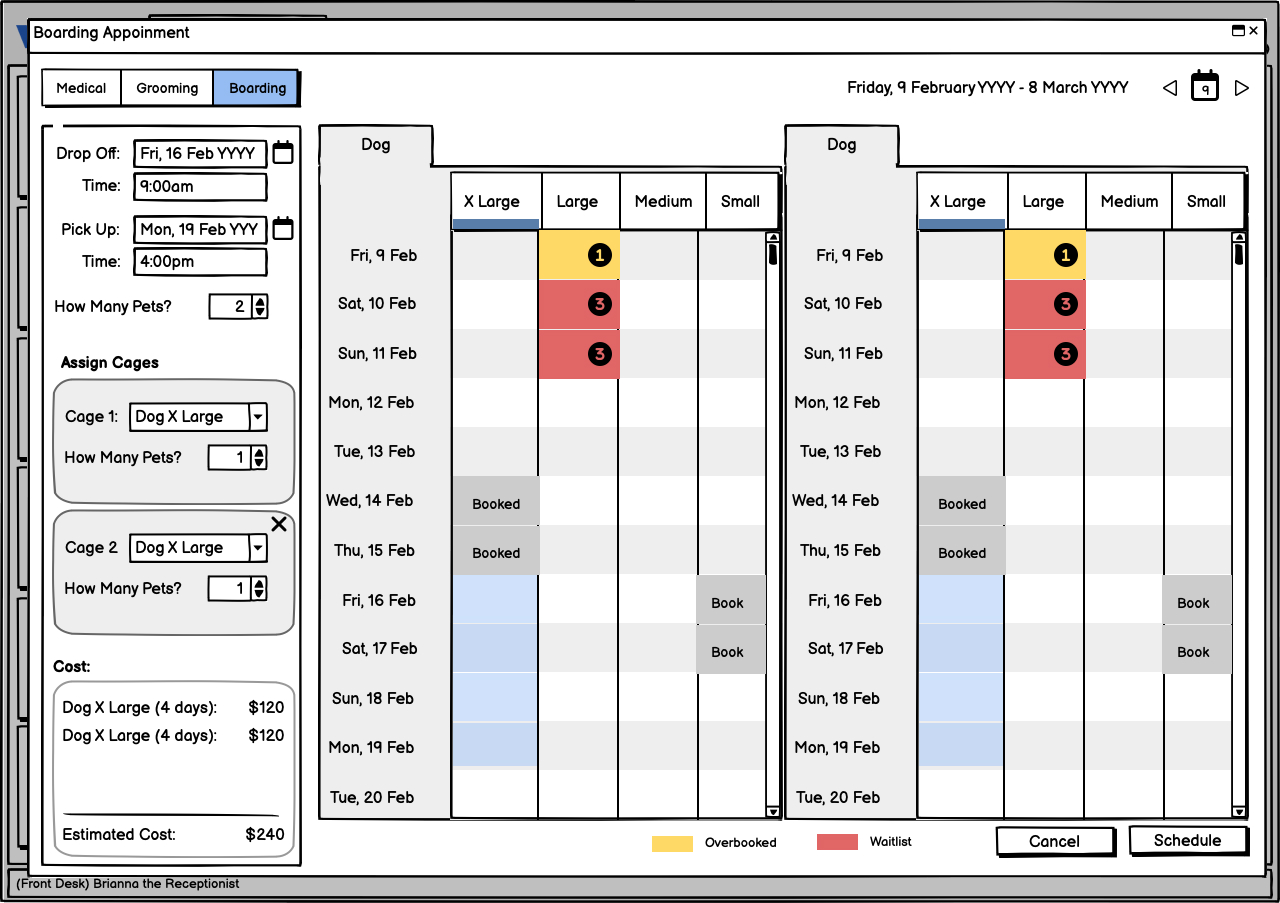
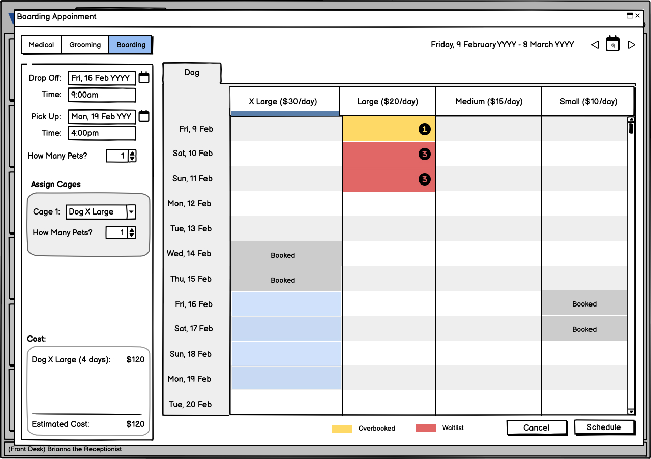
To solve the one cage and one species type problem, I introduced a tabbing element like browser tabs that is controlled by the left panel as the user indicates how many pets will be bordered. The tab name defaults to the species and since dogs are boarded more frequently the UI defaulted to the dog cages.
To solve the view more than one week problem, left side of the tab container was a scrollable calendar so the user could see all available cage types on a particular day. The scrolling was in sync across all tabs.
My solution also addressed the multiple pets sharing a cage problem. As the smaller cage sizes in the tab would become disabled from the UI if >1 pet was selected to share a boarding cage or kennel.
One Tab

Two Tabs
One Full Use Case
Booking any type of appointment for hospital staff always begins with two scenarios.
- Existing Client
has pets on account or is adding a new one. Considerations: account standing, loyalty discounts, documented pet behavior. - New Client
no pets on account, no relationship history. Considerations: often comparison shopping, no loyalty incentive yet, frequently in a hurry.
Early Boarding Iterations
Here's a closer look at the use cases and problems I was working through.
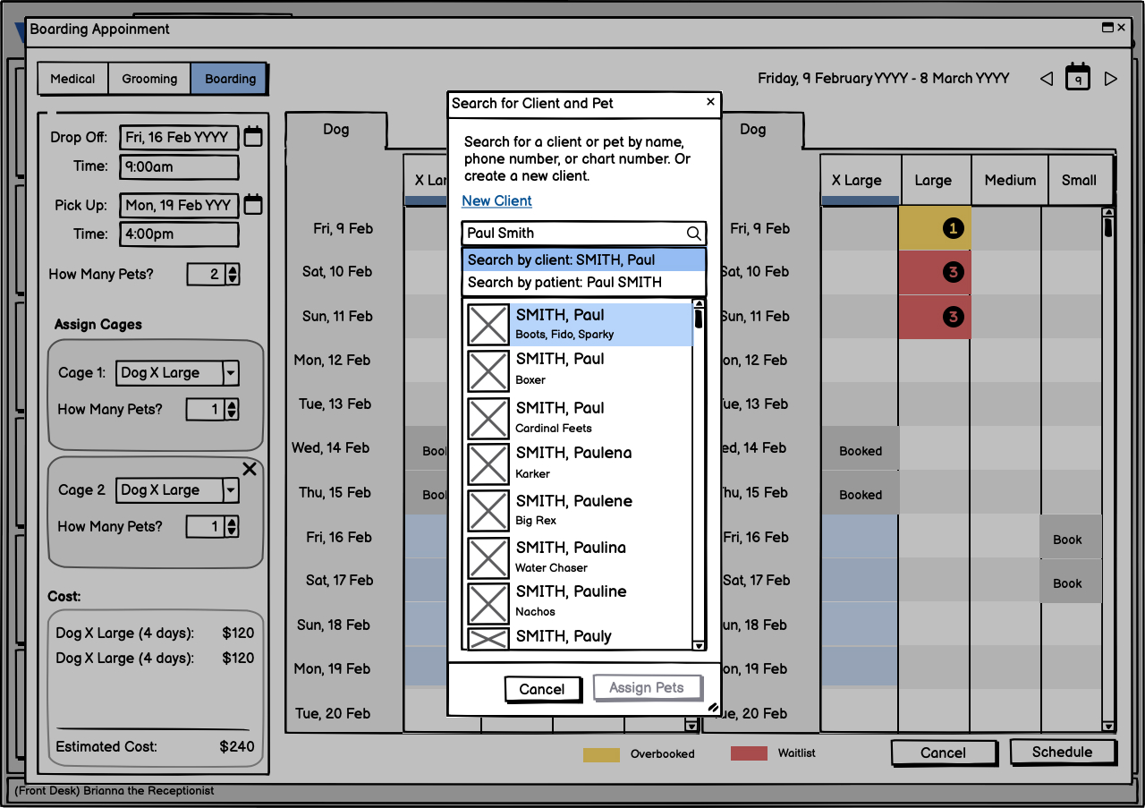
Paul and his partner Karina want to get away for the weekend, so they call VCA to price shop on boarding 2 of their 3 pets. Brianna queries Woofware to determine the availability and the price for the two pets and inquires if they are existing clients. Paul and Karina agree to book the boarding.
Example Use Cases
- Surface outstanding medical and financial items on the account during the booking flow
- Show all available cage types and sizes across a date range at a glance
- Support booking for existing pets and adding new pets in the same flow
- Look up clients and associated pets by name, phone, or chart number
- Enable staff to add boarding services and extras without a separate transaction
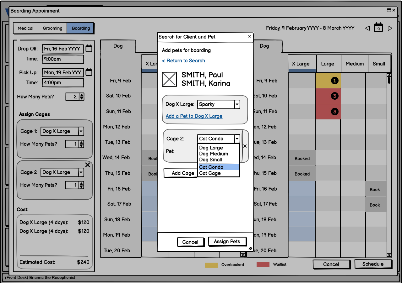
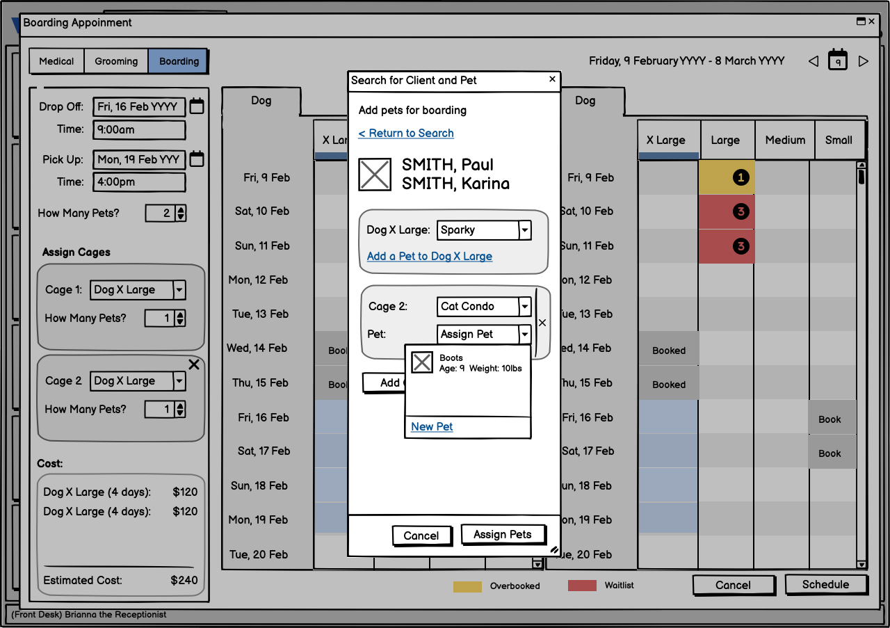
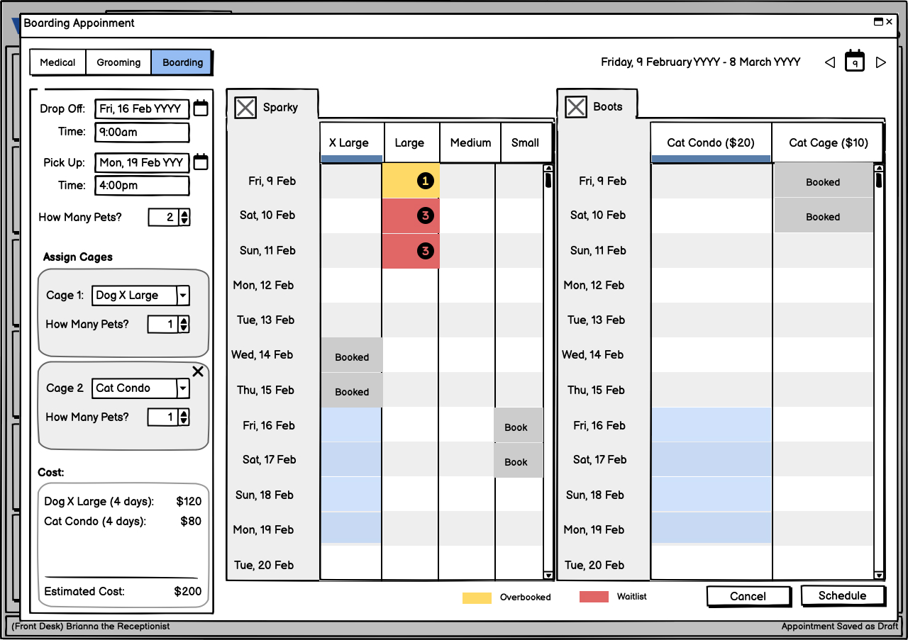

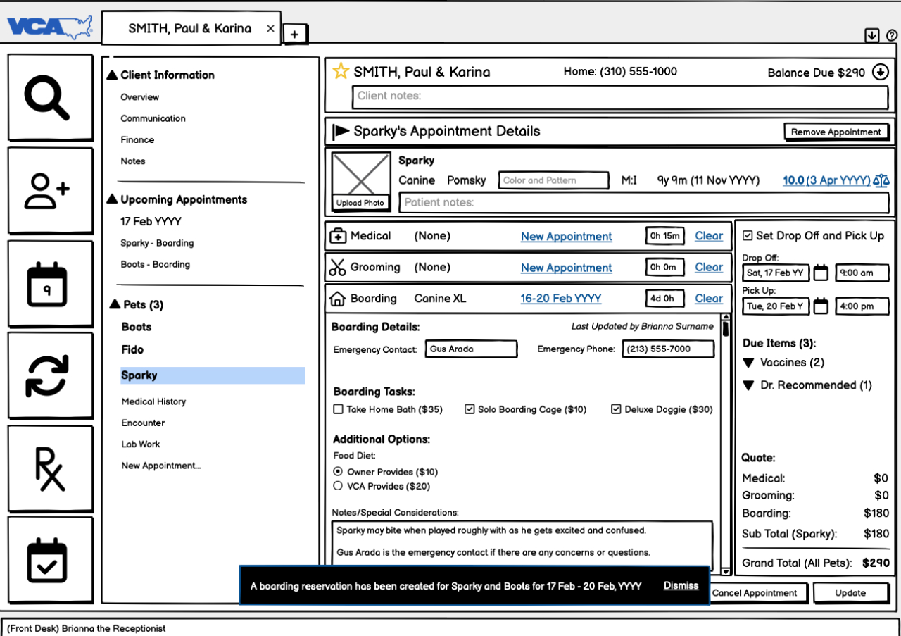
Video of Prototype
Tasked Based Storytelling Through Prototyping
To test the design solution with users and for stakeholder review; I used Balsamiq as the de facto prototyping tool. The video incorporates further iteration and demonstrates one way Brianna would use Woofware to accomplish the task outlined in the following scenario.
Download a Transcript of the Screen Names and Steps
Impact
What I Accomplished
The boarding proof of concept worked. VCA restored confidence in the UX process, kept the engagement intact, and what started as a contract rescue became an ongoing >12 year partnership. By the end of the first 2 years I had grown the design team from just myself to four designers.
- -75%
reduction in staff training and onboarding time - -37%
reduction in average check-in time - +40%
improvement in boarding price quote accuracy - +52%
improvement in medical record accuracy over the previous paper system
Woofware Phase 1 was released into five hospitals on schedule as a three-month Beta test to measure how well we accomplished our goals in the complexity of real life situations. It was then rolled out to VCA's 1000+ hospitals across the USA, Mexico, and Canada. In the middle of the Beta, I earned a second promotion to become the UX Practice Manager for iLink Digital Inc. and ceased having direct day to day individual contributor responsibilities with VCA and Woofware.
A few years later, I rejoined iLink Digital specifically to work with Mars Veterinary Health on Voyager Health. This SaaS platform is the successor of Woofware. I led design on several products and features such as the Accounts and Operations Dashboard.