The Program
T-Mobile offers a visual voicemail solution for native Android consumer and business users across its various branded experiences.
- Type: Consumer and Enterprise Native Android
- Market: USA
- Team: 1 Technical Product Manager • 37 Software Developers • 1 Product Designer (Me)
- Role: Sole Product and Visual Design • User Research on feature • Design System
- Timeframe: 5 Months (Part-time) Agile rollout • 2022
The Challenge
Support calls were piling up and subscriptions weren't growing. There wasn't an appetite for formal research, so I went guerrilla by talking to customer care and digging into app store reviews to find out what was going on. Turns out users weren't just asking for more features, the app was just too slow. I redesigned the core experience and brought new premium features through beta before moving on. Performance is still being worked out, but the direction was validated and the product shipped.
What Success Looked Like
- Reduce customer support calls
- Increase paid premium subscription conversion
- Offer increased localization (language) support
- Feature adoption (Language Translation, Transcription, Voicemail Transfer and Retention)
- Accessible Compliance (WCAG 2.0)
What Changed
Product was shipped after I left T-Mobile to pursue other opportunities. Results are from a two month Beta testing program with ~2,000 customers
- -25%
reduction in support calls related to performance complexities - 2x
faster success rate in consuming transcriptions and playing voicemails - 32
localized UI languages and support - +12%
increase in customer social sentiment (favorable commitment to pay for premium features)
How'd I get there?
What's wrong with Visual Voicemail?
My mandate of success was to improve the User Experience through a visual redesign and ideate new features for the product to increase subscription revenue.
The project was divided into two main milestones to measure success:
- Milestone 1 (Visual Design):
Rebrand and redesign the core user experience - Milestone 2 (Value Added Features):
Design and develop new features to increase revenue through paid subscriptions to access additional features.
The Strategy
Research and Discovery
There was not an appetite by the stakeholders to conduct extensive formal user research. So, I took the guerrilla approach by utilizing customer care to document support call trends and digging into app store reviews as the initial first steps. Creating a competitive analysis report and live user research sessions and a soft and hard beta release.
The effort was broken down into 5 steps
- 1. Classify top 5 pain points design and engineering can address to maximize impact
- 2. Conduct a competitive analysis of other voicemail apps and listen to customers
- 3. Identify additional value add features to increase subscription rate and retention
- 4. Read in stakeholders for signoff, approval, and align to business goals
- 5. Redesign and rebrand app to resolve pain points and integrate new features
Top 5 Opportunities (Pain Points)
Four of the top five pain points I learned from the user research were technical pain points. One was a business opportunity that product design could address.
Technical
- Customers often experience a delay in receiving voicemails often for hours or days
- Customers often cannot reliably authenticate into the app
- Customers often cannot successfully transfer their voicemails into their new phone when they purchase one or switch providers
- Customers often experience inaccurate transcription or no transcriptions
- Customers question why they hmust pay for features other apps offer for free e.g. storage and transcriptions
Competitive Analysis
To better understand the voicemail landscape, I looked at other telecom companies and phone manufacturers to compare ratings, features, and price points to determine where we could be a differentiator as Geeta and I had product ideas, but were they viable?

Empathy Mapping and Customer Interviews
In addition to app store reviews, I interviewed T-Mobile customers (internal and external) and non T-Mobile customers, about their experience with the voicemail app through surveys and in person (virtual meetings) sessions.
How can we make visual voicemail more useful and interesting?
I am including some insights here in the form of participant quotes from the larger artifact of information. The brevity is me siding on the side of discretion.
- Thinks:
"What is the difference between premium and basic?"
- participant 1 - Thinks:
”Transcripts are not really accurate, sometimes they are nonsense words”
- participant 3 - Says:
"I get transcripts for free with Google”
- participant 4 - Says:
"There is a lock feature? huh.. I've never used it. What does it do?"
- participant 1 - Feels:
”It is irritating when I miss a voicemail, I don't trust this app"
- participant 2 - Feels:
"Why should I pay for something that isn't reliable?"
- participant 2
As a result of these sessions the Technical Product Manager (TPM) and I decided there wasn't value in user testing the current legacy app as we were going to spend the effort on validating the new designs I was working on.
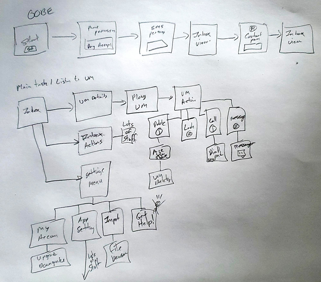
User Flow Mapping
I documented the user flow to sanity check with a few internal users to validate this made sense. One of the great things about working at T-Mobile, colleagues are also customers.
Execution (Milestone 1)
Early Concepts - Designing the Fix
Milestone 1 was to improve performance and stability of the app through rewriting the native app from scratch. In parallel, I set my design iterations in this phase to three main objectives.
- 1. Iterate on the interaction design and remove unused features present in the current app
- 2. Create visual branding and a design system modeled off of what I helped create for DIGITS
- 3. Ensure the design solution meets the corporate led Level AA WCAG Accessibility Guidelines
1. Iterate on the Interaction Design
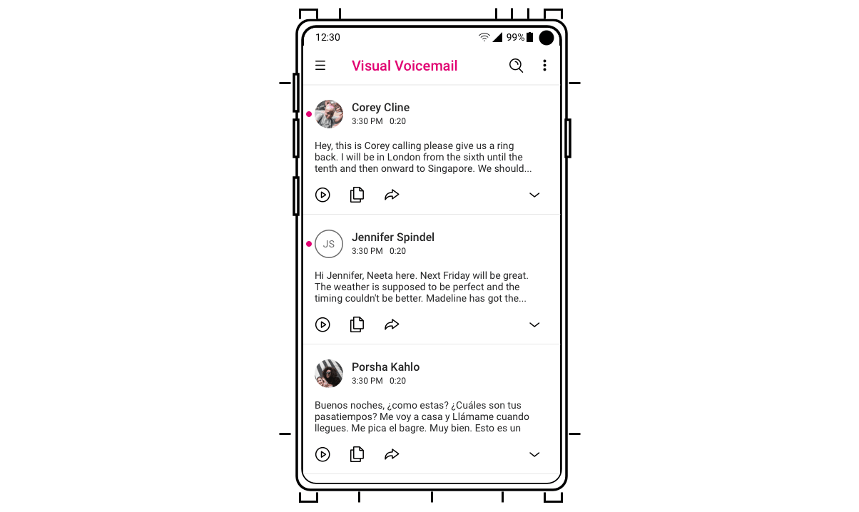
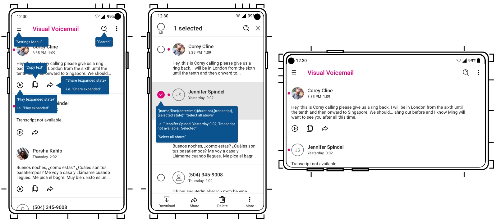
One of the new key features to Premium was the ability to play the audio portion of the voicemail, share, or copy directly from the card or tap to enter the details and have the full transcript along with play controls.

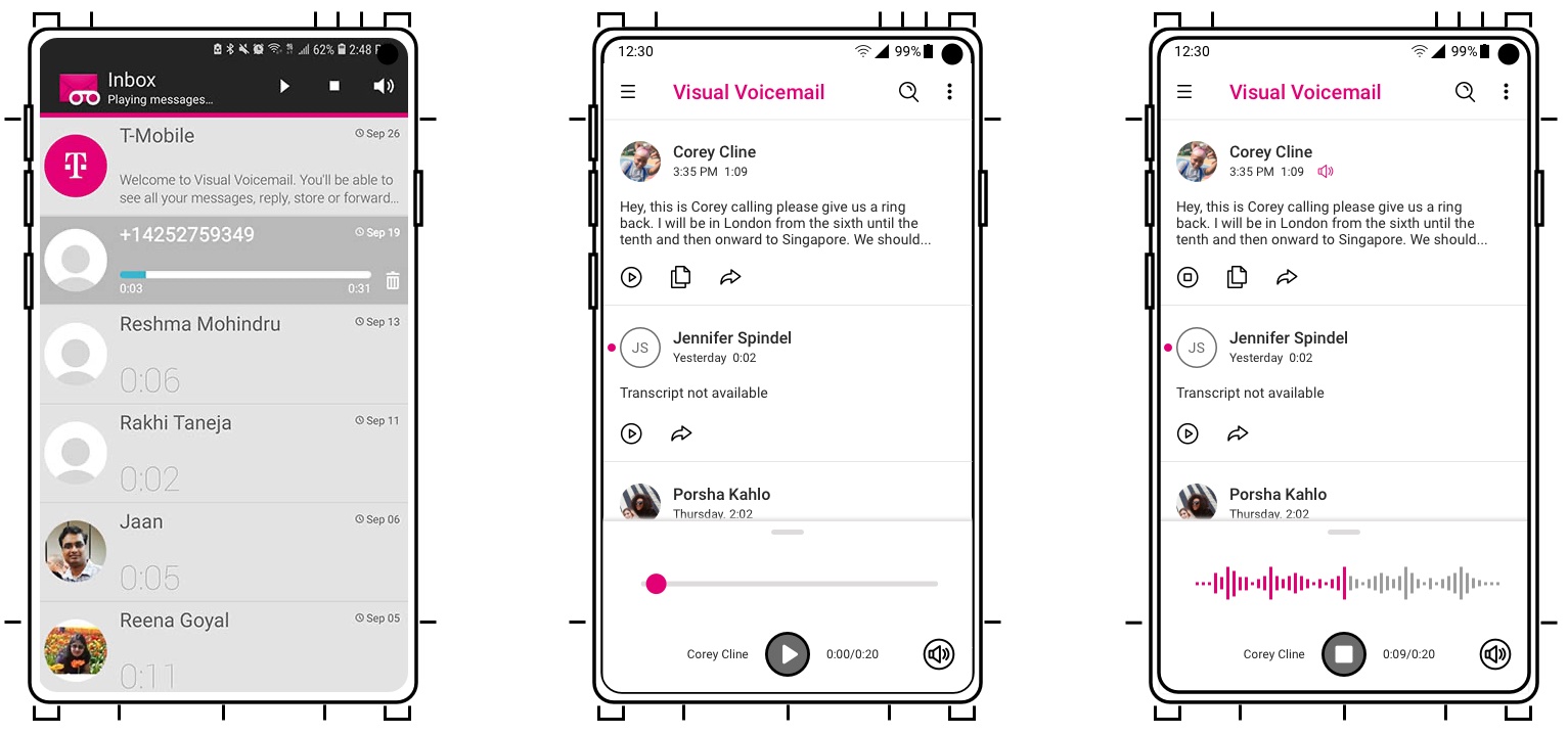
Improving Playback Interactivity
A major change is moving the playback and scrubber to optimize placement considering how humans hold their phone. One cognitive affordance risk was changing the visual design from the standard knob and bar to a knob less tracking control where the bar becomes the equalizer. In testing this change, 9 out of 12 users were able to understand they could track forward or backward.
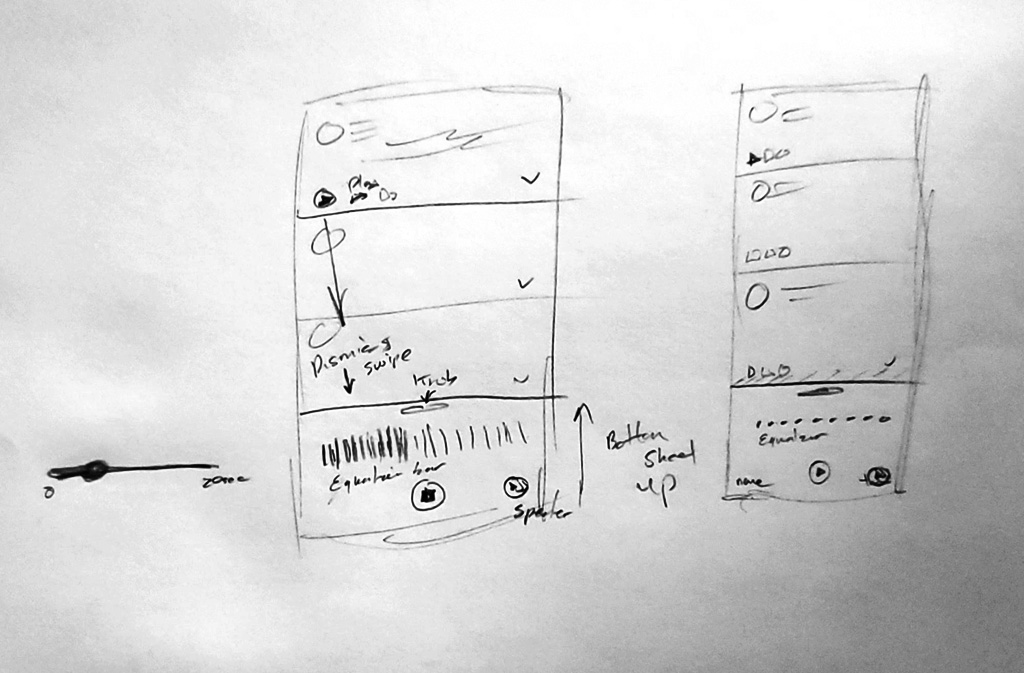
A Usability and Accessibility Issue Discovered
Figure ID.5 originally had this expand control on the card, shown in the animation, so the user could read the entire transcript without leaving the screen.
Design Choices
- Expandable card so user could read full transcript wihtout leaving screen
- Animation on the expanding and collapsing
Why Discarded?
- Expansion did not add value as full transcript was one tap away and a long transcript made the collapse portion clunky
- Engineering stated it would take extra effort to code
- Was not Accessible
Voicemail Transfer and Retention
A highly requested feature from users was a seamless way to transfer existing and saved voicemails to a new device across T-Mobile brands and subsidiary brands.
Within team discussions, while this feature had been scoped to require design artifacts for a manual process, in planning we discovered this could be solved in code and would be automatic and seamless to the user. A solid win for good user experience!
Visual Design
2. Visual Branding and the Design System
Design System
Branding
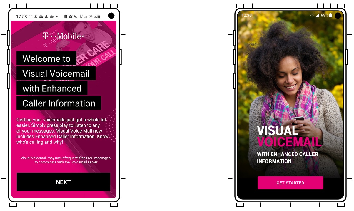
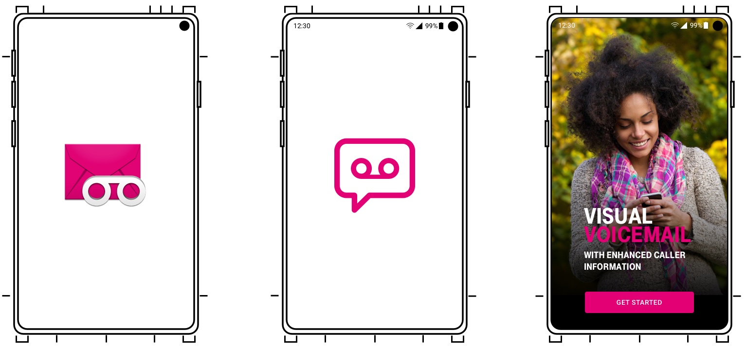
For the Out of the Box start screen I set the branding to adhere to T-Mobile's Corporate "Magenta in the Wild" theme through using a photo of a person wearing something magenta such as a scarf. I also simplified the content design on the start screen.
Visual Design Constraint
The visual design challenge was how to incorporate magenta into the user interface to convey this is T-Mobile without making it too overwhelming in the sense of visual fatigue with the color. To accomplish this, I decided to use Magenta as a highlight color in our related family of products (DIGITS, Visual Voicemail, Name ID, Scam Shield).
Logos
In the effort of modernizing the visual branding I also updated the product logos to make them feel more modern by simplifying them to their core colors. I ended up setting the visual style standard for Metro and Magenta logos for mobile apps. This accomplished the Brand goals of T-Mobile.

Illustrations
One of the major drawbacks from a content perspective of Voicemail is it is just audio files and text. In considering our visual language brand and color palette for T-Mobile is magenta, black, and white, and for Metro by T-Mobile is purple, gold, black, and white. I wanted to bring the UI more alive and engaging.
As part of the visual personality, I wanted to achieve, I designed and added illustrations and photos wherever possible. Following established brand guidelines of other apps, the illustrative style was outlined drawings with minimal detail. This adhered to our Diversity, Equity, and Inclusion guidelines while still creating visual interest.
Dark Theme
One of the top feature requests customers asked for was the ability to choose a dark theme. Initially I created a color theme for a dark mode, primarily for stakeholder review, but we decided to use the native Android dark theme in implementation as it was a lower engineering cost.

3. Designing with Accessibility and Inclusion in Mind
The redesign focused first on addressing the contrast, colors, and hit targets of the icons and buttons and second on defining swipe order with the developers and content design in screens and with aria labels.
As part of my UX process I provide the Engineering and QA teams with Aria labels for accessibility. External Keyboard and Panoramic support are also critical for making mobile apps inclusive.
Execution (Milestone 2)
Premium Features to Drive Paid Subscriptions
In Milestone 2, the TPM and I focused on additional features that would add value and could offer future monetization possibilities. While we added several features, for this case study I will focus on two.
These features ended up shipping with the free version.
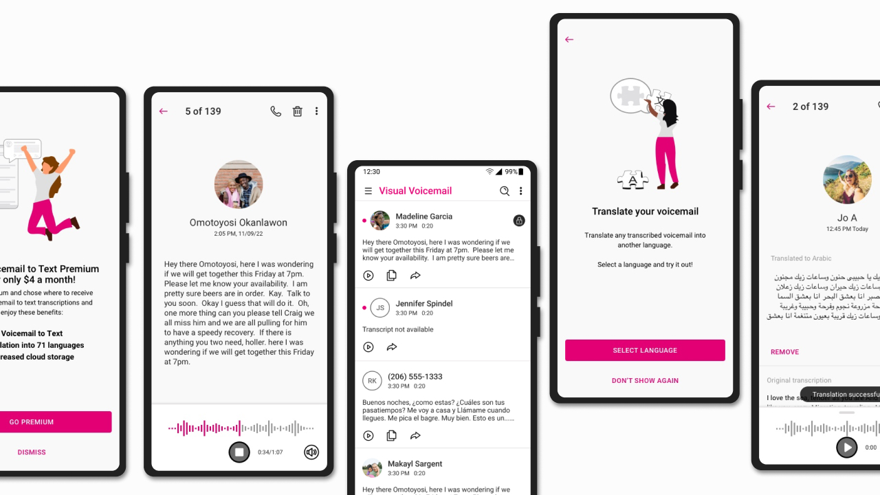
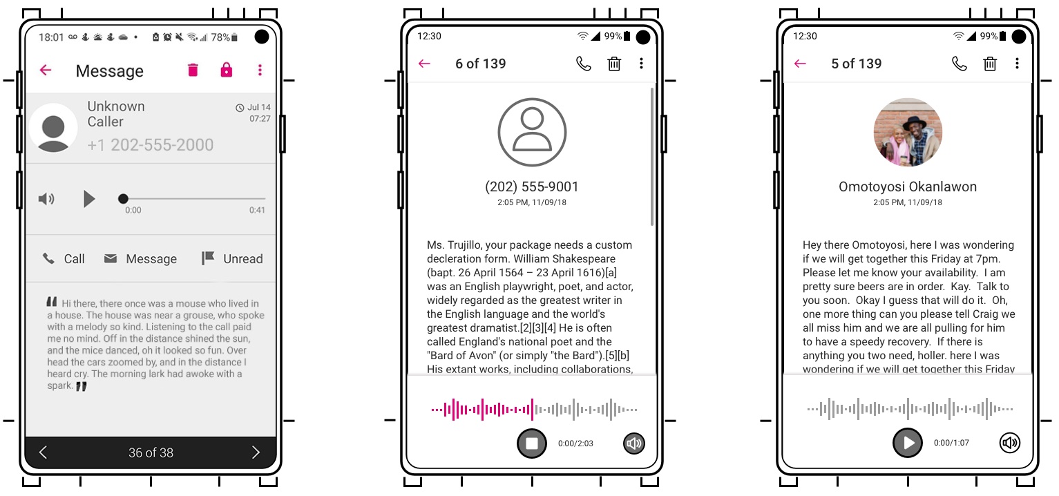
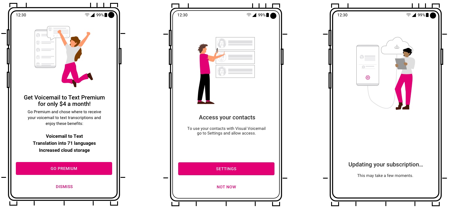
Translation Service
The first feature supported by our stakeholders as a priority was the integration of a language translation and transcription service. We prioritized as no other telecom carrier or third-party visual voicemail app except Google offered this service. The feature had two abilities:
- Automatically transcribe voicemails in the language of the audio in 96 languages
- Ability to transcribe from one language to another on demand (Figure T.1).

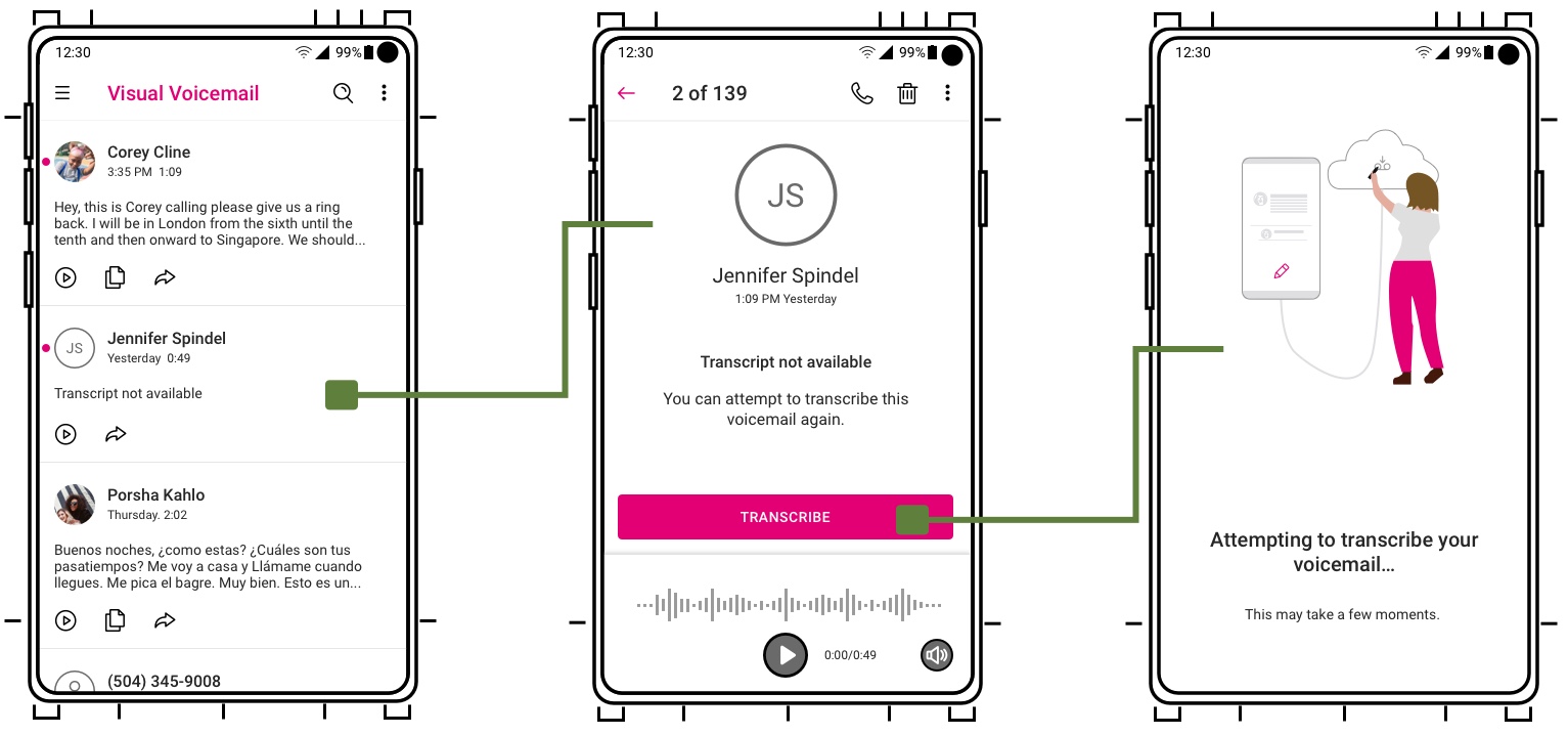
Transcribe a Failed Transcription Feature
The second feature and one I advocated for was the ability to transcribe on demand if a voicemail failed to automatically transcribe the audio. This feature however was deprioritized to a future version as the developer cost was rather significant when measured against other priorities and our team resources.
Impact
What I Accomplished
Product was shipped after I left T-Mobile. Results are from a two month Beta testing program with ~2,000 customers
- -25%
reduction in support calls related to UX or feature matters - 2x
faster success rate in consuming transcriptions and playing voicemails - 32
localized UI languages and support - +12%
increase in customer social sentiment (highly favorable commitment to pay for premium features)