
The Program
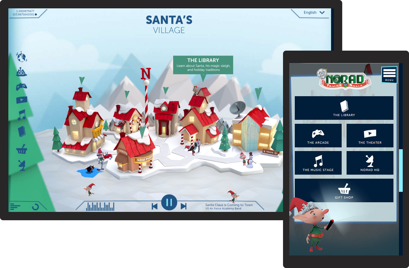
NORAD has tracked Santa Claus' worldwide journey since 1955. By 2012 they wanted a complete refresh of their Santa Tracker website with new design, new features, and a strategy to grow engagement against new competition.
- Type: Multi-platform Consumer (Pro Bono)
- Market: North America • Worldwide (Offered in 8 Languages)
- Team: 1 Technical Product Manager • 1 Visual 3D Artist • 3 Designer/Developers (Season 1)
- Role On Feature: Product Lead - Product Manager • Lead Product and Visual Designer • Lead User Researcher • Front-End Developer
- Timeframe: 3 Months (Q4) Agile rollout for 4 Seasons • 2012 - 2016
The Challenge
The brief was to redesign the NORAD Santa Tracker for children and grow engagement during the 24 days before Christmas. The unstated challenge was harder: how do you make a missile-defense organization feel magical to a four-year-old? Google had just launched their own Santa Tracker.
What Success Looked Like
- Increase DAU (Daily Active Users)
- Time to discover website content
- Feature adoption in Library and Mission HQ
- Design an experience that resonates with a preschool audience
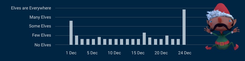
- Reduce bounce rate during 2-23 December
What Changed
- 15M
increase in visitors in December overall year-over-year - >5 mins
increase time on site and interaction with Library feature - 18%
increase in engagement with website between 2 Dec to 23 Dec from Y1 to Y4 with a 55% decrease in bounce rate. - 2
new social media platform launches that drove engagement an additional 30% to website
Learning from Children
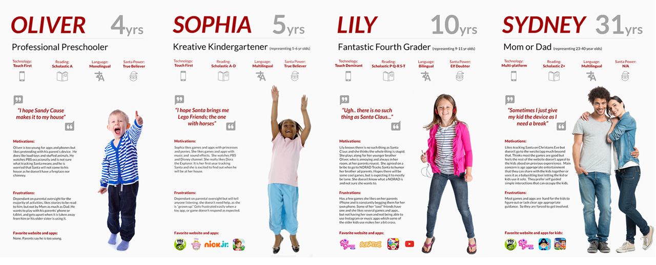
I had designed for children before, creating kiosks at the Children's Museum of Houston, educational games for middle schoolers, a holiday interactive CD. I knew this audience. Or thought I did. Before Season 1 I built three archetypes from that experience: Sophia (5), Lily (10), and Sydney (31). Competitive analysis and social media review confirmed the direction. A usability study after Season 2 corrected the one critical thing my experience had gotten wrong.
The Finding That Changed Everything
We went in targeting 8-11 year olds. Parents in recruitment told us otherwise:
- "My older kids have no interest in tracking Santa Claus, my youngest will sit with me to watch the videos."
- Mom, Child Age 3 - "I'm exhausted. I just want to give him my iPad and have a few minutes of peace and quiet. I don't care what it is as long as he is entertained."
- Mom, Child Age 4 - "[name] is 10, he has never been interested in the website before, but his younger brother will sit with me and we track Santa and maybe watch a few videos."
- Mom, Child Age 10 and 5 - "There isn't anything on this website that interests [name]. Have you seen PBS Kids? There's a lot to entertain him for at least an hour. That's what I'm looking for."
- Mom, Child Age 4
The primary audience was 4-7, not 8-11. We added Oliver (4) to the archetypes. Everything we'd assumed needed rethinking.
What Testing Kept Teaching Us
Testing across seasons kept correcting and sharpening our thinking. Two moments stood out.
Finding 1
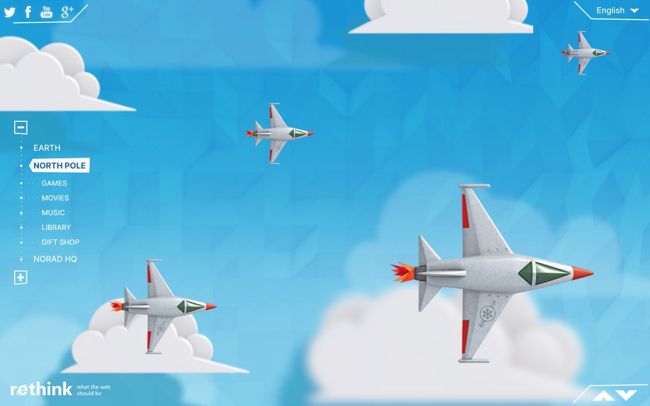
A four-and-a-half-year-old boy watched the planes we designed crossing the sky toward the North Pole and asked his mother:
That one question at the end of season 2 changed our thought process. Less military more magic.
Finding 2
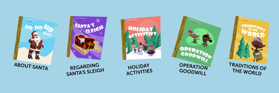
A six-year-old girl in the same study clicked on the North Pole village, then got bored in the library. There were no books. Nothing to do. We asked what she expected. She said books she could read, or animated stories. That answer became the brief for the Little Golden Books library redesign in Season 3.
Designing For Children
The design challenge wasn't just making something engaging for children. It was making a missile-defense organization feel warm, safe, and magical to a four-year-old, while giving parents a product they trusted enough to walk away from and grandparents something that felt like a childhood memory.
Season 1 - Mixing Military With Magic
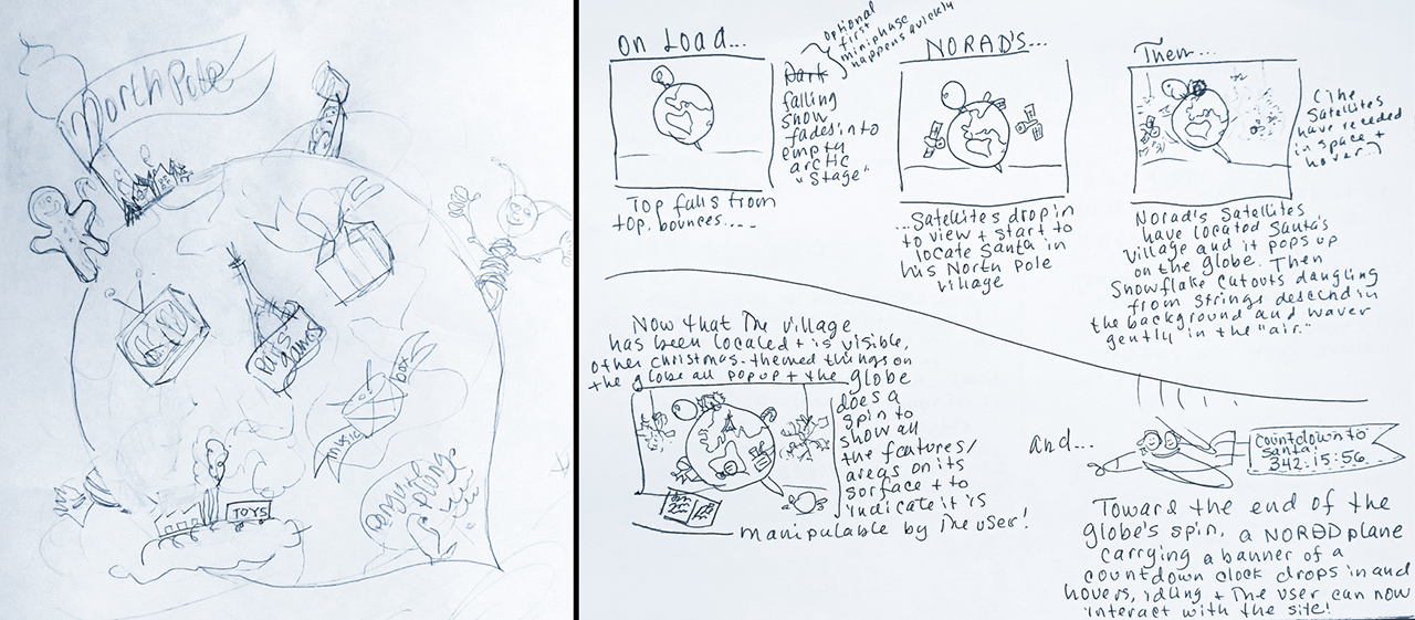
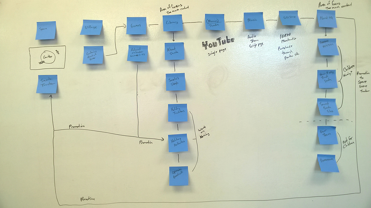
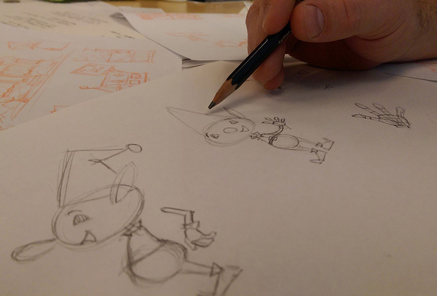
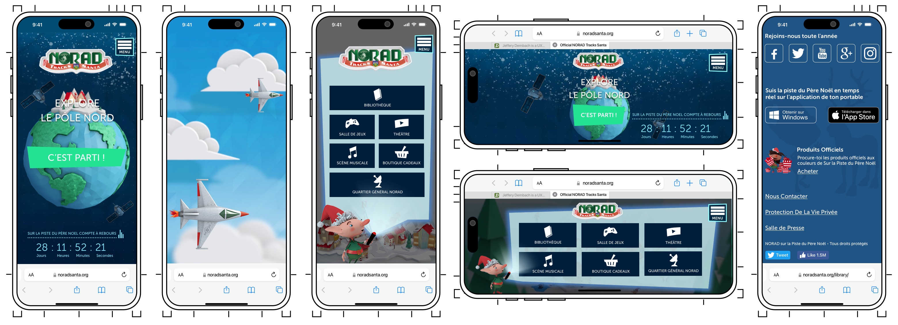
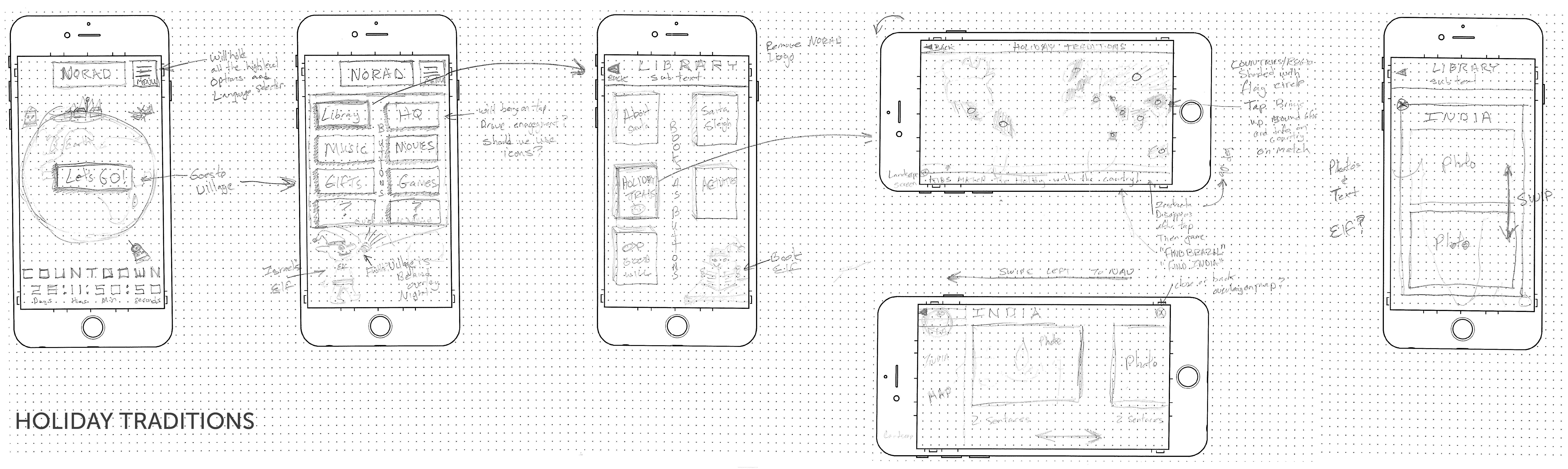
Season 1 established the visual language and information architecture. The collateral didn't survive, but the hand sketches and IA whiteboard did. The Season 2 redesign grew directly from them.
Season 2 — Finding the Visual Language
For Season 2 I had a clearer vision and the right partner to execute it. The aesthetic direction was specific: the 1964 Rudolph the Red-Nosed Reindeer claymation style. Not arbitrary nostalgia rather a deliberate three-generation strategy.
A four-year-old responds to the warmth and whimsy. A parent recognizes the aesthetic and relaxes. A grandparent sees something that connects to their own childhood Christmas memories. NORAD and every partner loved it immediately.
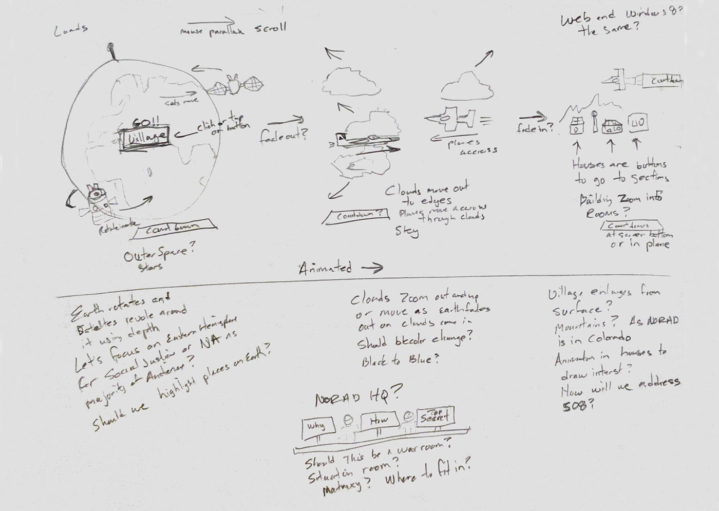
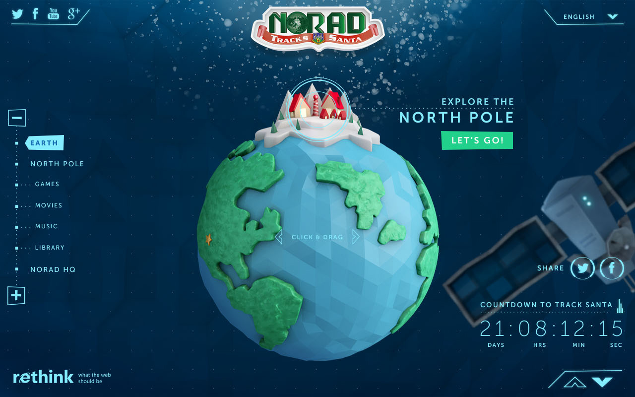
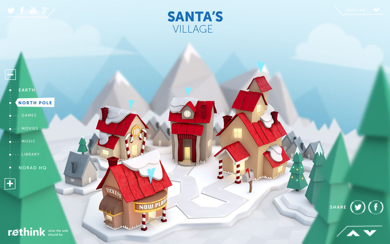
The parallax structure built the world in three layers: outer space (NORAD's radar and surveillance mission), the sky and journey to the North Pole, and the North Pole village itself. It was immersive, it was child-friendly, and it gave older children and adults something to explore.
Season 2 testing confirmed what the research hadn't caught: the visual language we'd built was still too military. Four NORAD jets crossing the sky toward the North Pole read as an escort, not a celebration. The elves and village warmth of Season 3 did enough to balance the tension. The jets came down in Season 4.
Season 3 — Resolving the Tension
We created an elf avatar named Elfie, designed to give children someone to identify with and follow through the experience. Our in-house 3D artist, modeled Elfie and 11 other elves and animated them throughout the North Pole village. Elfie was later renamed Barry from a child's suggestion in testing.
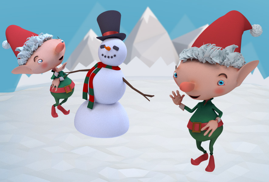
Barry and his friends were created across Seasons 3 and 4. Most were assigned to a specific section of the experience, some just played in the village. Building a cast of characters gave every part of the website its own personality and gave children a reason to explore beyond the tracker.
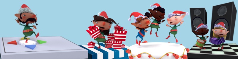
Text navigation was replaced with icons entirely. Preschoolers don't read. Images, symbols, and animation communicate faster and more reliably for a four-year-old than any label we could write. Music and sound effects were introduced for the first time with a jukebox feature and ambient audio that made the experience feel alive rather than static.
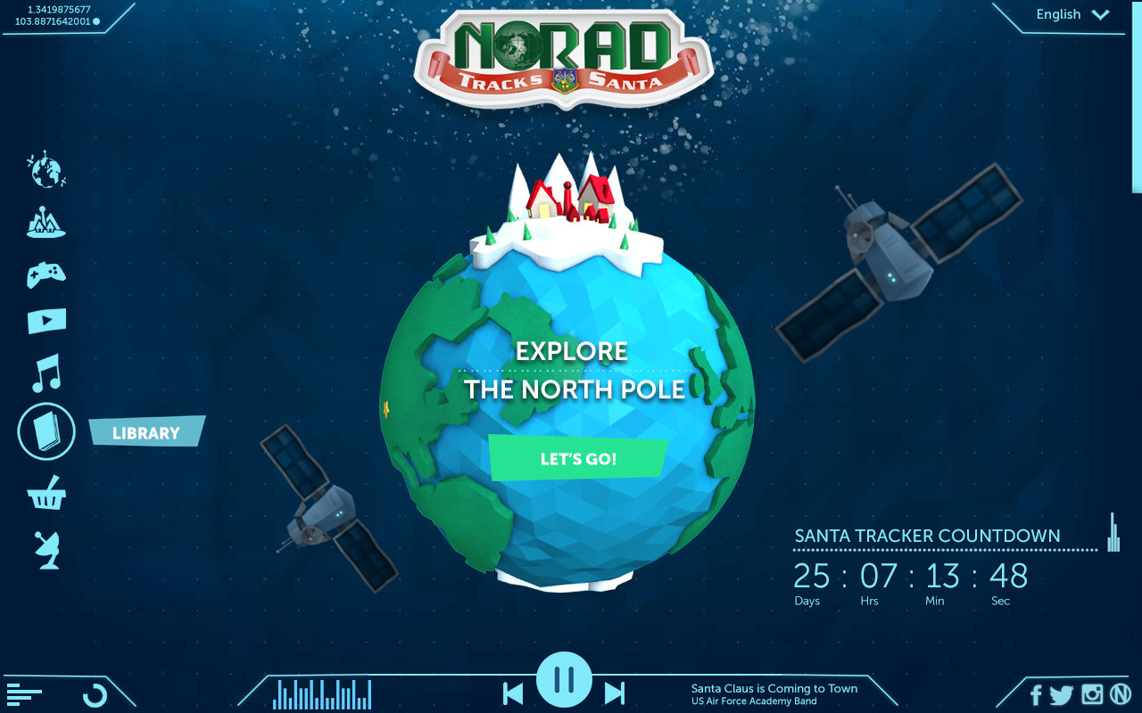

Library - Holiday Traditons
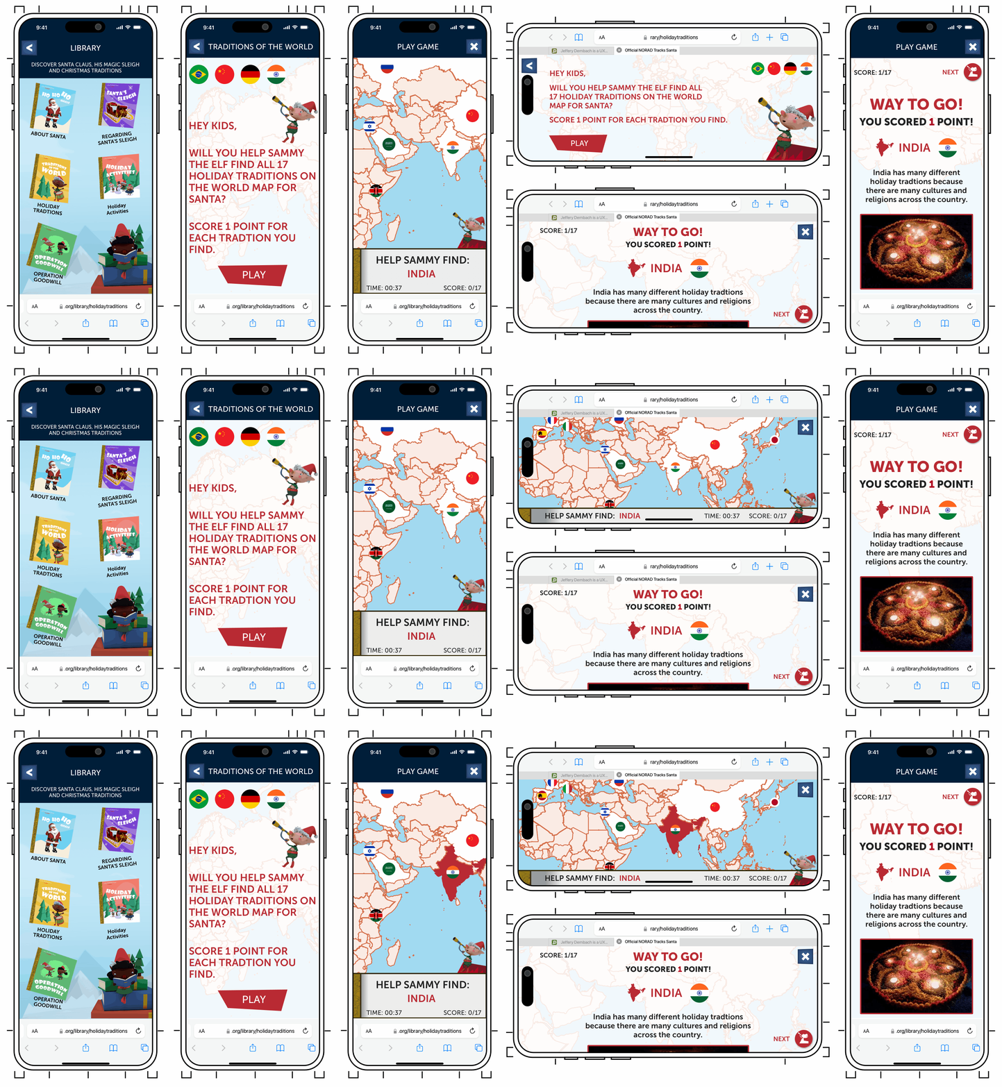
To make the Library meet that six-year-old's expectations, I created stories and activities in the library. Holiday Traditions had launched in Season 3 as an informational feature with countries, celebrations, regional customs.
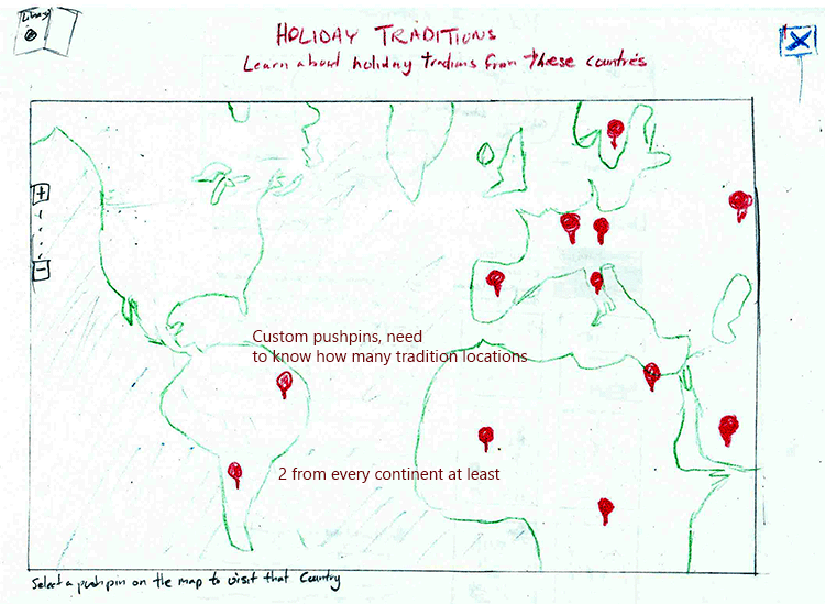
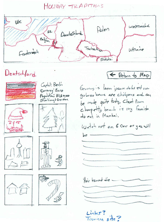
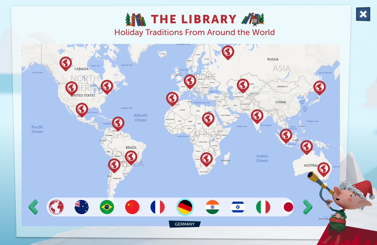
Season 4 — Deepening the Engagement
Season 4 turned content into interaction. Holiday Traditions had launched in Season 3. Analytics showed high visit rates but also high bounce rates. People arrived and left quickly. The content was interesting but passive.
For Season 4 I proposed turning it into a game. Players helped Sammy the Elf, one of twelve named elf characters across the experience, locate traditions by region on a world map, earning points for each correct match. The informational content became the game mechanic.
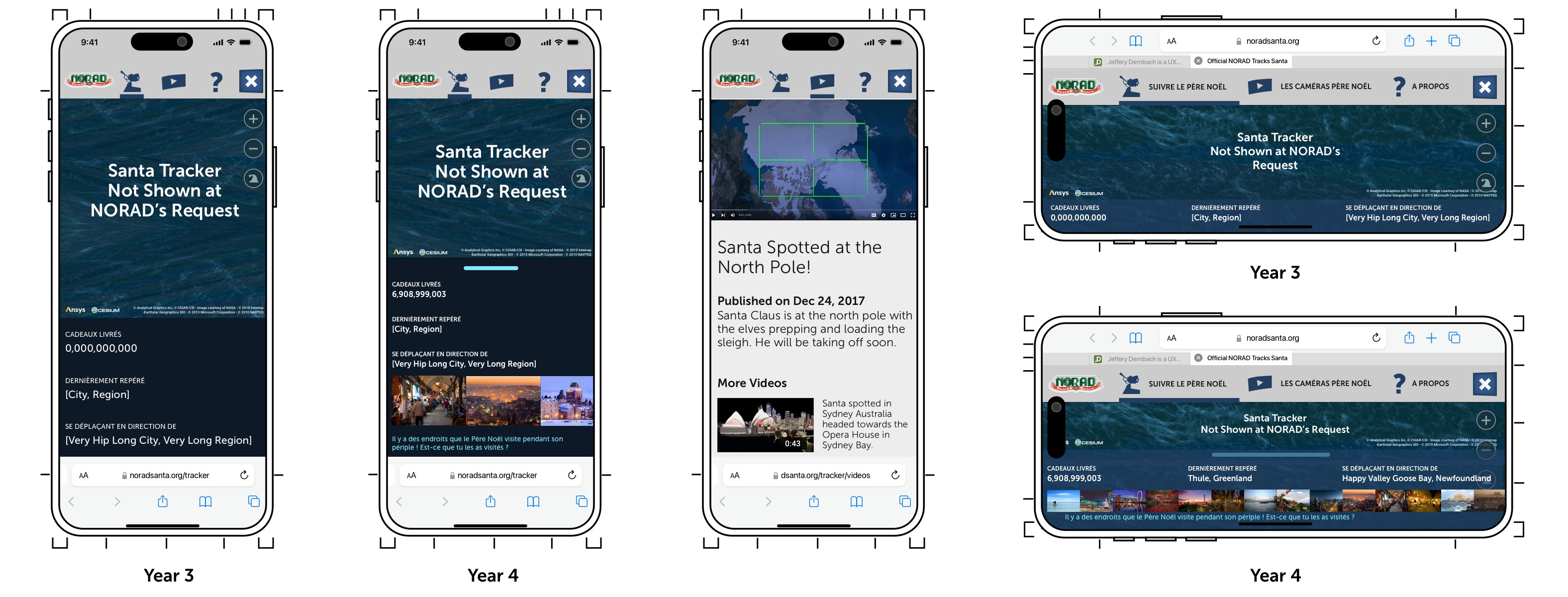
Mobile: 60% of our traffic
The Holiday Traditions game was designed and built mobile-first. Desktop followed from there.
A Last Minute Partner Request
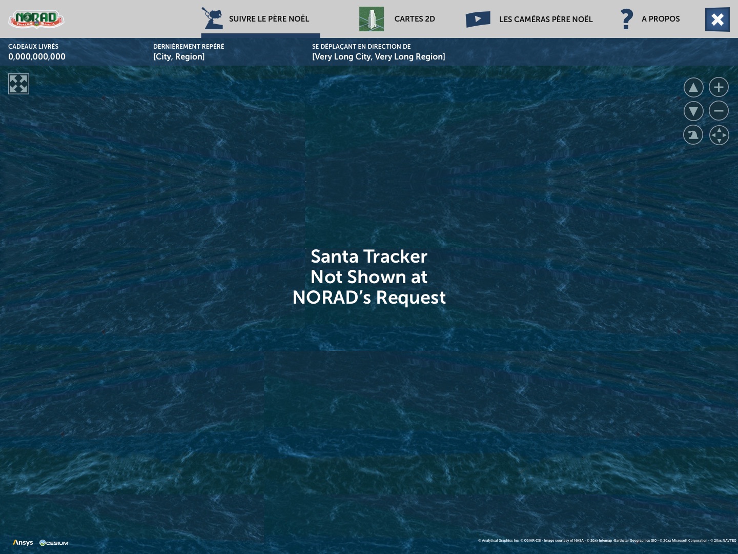
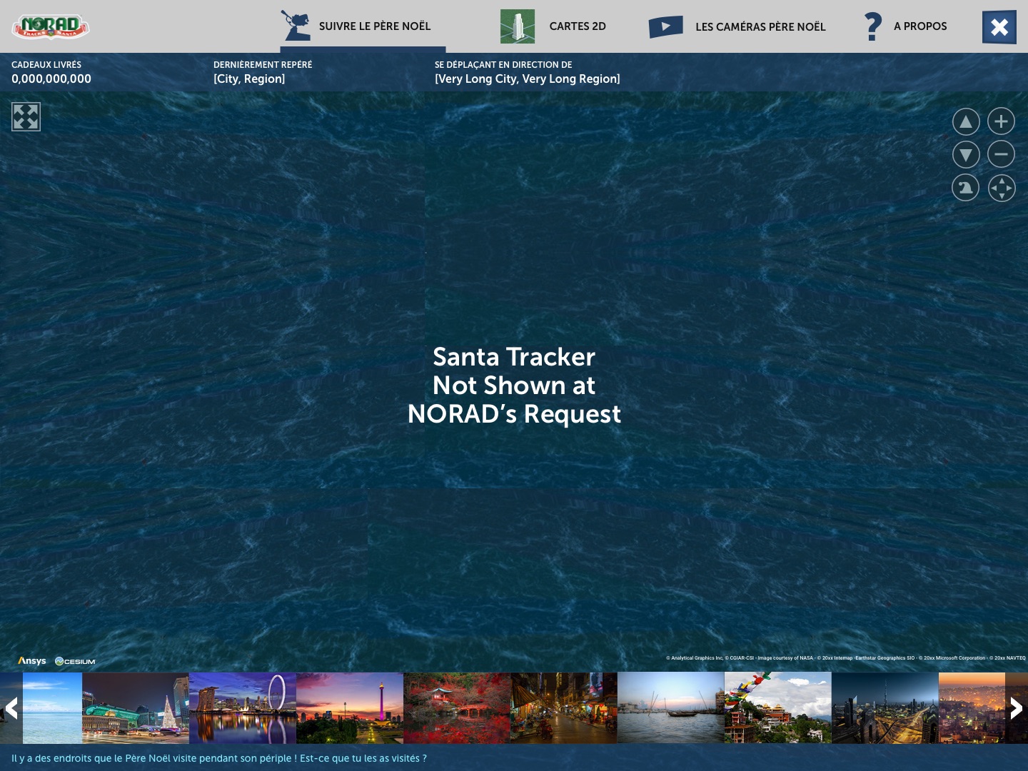
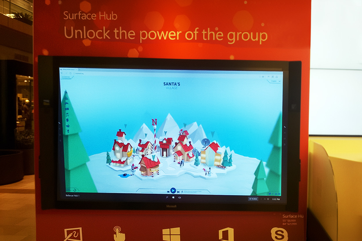
The Bing photo carousel was a late Season 4 request from Microsoft to add content to the Santa Tracker screen that would drive traffic to Bing.
Two constraints: don't confuse or distract a preschooler from tracking Santa, and fit it into the small landscape mobile viewport without disrupting the tracking experience. The solution was a photo carousel of places Santa had visited, with a subtle prompt asking if the user had been there too. A swipe control showed and hid the carousel without touching the tracker itself. 93% of users who saw it selected more than one photo.
Pitching and Shipping Features
Every season had three sets of goals: NORAD wanted mission visibility and increasing DAU. Our main partner Microsoft wanted Bing and Edge engagement. Users wanted something fun. My job was building the feature that satisfied all three without anyone noticing the other two.
How We Prioritized
The process was informal but consistent. I scoped NORAD and Microsoft's requests with my team first, sized the effort, then pitched our own ideas against whatever capacity remained. NORAD made the final call on priority.
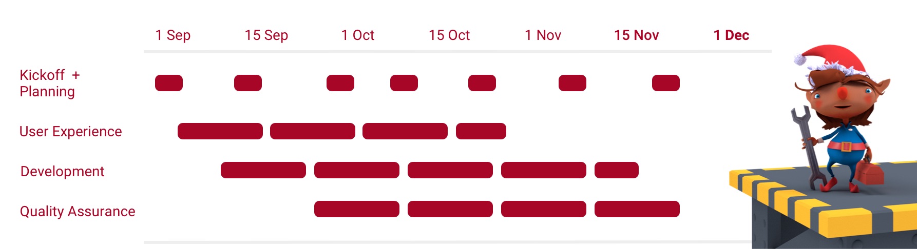
Three months. Four workstreams. Over 50 partner organizations. One ship date.





Running the Program
Three months each year. A fixed ship date. A team that kept getting smaller.
Shipping Under Constraint
Season 1 started with three designer/developers alongside me. By Season 3 they had moved to other commitments. In season 3, I absorbed the front-end work myself. I had been a developer before I became a designer.
What I descoped to make that work: a fully gamified NORAD HQ experience was the biggest casualty. The vision was an animated story teaching children about NORAD's mission and the history of tracking Santa Claus. What shipped was a clickthrough About NORAD section that was text-heavy, informational, functional, and visual. But not the vision. The right call given the timeline.
Making the Data Call
In Season 4 I proposed expanding language support to Arabic, Hindi, and Russian. Demographics in our North American traffic were shifting and the audience was there in principle. Analytics said it wasn't large enough yet to justify the development effort across three new languages with right-to-left layout requirements and new translation vendor relationships. I put it in the backlog. A good idea in the wrong season is just scope creep.
Building for Scale
From Season 1 the website shipped in eight languages. To support our native mobile partner, I built a design system from scratch, pre-Figma. It was a brand book: typography, color, component specs, interaction patterns, and localization guidance. I used German, Japanese, and Spanish content in the mobile layouts specifically to pressure-test spacing and hierarchy under real localization conditions before a single line of code was written.
I ran the same sprint structure successfully for four consecutive seasons: three months, four overlapping workstreams, one hard ship date, non-negotiable. That's the part I'm most proud of. Not any single feature. The fact that it kept working.
What Shipped
NORAD had been tracking Santa since 1955. We gave a new generation of children a reason to care. As the designer, researcher, PM, and eventually front-end developer, I grew the audience from 3M to 15M visitors across four seasons. Not because of the number. Because every one of those visitors showed up in December looking for a little magic, and we delivered it.
User Sentiment and Feedback
Coffee Queen
"This app is really amazing, been using it for years, would not ever use another app to track Santa."

Social Media
MG DE
"He just came to Berlin! Thank you, Santa. We really needed to see you this year"

Social Media
Jana V
"We've just seen him in Prague now. Rudolf's red nose was well visible 😊"

Social Media
D'Anna B
"Had to look on a map to find this location! Thanks for making geography fun on Christmas Eve!"
Social Media
Judith L
"My 10yr old daughter is so excited for tomorrow and can't wait to track Santa. It's something we do every year. Even though I'm 51 I have to say I thoroughly enjoy watching him travel the world."
Social Media
Lorinda E
"This is so cute guys its tracking santa all over the world. The pics are amazing. Can't wait for him to come to South Africa"

Social Media
KG
"I'm 10, and I love tracking santa. 😊"
Social Media
Press





 Website
 iPhone
 Android