

The Program
Mars Veterinary Health is building Voyager Health, an enterprise practice management application to replace disparate legacy systems, including Woofware, the platform I originally designed for VCA in 2012.
- Type: Enterprise SaaS
- Market: North America • Asia • Europe
- Team: 7 Product Managers • 3 Technical Product Managers • 12 Designers • 37 Software Developers
- Role On Feature: Sole Product and Visual Design • User Research • Led Design System
- Timeframe: 4-month Agile rollout • 2025
The Challenge
Veterinary hospitals run on controlled chaos. Appointment targets, room status, patient flow, client emotion, and follow-up tasks all happening at once. Each tracked a different way.
Having just wrapped the Accounts project, the PM approached me with a new feature idea. Before starting any design work, I returned to the hospitals with a new focus: what did staff need to see at a glance?
- We really need a way to see Business Performance KPIs (Appointment Bookings vs. Target Goals) as that is critical for each hospital
- Banfield Staff Participant - It would be amazing to easily see all the arriving patients all in one place.
- Staff Participant - Sometimes it is hard to remember which room is occupied.
- Veterinary Doctor Participant - We need a better way to alert on a euthanasia
- Staff Participant - Wow yeah... I really want to know how many drop-offs we have in the morning. I have to know where to put them.
- Staff Participant - So, my call sheet is important, we need to call and confirm appointments, yeah... and we need to follow up with no-show clients. I usually just use a notebook to remember them.
- Staff Participant
What Success Looked Like
- Improve appointment target hit rate across all brand hospitals
- Reduce time to identify patient journey status and physical location
- Increase room utilization and preparation efficiency
- Increase SLA compliance on patient follow-ups and task completion
- Ship WCAG 2.0 compliant across all dashboard features
- Replace legacy workflows with features staff can learn independently, critical for high-turnover roles like front desk staff
How'd I get there?
A Multi-Brand Veterinary Operation
Voyager Health supports several retail brands within the Mars Veterinary Health Organization. Each brand has its own processes, legal jurisdictions, business goals, and ways it generates revenue. The largest being VCA and Banfield with 1,000+ hospital operations in the USA, Mexico, and Canada.
Aligning to a C-suite directive, the product team's Phase 1 focus was on the two largest retail brands: Banfield and VCA, each running a different legacy practice management solution. The product goal was to unify all the retail brands onto a single platform.
The Strategy
Starting With People
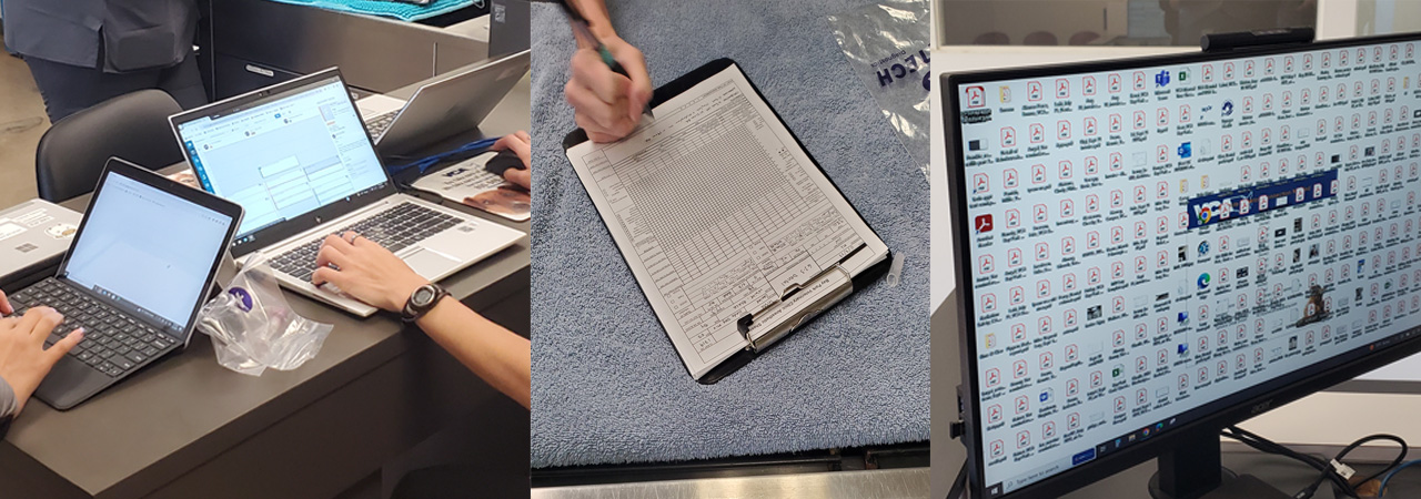
My first move was to go onsite rather than start designing. I initiated generative research across five hospitals to understand what the dashboard needed to solve. Several features, including the Maître D' wait time estimator and the address book, weren't in the original brief. I recommended them based on what I observed in the field.
Deep Dive on the research methodology
From Research to Ideas
Feature Board and Ideation
Early Concepts - Designing the Fix
Iteration 1 - Structured for Unique Staff Roles
User feedback changes my direction
- Design Strategy
Personalize the dashboard experience with unique features per hospital role. - Why Discarded?
Staff often take on multiple roles in smaller hospitals.
Higher production and maintenance costs. Engineering flagged the significant effort required to maintain a fully personalized experience with unique features per role. - Design Strategy
Add comprehensive financial and AR aging features to dashboard. - Why Discarded?
AR Aging data is not critical for users on the landing view. Internal political sensitivities by other product teams. - Design Strategy
Add medical information for patients to aid in appointment scheduling. - Why Discarded?
Too much information and not useful in this view. Research feedback was that users and stakeholders needed more high-level operational information. - Design Strategy
PM suggested a news and weather widget. - Why Discarded?
Users in testing confirmed this feature wasn't valuable in this context
Rethinking the Approach
Structuring the Level A, B, C model
Iteration 1 told us two things clearly: too many role-specific views created maintenance problems, and too much information on one screen overwhelmed users. In a working session with the PM and VP of Product, we reframed the problem around three levels of information depth.
From that session, I concentrated on six features for Iteration 2:
- Appointment Target KPIs for Banfield
- Appointment Arrivals, Departures, Visit Tracker
- Hospital Digital Care Teams Setup
- Room Utilization a.k.a. Hoteling Status
- Daily Task List - Pending Jobs To Be Done
- Address Book (Nice to have)
Zeroing In On the Solution
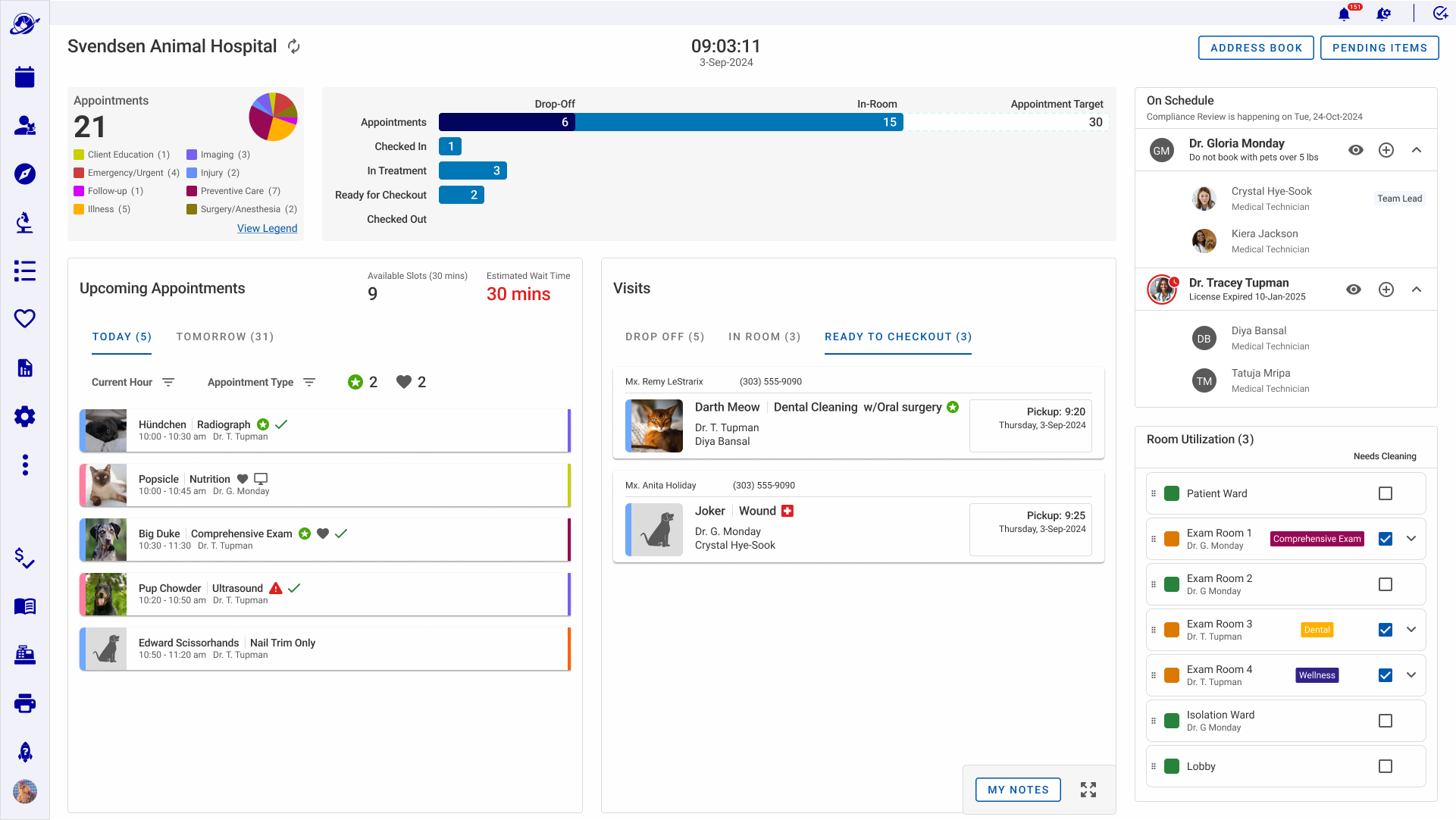
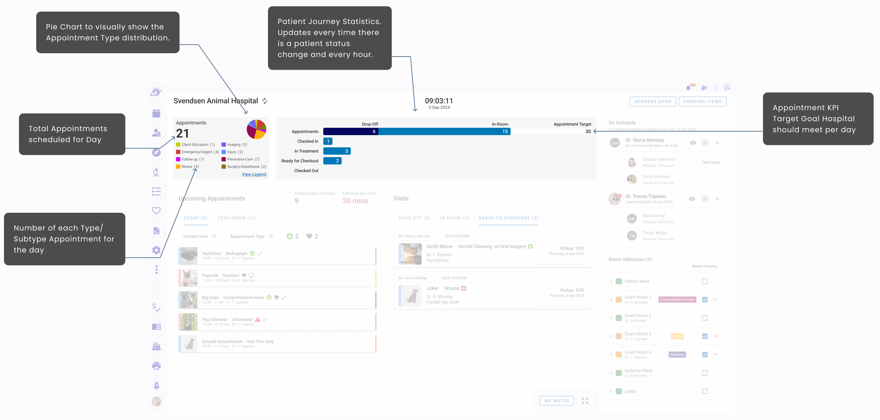
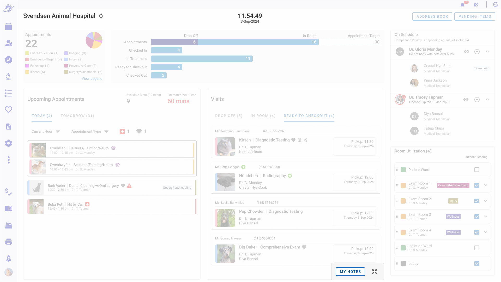
Feature 1. Operational Target Appointment KPIs
Through user and stakeholder sessions, the Appointment Target KPI emerged as the highest-priority feature.
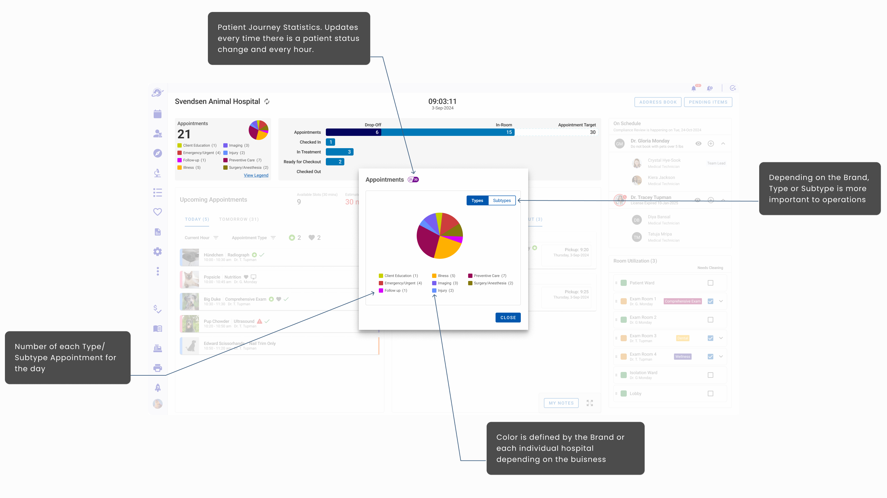
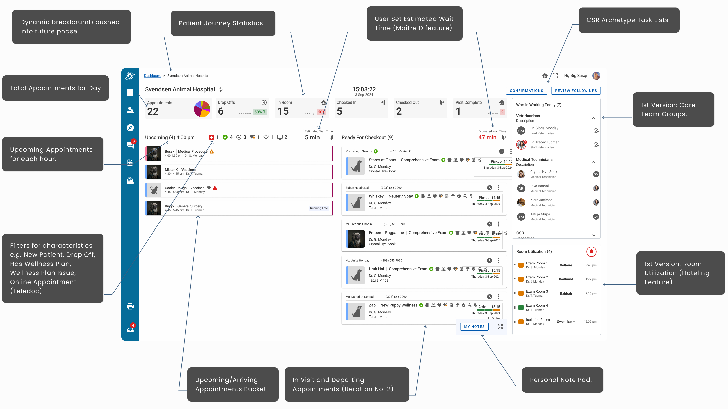
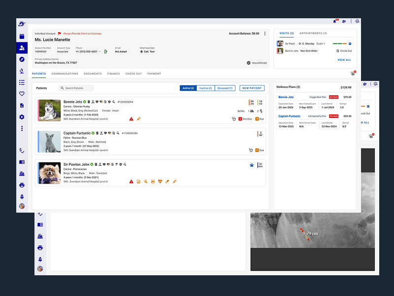
Feature 2. Appointment Drop-Offs, Outpatient, Inpatient Tracker
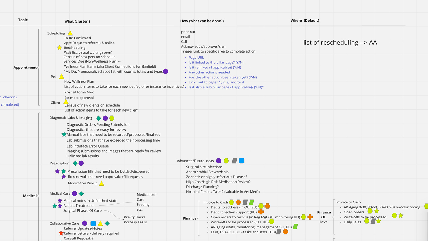
Appointment Management is the nucleus of hospital operations, and this feature has many levels of drill down and actions users can take within the phases of the patient journey. For the dashboard we wanted to capture Level A relevant information. Who is coming in and when, where are they in the treatment journey, when are they leaving and with whom, and follow up is needed on discharge or in the future (Finding 2, 3), both surfaced in our hospital observation research.
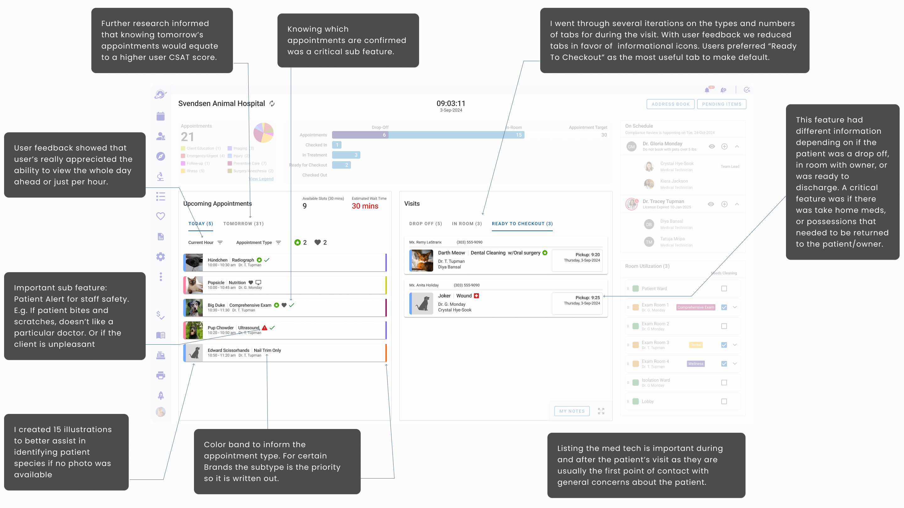
One of my highest-impact recommendations was surfacing Patient Check-In directly from the dashboard with no navigating away required and reducing the user interaction by three clicks. Banfield stakeholders had explicitly prioritized reducing click depth across the experience.
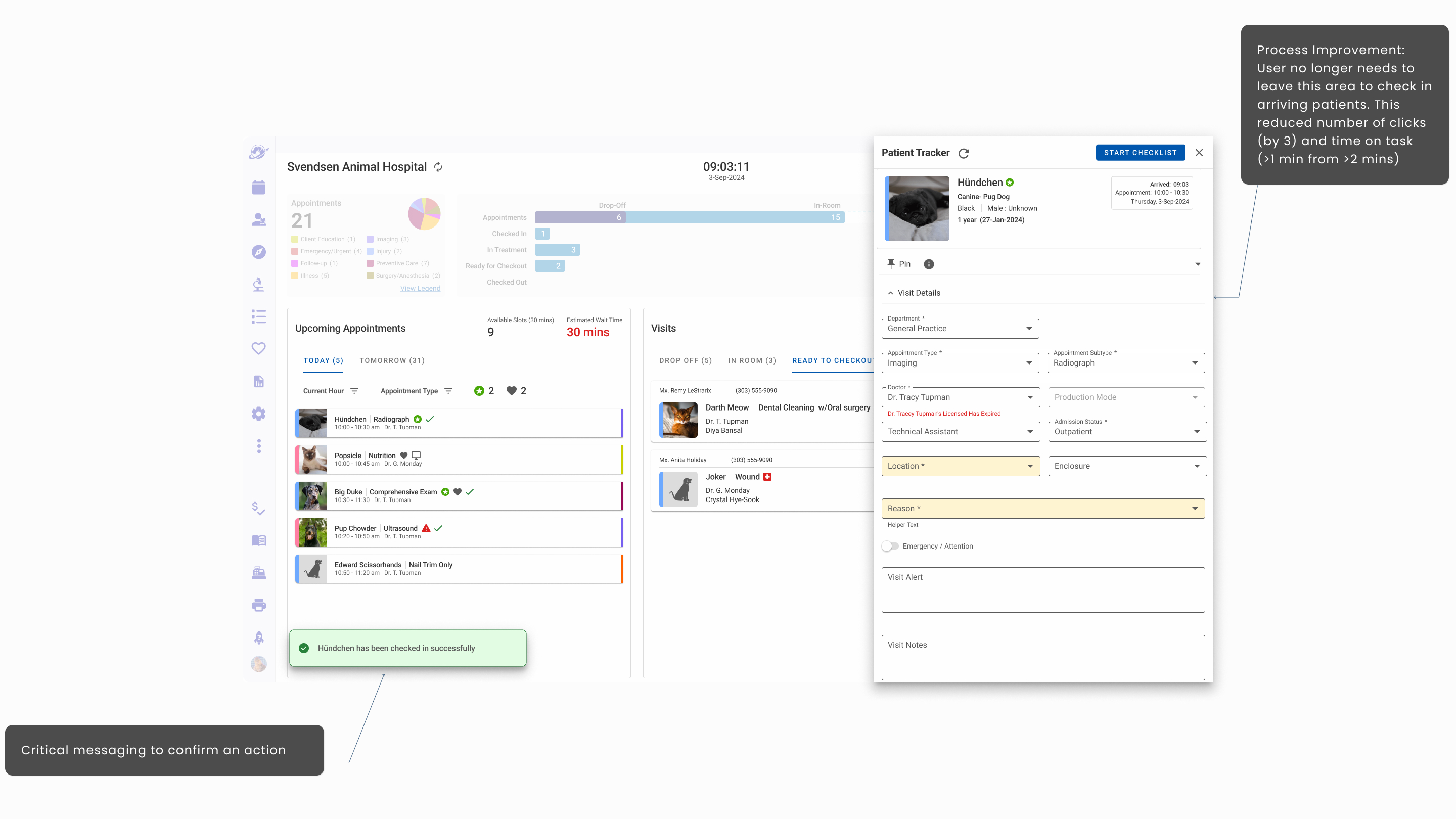
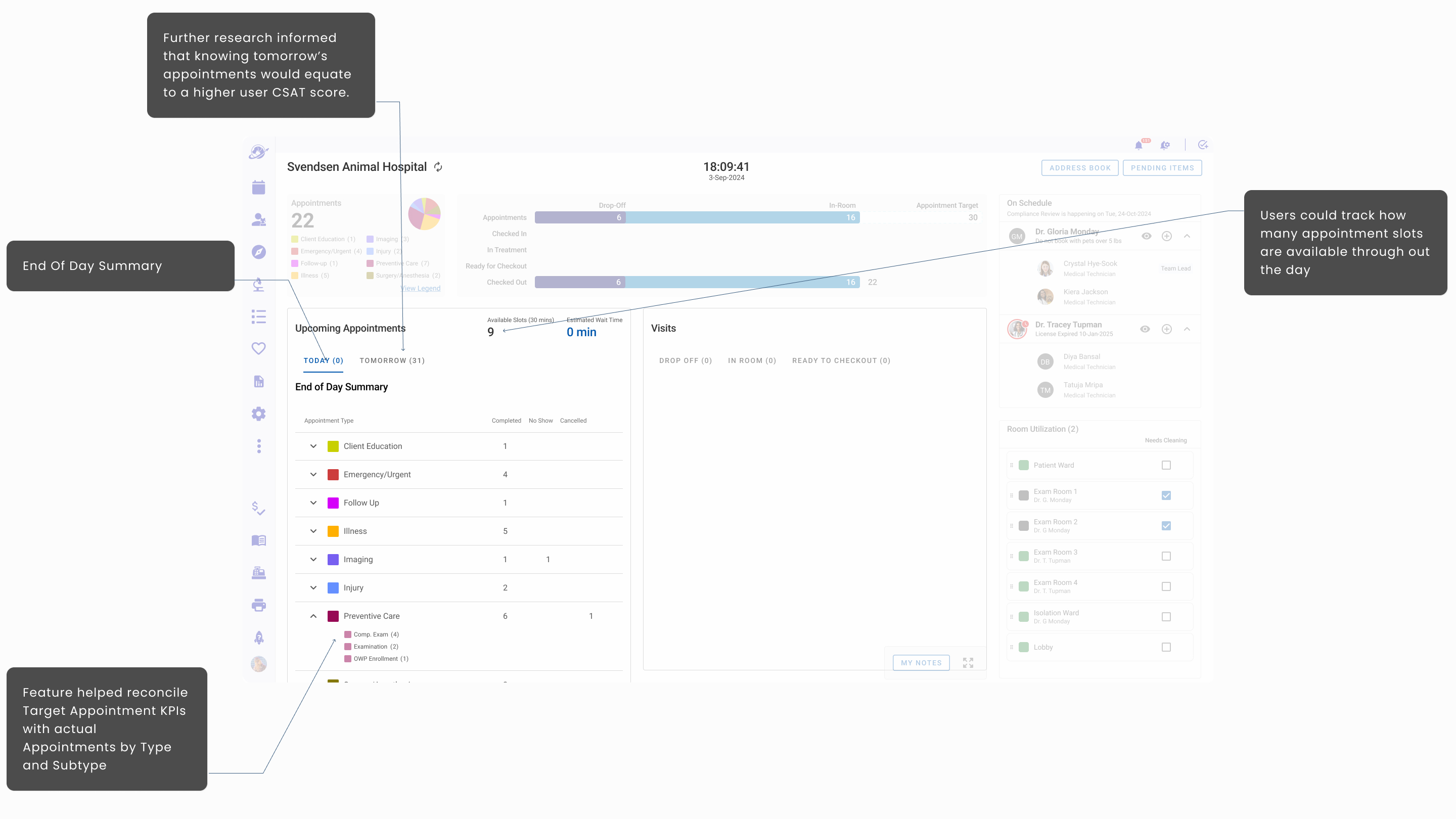
Another feature I recommended was an End of Day Summary that would show once the last Upcoming Appointment was checked in or cancelled/rescheduled. This feature contributed to a higher user CSAT score and was well received by stakeholders to reinforce tracking the Appointment Target KPIs.
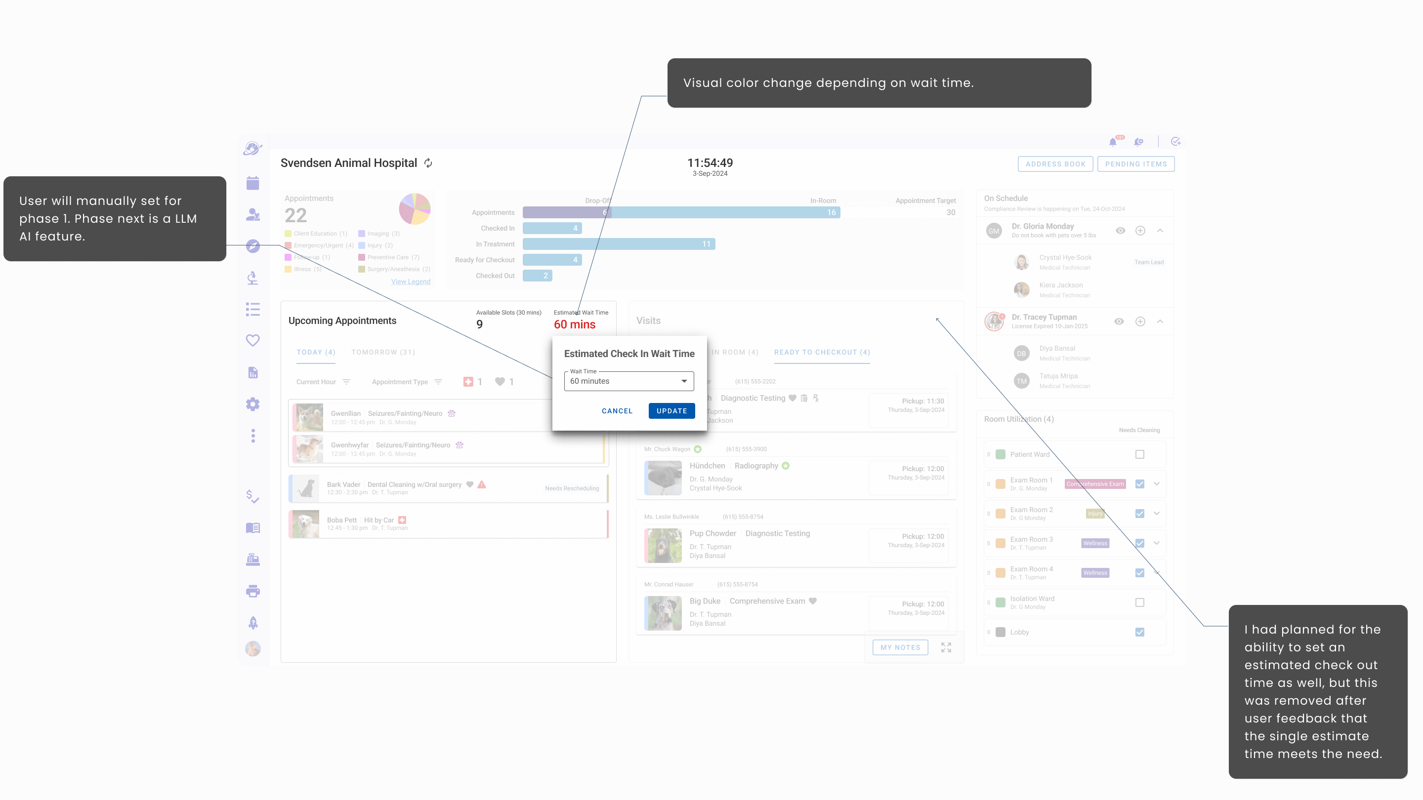
Bonus Feature I recommended à la Maître D'
I designed an estimated wait time feature inspired by my experience in restaurant hospitality. The next intended phase would have been to train our LLM with situational data to make an AI driven estimation feature that would adjust in real time without manual input.
Feature 3. Hospital Digital Care Teams Setup
Every clinic I visited had a literal whiteboard where care teams are listed for the staff, so everyone knows which medical technicians are working with which doctor. The board was updated daily or weekly. In larger hospitals these were up to 8 care teams. The typical structure was 1 or 2 care teams per day.
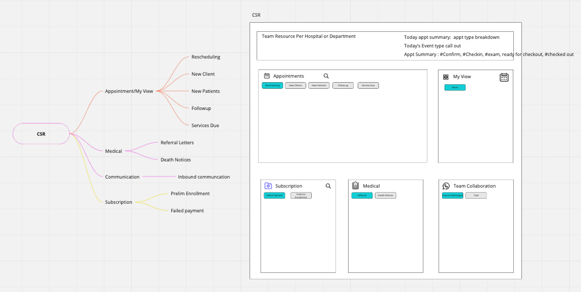
Collaborating with the feature PM and User Advocacy Team, the digital care team feature went through a few iterations. The first iterative idea can be seen in Iteration No. 2 screen above.
Changes I made to this Iteration No. 3 version were to remove the CSR staff and group the doctors together with the medical technicians as sub elements. Also, we added a new team lead designation feature to the medical technicians.
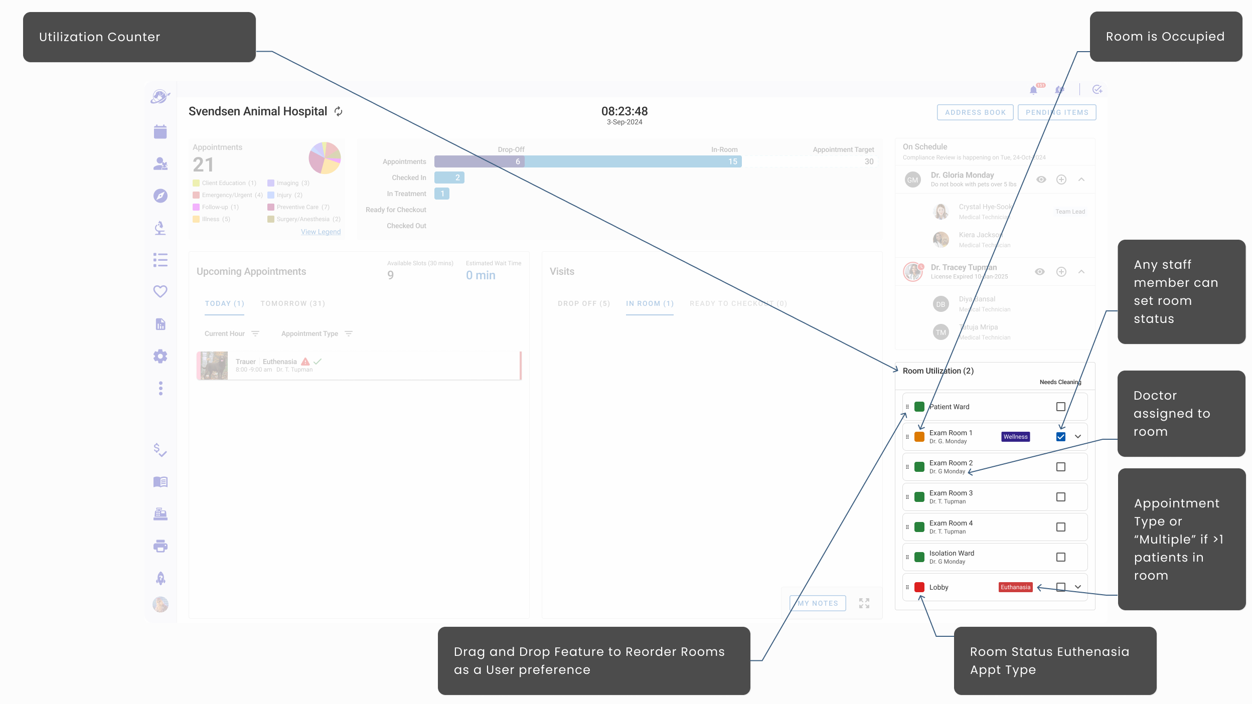
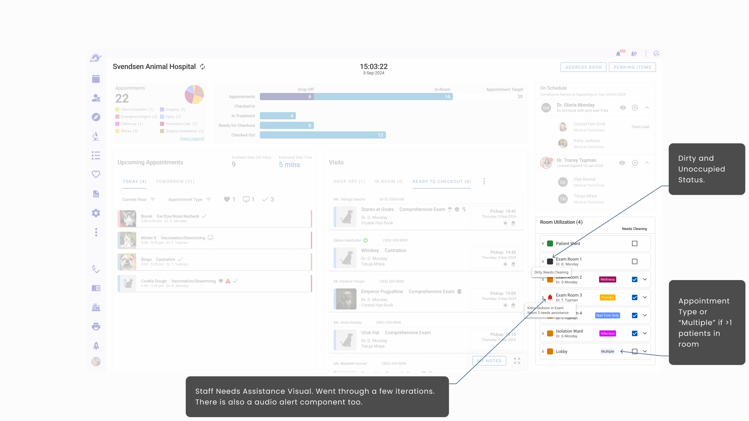
Feature 4. Room Utilization (Hoteling Status)
Based on my Hotel and Hospitality experience and addressing Findings 2 and 3 in Starting With People above, I created a room utilization feature. A recurring theme across all hospital visits was how hard it was to track room statuses. That pain point became an opportunity for delight.
- What is the condition of Exam Room 3? Is it still occupied?
- Which exam rooms should we not put other patients in during a euthanasia?
There is the need for a quiet, respectful, and dignified buffer zone for the most difficult of times. - Which exam rooms/areas need attention? Did a patient make a mess that needs to be cleaned up?
- Which exam room is that abusive/excitable/unpleasant client in?
Through iterative reviews with the PM and User Advocacy Team I created the status display for Phase 1 with a plan for additional features for future phases. Ask me about the plan to make this smart and automated.
Feature 5. Daily Task List (Pending Items)
Generative research surfaced a clear wish: a way to manage daily follow-up items without relying on notebooks that were occasionally misplaced.
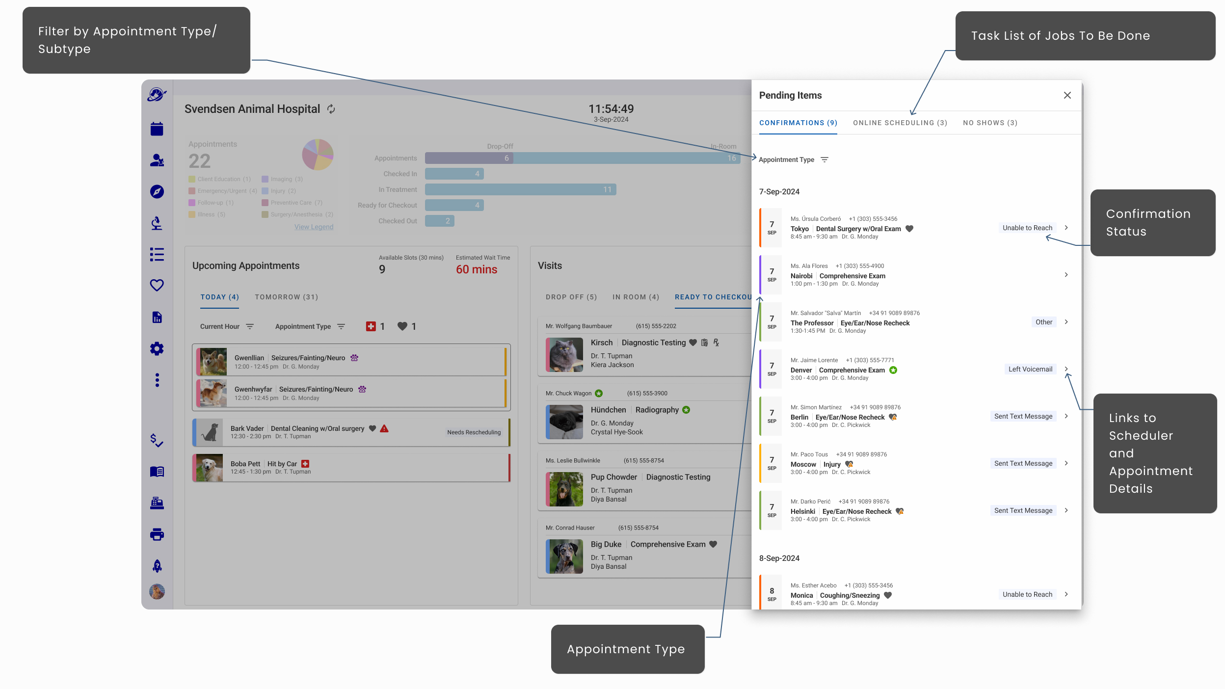
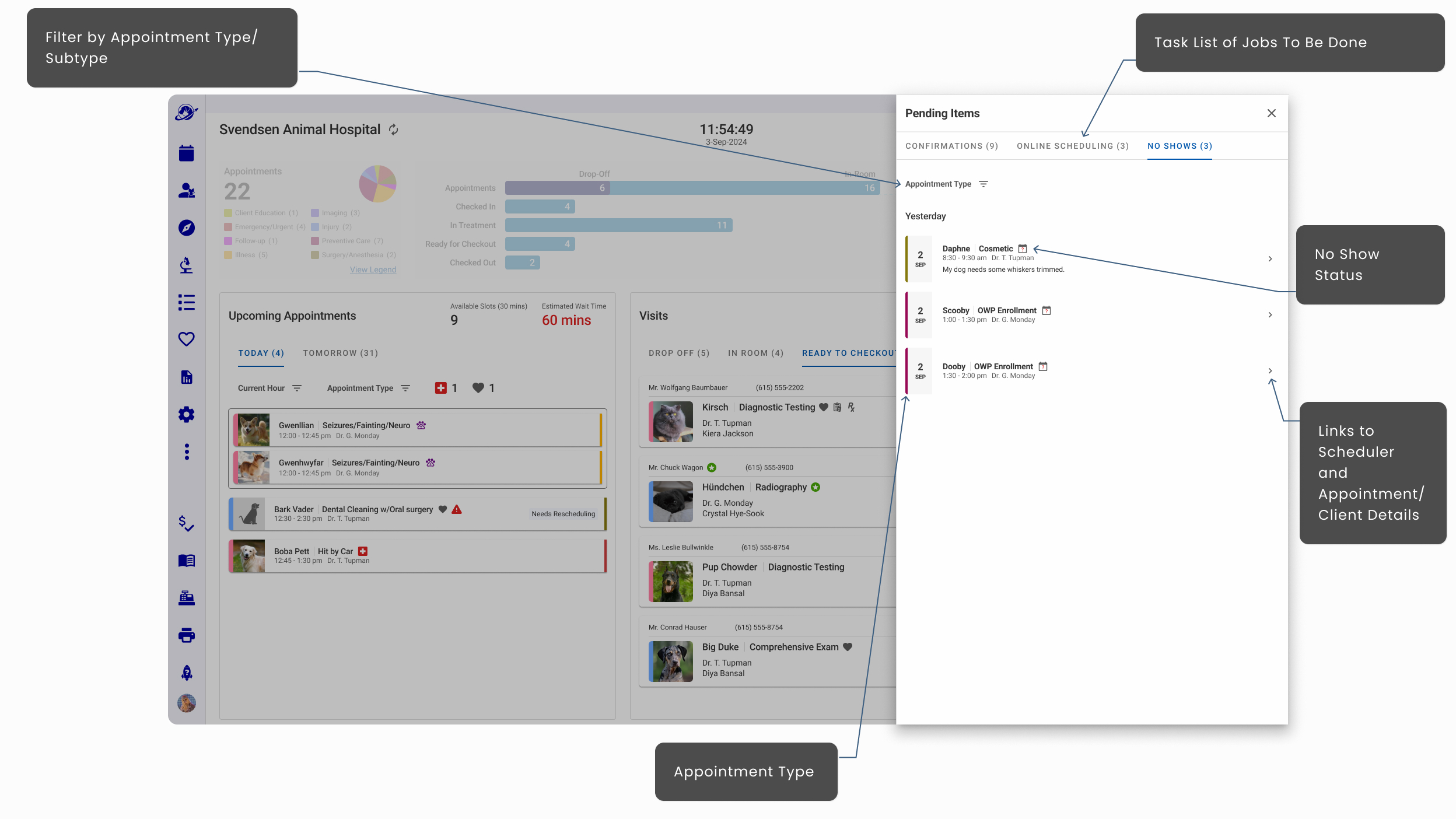
This feature was met with tears of joy, maybe not literally, but this consolidated list and placement on the dashboard hit the mark.
- Wow that will make callbacks so easy!
- Staff Participant 3 - I usually have a notebook for remembering who I need to call, and I forget where it is sometimes. Well done team!
- Staff Participant 7
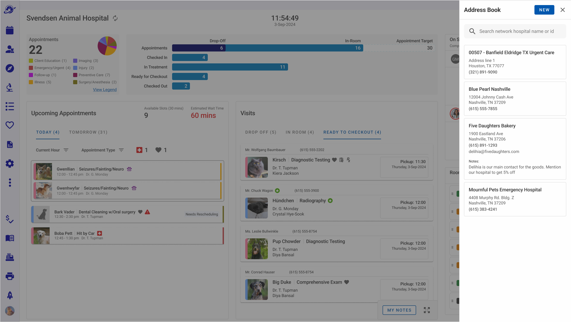
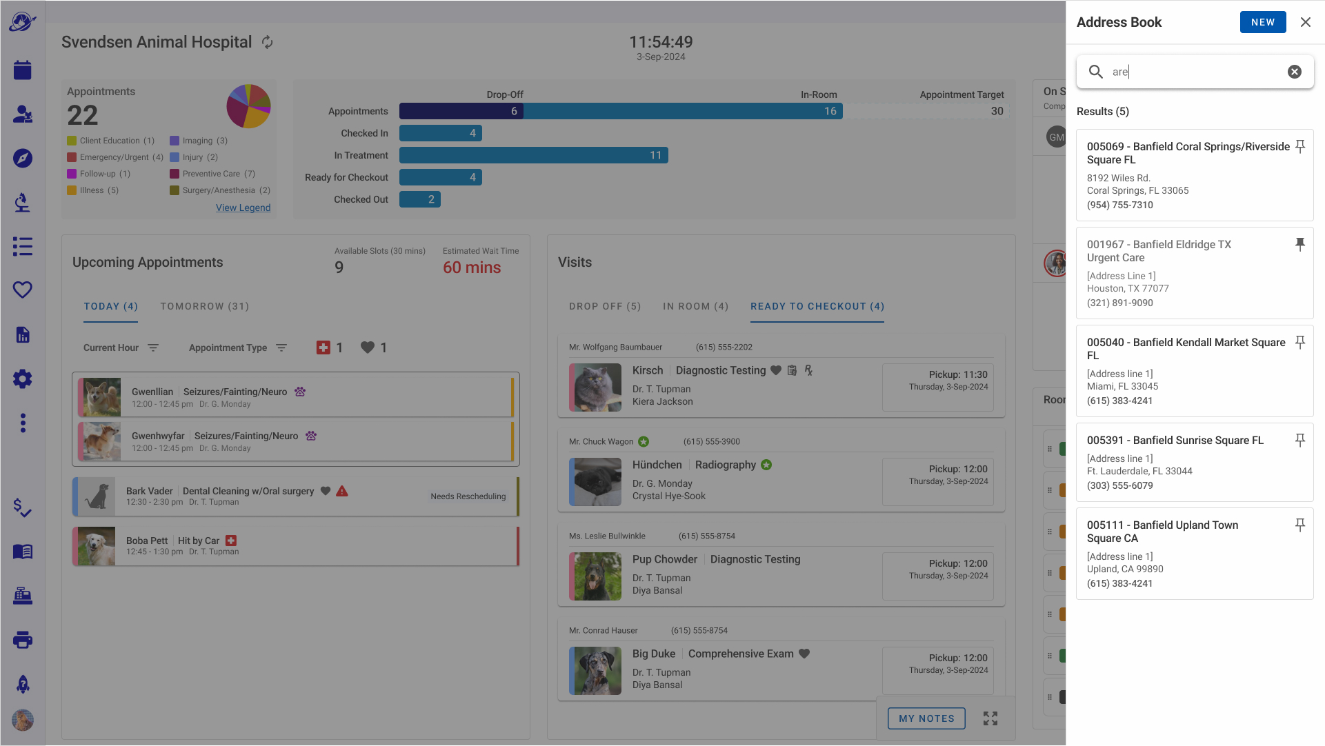
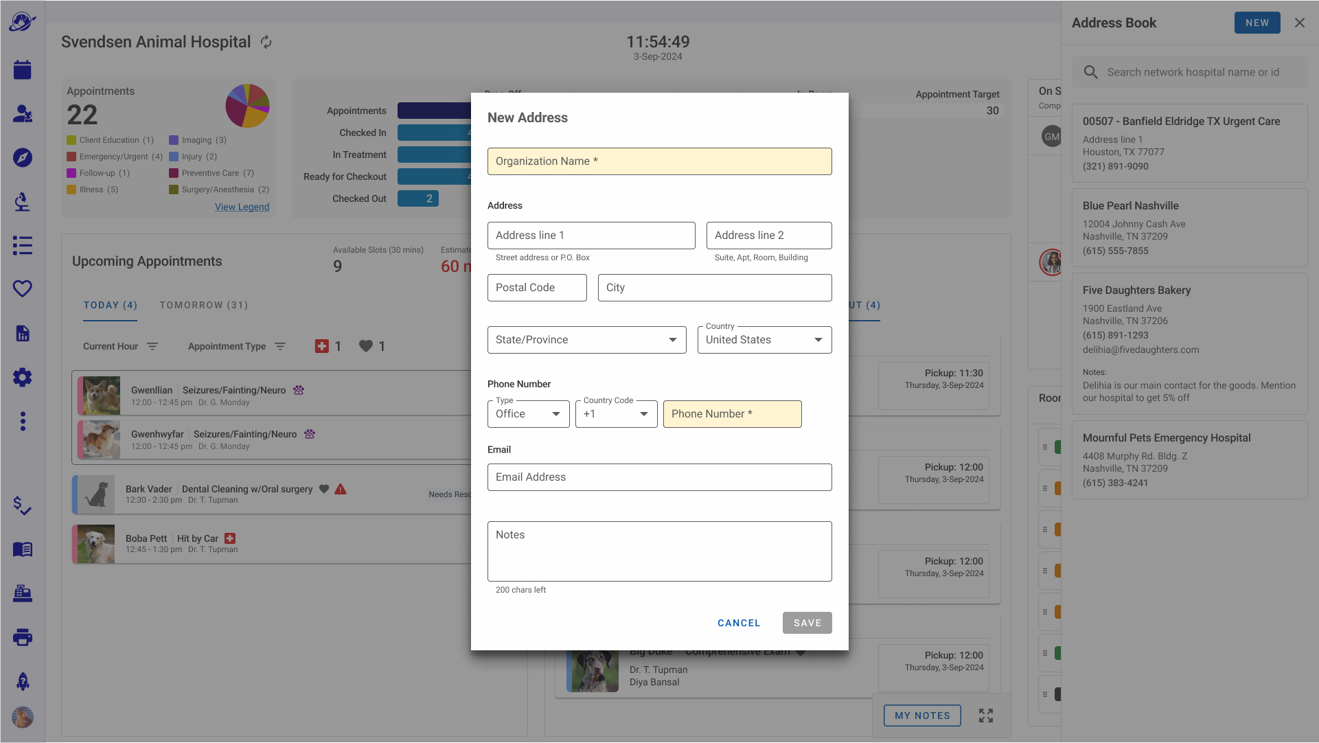
Feature 6. Address Book (The Impactful Value Add)
In a few hospitals we noticed post-it notes all over the staff's work area that contained addresses of outside organizations that the hospital frequently contacts: e.g. surgery hospitals, labs, specialists, other brand hospital locations, local food places for delivery or pickup. We noticed staff looking up local bakeries and restaurants during their shifts. So, I had an aha moment! Let's add the ability to include them in the digital address book as well.
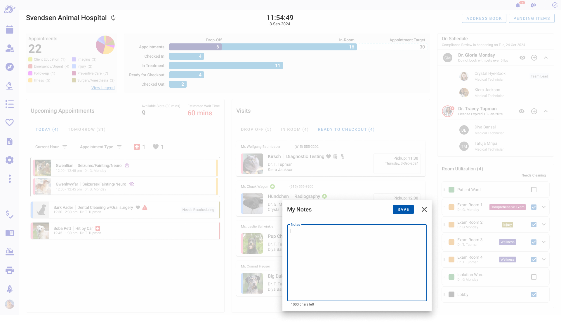
Feature 7. Personal Notes (Another Impactful Value Add)
Another curiosity in our observational research was how many notes the staff scribbles down as daily or hourly reminders. We created a simple digital private and personal note taking space in the dashboard. It tested well, but it generated an unexpected, repeated question: were the notes private to the user writing them? Unlike other note-taking features in the platform, which are visible to all users, these are private. To solve this in the MVP release, I agreed with the User Acceptance Team that this question would be answered in the release notes and concierge training program.
Visual Design Solution
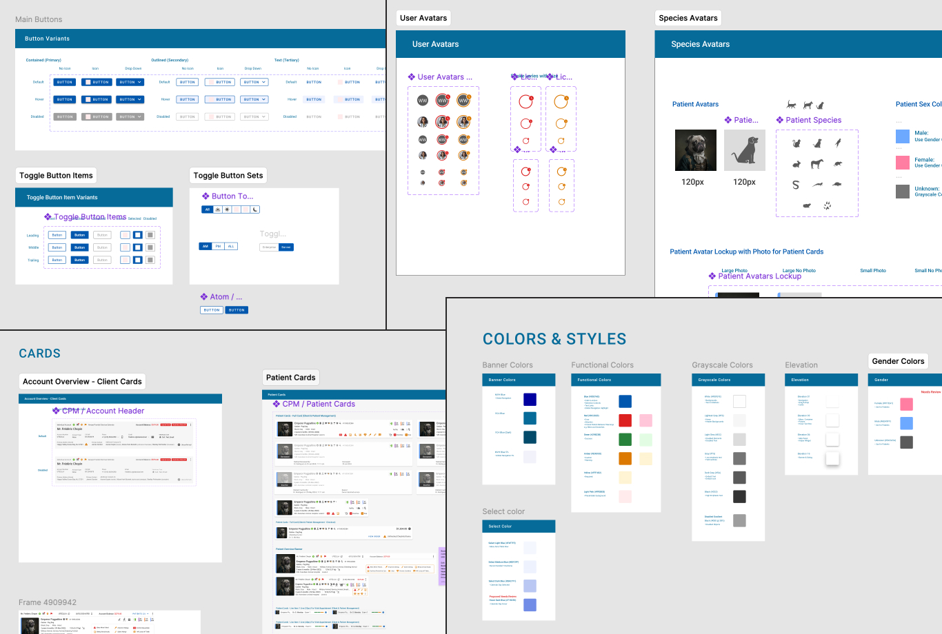
The Platform's Visual DNA
While the Design System and Visual Language were a team effort, I drove four main sections of the design system.
- Base Visual Design Layout
- Illustrated Patient Avatars
- Icon Style Design
- Accessibility
1. The Base Visual Page Design
The base layout uses a header and columns grid covering 90% of the UI, with a light gray background and off-white cards.
2. Illustrated Patient Avatars for Quick Species Identification
The culture and user behavior encourages using photos of patients for identification and species.
Illustration Evolution
Getting the emotional tone right for dogs and cats was the focus as user acceptance depended on it.
Dogs
Early feedback was the dog looked mean or too serious. The "anticipating" dog version won the vote.
Cats
I presented 3 ideas that I reviewed with the design team and then asked users to vote.
3. Icon Set and Style
Standardized the Icon Set and created a Design Ritual and Guidance Documentation for team to create new icons when needed.
4. Accessibility and WCAG Guidance
- Established a Design Ritual around Accessibility Best Practices for design and engineering including testing
- Worked with a teammate on Accessibility Documentation in Zeroheight. My contribution was the Perceivable, Operable, and Understandable pages.
5. Design System (Contributing)
Design Philosophy and Strategy: As part of the design team I helped develop our visual and experience philosophy as Clear, Concise, Respectful, and Human.
Our 5 principles guiding the Voyager Health User Experience:
- Anticipate & Augment User Needs
- Foster Trust & Peace of Mind
- Support Individual Working Styles
- Seamless Continuity & Hand Off
- Optimize Task Prep & Information Access
Localization and Globalization: With a focus on WCAG and ADA Guidelines and cultural/language support in 40 International markets. We regularly engaged in design rituals with cross-discipline and user feedback reviews to iterate on the Visual Brand and Voice. Our design strategy included adhering to local legal frameworks and agreements; e.g. GDPR, CCPA, CPRA, EFTA, WCAG, and State Boards of Veterinary Medicine.
Design Mechanics: The Design System was based on Material Design, constructed using the Atomic Design Model. Every designer on the team contributed components to the system.
What Shipped
After four months of onsite research, iterative design, and cross-functional collaboration, the Operations Dashboard shipped to production. The results validated the core design decisions: particularly the single unified view over role-specific dashboards and surfacing the patient journey and appointment KPIs directly from the dashboard.
- +5%
increase of proactive patient bookings from appointment/actual target rate - 5x
faster success rate in identifying patient journey status and physical location - +32%
success rate in optimizing room usage and prepping rooms - +21%
increase in SLA patient follow ups and task completion
Let's Build Something Brilliant
Connect with me and we can discuss all the features and AI Tools I worked on to build the Voyager Health SaaS Practice Management Solution and how I will create impact on your business goals
Check Out More Projects
Voyager Health - Accounts
Visual Voicemail
NORAD Santa Tracker