Reimagined the CRM account and patient experience for an enterprise veterinary SaaS platform, reducing check-in and patient identification time by 3 minutes. User satisfaction up 80%.
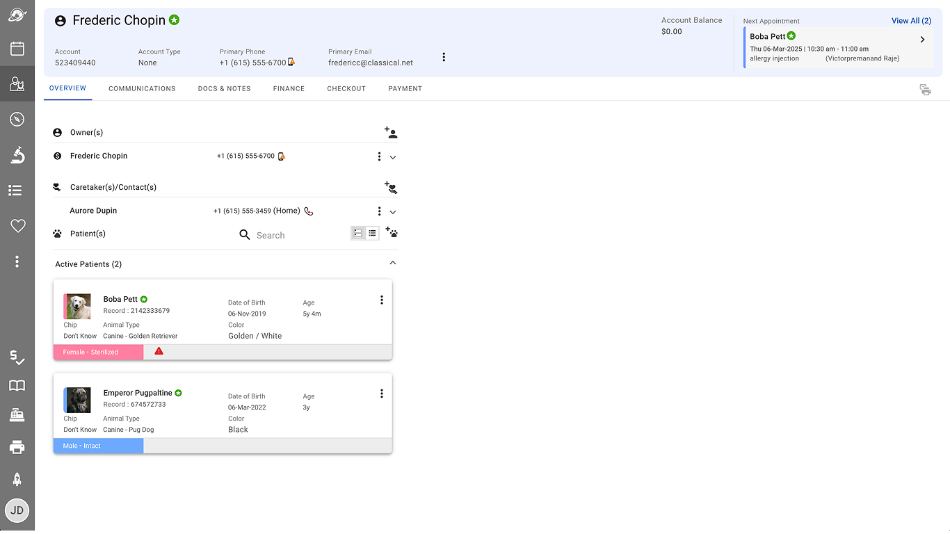
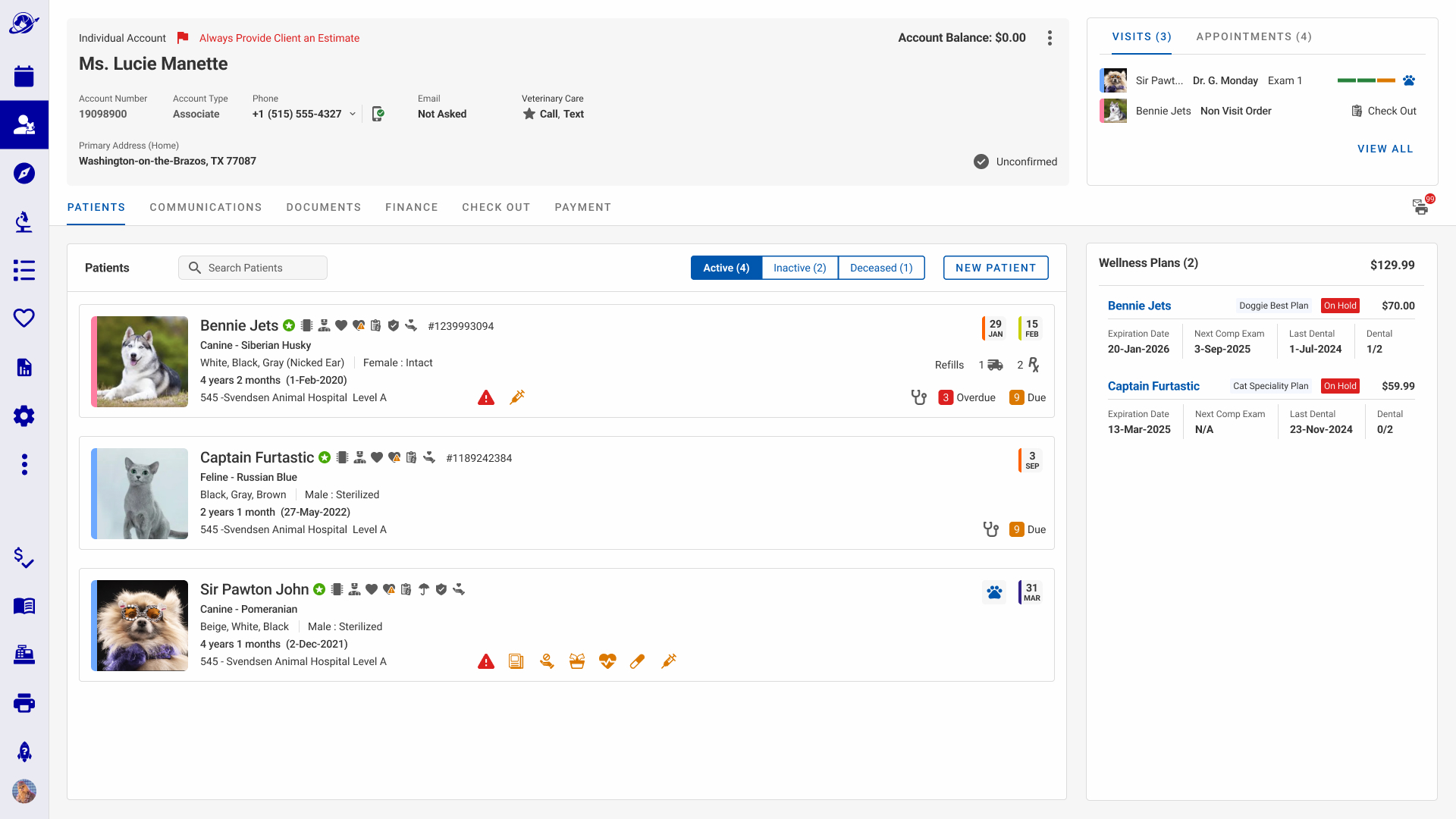
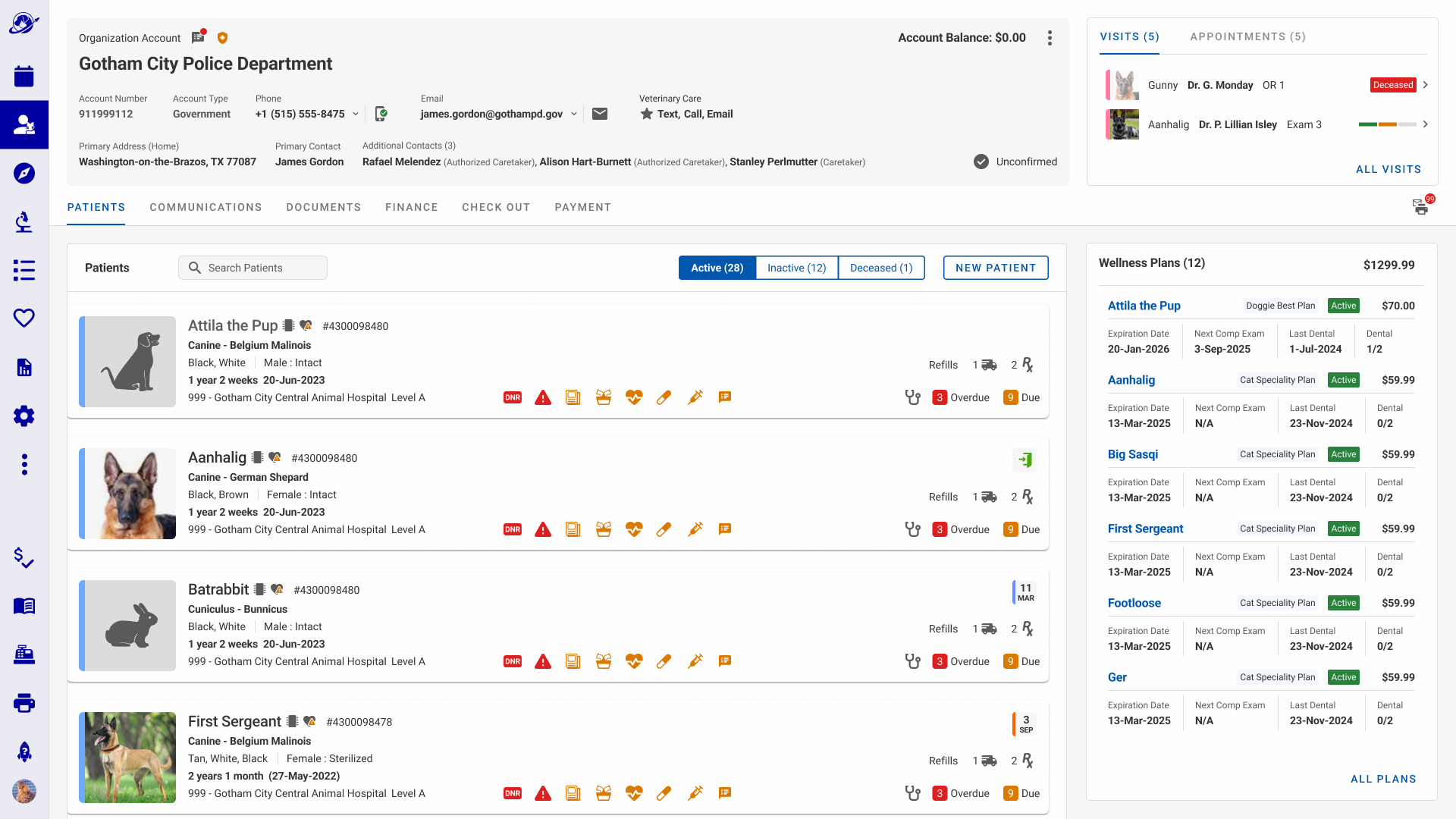
The shipped Account and Patient Overview, consolidating CRM workflow, wellness plan status, appointment history, and financial alerts into a single view for hospital staff.
The Program
Mars Veterinary Health is building Voyager Health, an enterprise practice management application to replace disparate legacy systems, including VCA Woofware, the platform I originally designed for VCA in 2012.
Role On Feature: Sole Product and Visual Design • User Research • Led Design System
Timeframe: 4-month Agile rollout • 2025
The Challenge
Voyager Health's Account and Patient feature launched with the basics: add a client name, phone, and email. Add a patient name, photo, species, and age. Functional for onboarding. Not functional for running a hospital.
Legacy software like Woofware and Banfield's practice management system had years of clinical and operational features staff relied on daily. With Voyager mid-way through development and in beta across hospitals in the USA, Spain, and England, the Account feature needed to close that gap. Staff weren't going to abandon tools that worked for one that didn't yet.
That was the problem I was brought in to solve.
What Success Looked Like
Decrease discovery time spent to identify correct patient and diagnostics information
Decrease discovery time spent identifying and solving wellness plan issues (key revenue metric)
Enhance awareness of all appointments for multiple pets on an account to enhance customer service efficiency
Enhance awareness of patient warnings and alerts
Strengthen Accessibility Compliance (WCAG 2.0)
Increase CSAT score to drive adoption by reducing operational friction
What Changed
-3 mins patient account identification and check-in
99% success rate in identifying wellness issues on account in under 1 minute
3x faster in discovery of all patient appointments in an account
+15% increase in success rate in discovering patient warnings
How'd I get there?
A Multi-Brand Veterinary Operation
Voyager Health needs to support several retail brands within the Mars Veterinary Health Organization. Each brand has its own processes, legal jurisdictions, business goals, and ways it generates revenue. The largest being VCA and Banfield with 1,000+ hospital operations in the USA, Mexico, and Canada.
Aligning to a C-suite directive, the product team's Phase 1 focus was on the two largest retail brands: Banfield and VCA, each running a different legacy practice management solution. The product goal was to unify all the retail brands onto a single platform.
Legacy Experience
I was tasked with improving both the feature set and visual design, which meant building a new design system from the ground up.
Legacy Account Management Screen
Defining the Problem
In my discovery phase, I learned that the User Advocacy Team (UAT) and hospital staff were frustrated with the client account and patient records feature. It didn't offer the features that legacy solutions already provided.
Missing key features measured against brand workflows will inhibit adoption.
- Business Stakeholders
There is wasted space and the design lacks a visual aesthetic. There is potential to add features that would make hospital staff happier."
- UAT (Staff Trainer: Subject Matter Expert)
The Strategy
Starting With People
How Does a Veterinary Hospital Operate?
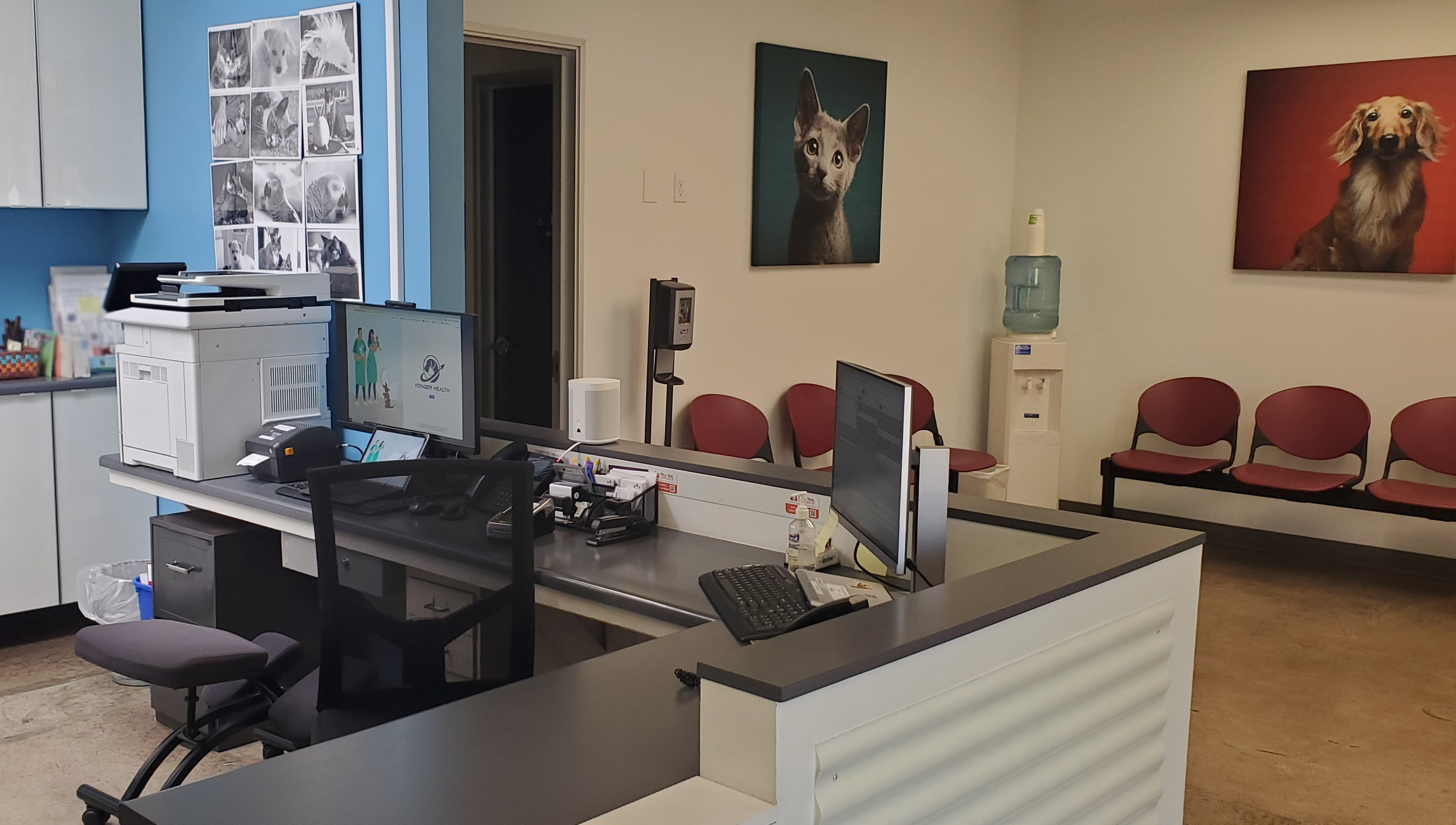
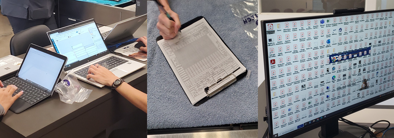
I observed and interviewed hospital staff on location to understand their duties and pain points across several different sized veterinary hospital brands.
Deep Dive on the research methodology
In the Field
How Does a Veterinary Hospital Operate?
Veterinary hospitals are busier and more emotionally complex than most enterprise software teams assume. To understand what a dashboard needed to show, I needed to see the environment firsthand and not rely on stakeholder assumptions.
The Visits
VCA hospitals - observing Woofware in daily use
VCA hospitals - observing paper-based analog processes
Banfield hospitals - observing Legacy Software B in daily use
Observation Methodology
Rather than open-ended observation I focused on specific operational touchpoints:
What I Was Looking For
How does the staff identify patients and client?
How has the check-in process changed?
How does the staff resolve any balances due?
How does the staff enroll or re-enroll a client in a Wellness Plan?
Are there brand deltas in the check-in/out process?
UX Observation: Few animal visits are routine
Finding 1
The different brands have different financial poilicies around balances due. Some brands want payment at the time of service, some brands allow balances forward.
Finding 2
When a new client calls to schedule an appointment, the staff inputs bare minimum amount of information about client to schedule an appointment quickly.
Finding 3
When the staff is reviewing a client's information, any amount owed is the most important item to resolve. Secondary is any wellness due items for the pet/patient.
Finding 4
The value of the Wellness Plan is subjective to how clear the benefits are explained and how often the services are consumed.
Listening Closely
I selected two participants per operational area across five hospitals, varied by tenure where possible. Beyond active staff, I also interviewed two former hospital employees now on the User Advocacy Team, a CSR trainer and several retired veterinary doctors, both with long tenures at VCA and Mars Veterinary Health, having trained staff on both Woofware, Banfields legacy software, and Voyager Health.
Field research in a working hospital requires situational awareness. I was a guest in a clinical environment. My presence couldn't disrupt patient care or staff safety, which shaped how I conducted every session.
What I Asked
I structured questions across three facets: technical, aspirational, and emotional. Here are a few examples:
What is the sales pipline for Wellness Plans?
What happens when there is a past due balance?
How does the staff resolve issues with Wellness Plans?
What does the staff need to enroll or re-enroll a user in a Wellness Plan?
How does a client know they have unused services in their plan?
How I Synthesized
Notes from each session were grouped into an affinity board to surface patterns across roles and hospital types. AI assisted in synthesizing the results into actionable themes.
Meet the Users
During the foundational stages of Woofware, the practice management application I designed for VCA, a former design colleague and I created four archetypes based on hospital roles common across all hospitals.
Concerning the opportunities the Dashboard was going to solve, the archetypes evolved into two generic task based roles: Day-to-Day Healthcare and Day-to-Day Financial and Performance Target Operations.
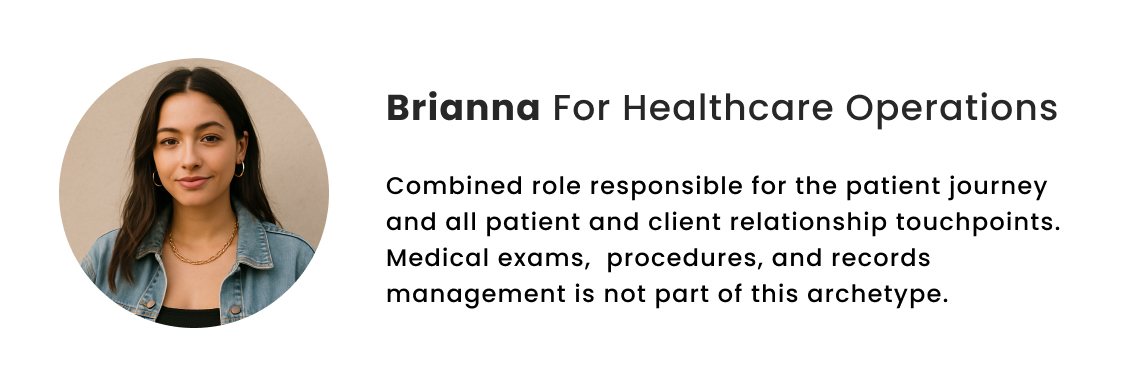
Meet Brianna, health care and appointment operations
Answers and makes calls, greets clients and patients, checks in and checks out patients
Prints out after visit summary and other documents, collects patient belongings, takes payments, and gives take home medication
Confirms appointments, makes no show follow up calls
Completes client record and maintains social data
Will use the CRM feature frequently
Meet Crystal, medical technician and client relations
Greets client and patients
Escorts patients, takes initial health metrics, performs some medical exams and procedures
Data entry of exam results, medical findings, and visit notes
Often takes on the dual role of CSR and Med Tech depending on the hospital size and volume of business
Will use the CRM feature frequently
A few other archetypes for process conversations
To facilitate discussions across product and with stakeholders I created a veterinary doctor: "Dr. Gloria Monday", Medical Technician: "Crystal Hye-Sook", and a client: Dale-k.
Putting a Plan Together
Working with the VP of Product, I mapped the data points hospital staff actually needed, drawing on patterns from a CSR feature I was building in parallel. I sorted that into five categories and validated them with the UAT team and hospital staff to confirm we had captured both user and business needs.
Developing Context Scenarios
As part of the early design concepts, I created context scenarios to explain the platform features and design choices with the technical team, to align with APIs, backend development, and set expectations for scoping.
A context scenario mapping how Brianna resolves a past-due Wellness Plan balance, from locating the account to reinstating the plan. Written to align engineering on the exact data and actions needed before any wireframe existed."A second scenario exploring the inverse case: a client with no Wellness Plan at all. Used to test whether the same UI could support both resolving debt and creating revenue opportunity.
Aligning On The Phase 1 Feature Set
Based on my research at the hospitals and consulting with the Feature PM to align with business goals, we focused on these 6 features with Wellness Plans being the priority. I created an initial wireframe to align the team on scope and start the design conversation with engineering.
Consolidate frequently referenced information in one location
Appointment information for the account
Wellness Plan Status Information (Top Business Priority for 1 Brand)
Top Level Due Items and Health Information
Top Level Client and Financial Information
Top Level Client Communications
Visualizing a Layout
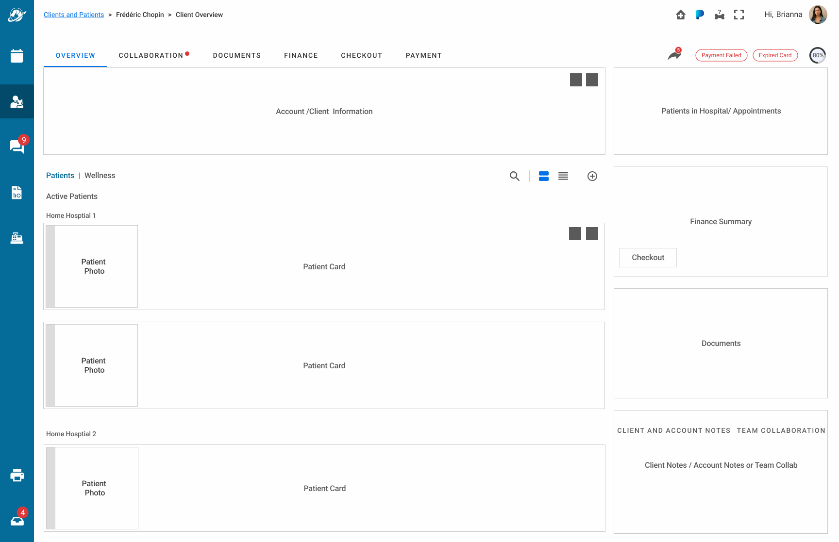
With the six features defined, I built a first layout to test placement and structure.
First layout pass: high-level placement of all six features, used to evaluate information architecture and align with the Accounts Feature PM before detailed design began.
The Work
Defining Problem 1: Designing the Fix
For brevity on this writeup, I am focusing on the Wellness Plan feature design and product solution journey. Though the holistic design solution is shown here in various screenshots. The headline results above reflect the full feature; Wellness Plans was one of six contributors to that outcome. Contact me if you'd like to explore the full case study.
Wellness Plan Feature
Getting this wrong meant lost revenue and denial of service for one of the target brands.
The Initial Concept (Iteration 1)
After exploring a broader filter approach, the design landed on two tabs: Patients for the full list, Wellness for active plan holders.
Design Choices
Early exploration with the Feature PM covered up to 7 filter categories including Finance, Documents, Services Due, and Prescriptions. This wireframe captures the pivot where most categories moved to right-column widgets. Wellness remained as a dedicated filter, isolating patients with active plans to keep the most critical business priority front and center.
Designed the Wellness tab as a filter to manage cognitive load and scroll length, anticipating accounts with large patient rosters based on real-world veterinary contexts like kennels, humane societies, and multi-jurisdiction organizations with hundreds of records.
Added a search feature and a card/row view toggle to the patient list, giving staff two ways to locate a specific patient quickly without scrolling through a long list.
Applied data points validated through the five-category card sort with the VP of Product, PM, UAT, and hospital staff.
Why Discarded?
It felt disconnected to the patient (pet) list, even though the intention was to use patient photos to connect the plan to the patient.
Separate tab was overkill for the 90% case (<3 pets) just to address the 10% case (>3 pets).
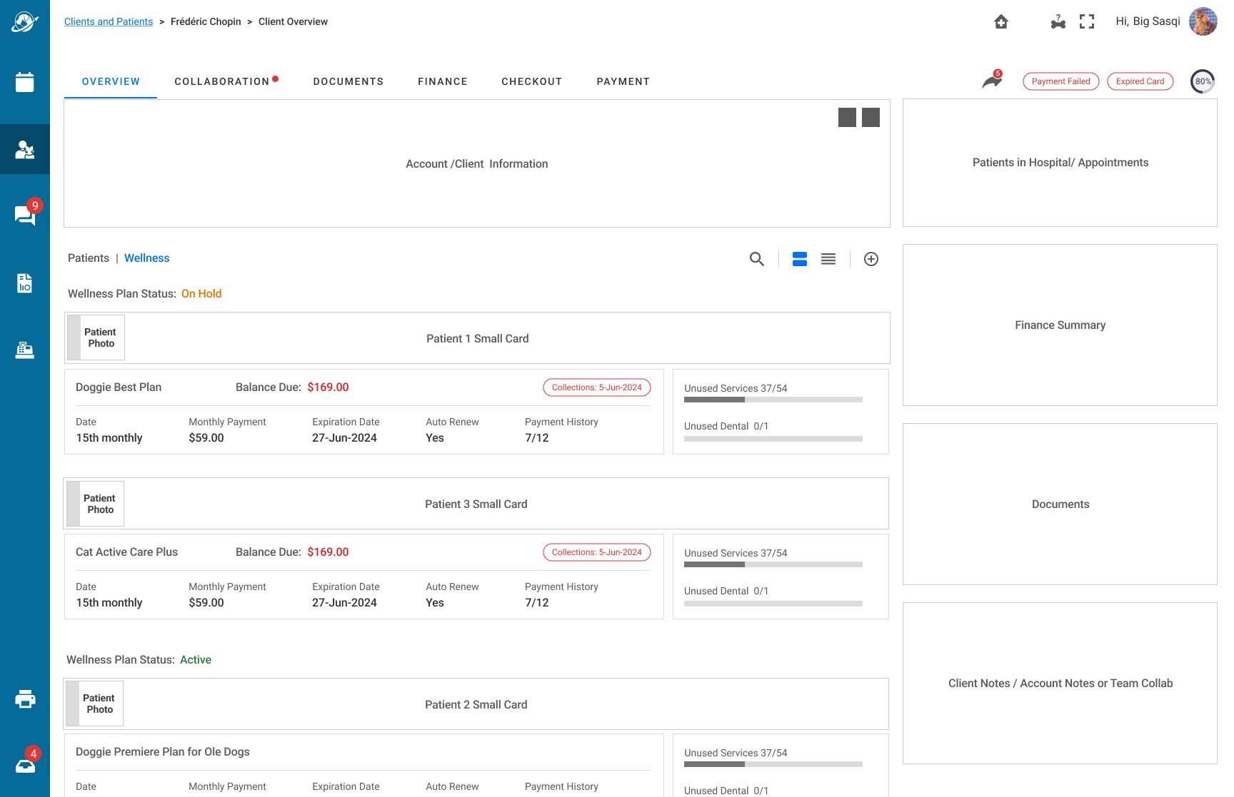
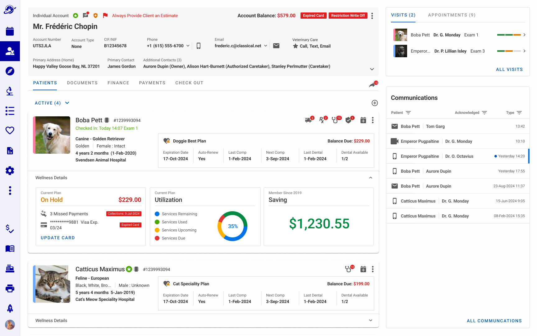
A dedicated Wellness tab listing patients with their wellness plan details, balance, payment status, and unused services beneath each. Wireframe stage, used to test structure and design direction before visual design.
Moving From Tabs to Filters and Prioritizing Financial AR Aging (Iteration 2)
Design Choices
Moved Wellness Plan data inline on the patient card, eliminating the tab filter after staff, UAT, and the broader team validated that the tab added unnecessary navigation without improving access to critical plan information.
Surfaced payment status, balance due, and enrollment opportunity directly on each patient card, giving staff the context needed to have informed conversations with clients without navigating away from the account view.
Added a payment failure alert and a manual card update flow, allowing staff to act on payment issues during a client interaction rather than escalating to another department. Payment data visibility evolved across subsequent iterations as business rules were refined.
Flagged patients not enrolled in a Wellness Plan directly on the patient card, creating a natural conversation prompt for staff and designing toward a connected enrollment experience beyond the account view.
Added a "Not Enrolled" state for patients without a plan, giving staff a clear talking point for upselling.
Why Discarded?
7 users and UAT favored all three Wellness panels visible simultaneously. Progressive disclosure solved this while allowing the section to hide entirely for brands where Wellness Plans didn't apply. Engineering confirmed the feature flag approach was simpler to build than separate carousel logic per brand.
Financial PMs confirmed the Credit Card information shouldn't be available to all staff for security reasons.
Collections status, shown on the screen, wasn't something hospital staff should see at all. One brand gave the clearest reason: that information belonged to a specific call-center department, not the hospital level.
Iteration 2: Wellness merged into the patient list, with plan status, balance, and payment details surfaced per patient card. Right column simplified to upcoming appointments, active visits, and communications.
Progressive Disclosure with Expandable Cards (Iteration 3)
Design Choices
Added a Wellness status icon next to the plan name, giving staff an immediate visual signal of plan health before reading any data.
Replaced the 2-column layout's carousel interaction, which showed one data point at a time, with a 'Wellness Details' disclosure that surfaced all three data panels simultaneously, reducing the interaction cost of getting a complete picture.
Adapted an internal Voyager Health design pattern for the Utilization donut, helping staff drive renewal conversations by showing how much of the plan a client had used.
A Savings panel showing the client's cumulative savings from their Wellness Plan subscription, designed as a conversation aid for staff to pitch renewal by demonstrating tangible value to the client.
Why Discarded?
The Utilization donut and Savings panel were cut: the business decided this level of financial and service-consumption detail wasn't appropriate to surface to hospital staff in this view. The Wellness Chart summary was sufficient.
The "Not Enrolled" explicit panel was redundant — the absence of the Wellness status icon already communicated the same thing to staff.
Credit card and collections data remained visible in this iteration; credit card information was cut in the next pass after PM and Finance alignment.
What survived: the Wellness Chart (plan name, balance, key dates, status icon). Everything else was removed.
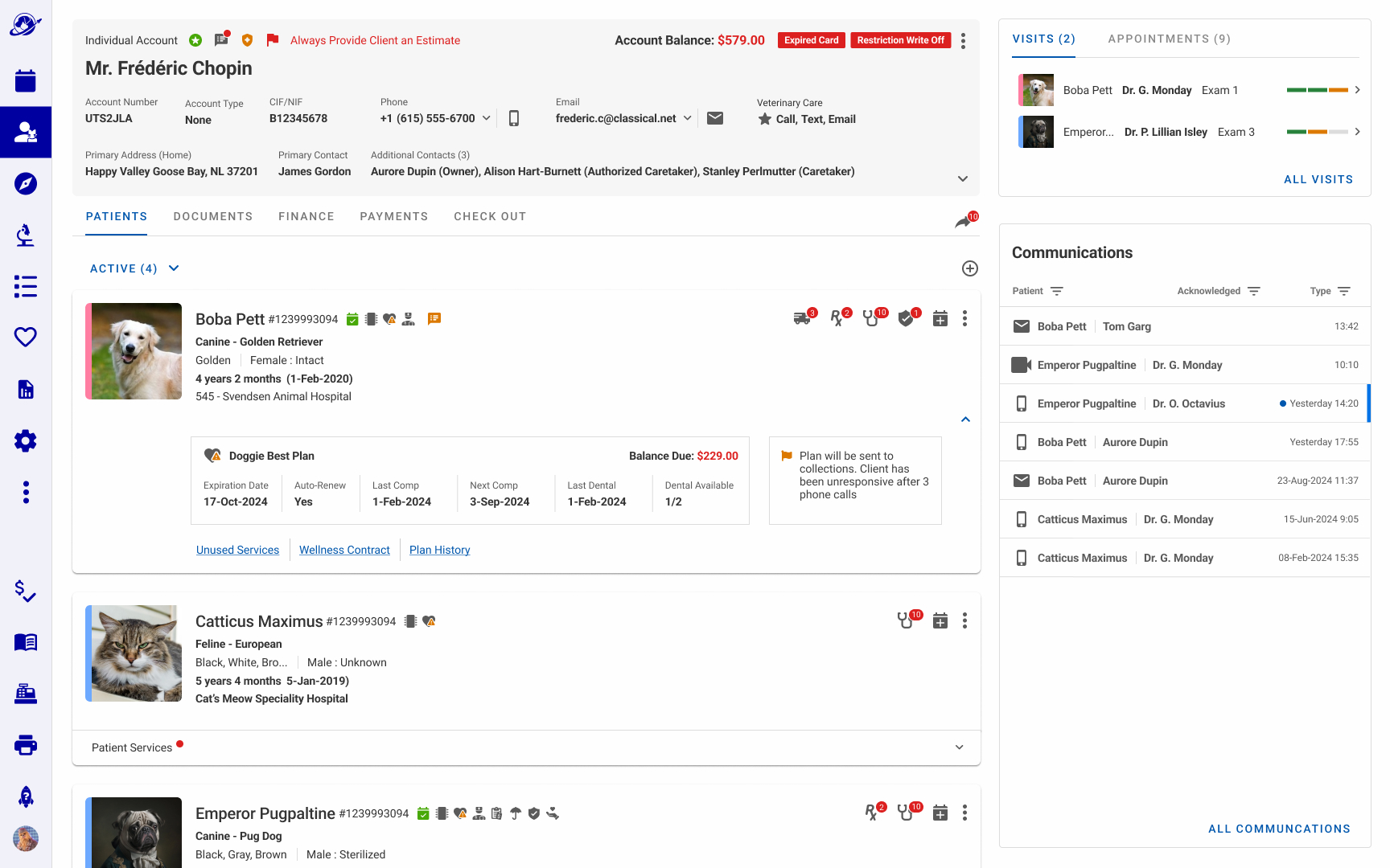
Iteration 3: Wellness Plan data moved inline on the patient card, visible without any interaction. Plan name, balance, key dates, and status surfaced at a glance.
Iteration 3: Wellness Details expanded: Current Plan status, a Utilization donut tracking service consumption across the subscription year, and a Savings panel designed as a renewal conversation aid for staff.
Simplifying the Wellness Footprint (Iteration 4)
Design Choices
Removed the three graph panels reducing the Wellness disclosure to the chart only aligning to the level of detail the business confirmed was appropriate for hospital staff.
Added three deep links (Unused Services, Wellness Contract, Plan History) directly on the patient card, replacing a six-step navigation path to the same content and addressing Banfield's stated goal of reducing clicks.
Moved the Wellness Chart into the progressive disclosure to make room for other medical content on the patient card.
Consolidated payment status alerts to the client header only (Expired Card, Restriction Write Off), removing the redundant duplicate from the Wellness disclosure as business requirements around account issue disclosure were formalized across brands.
Why Discarded?
UAT rejected the Wellness Chart inside the progressive disclosure as plan status was too important to require a click to reveal, particularly for Banfield where Wellness Plans were a daily operational priority.
With Communications filling the right column, there was no dedicated space for Wellness at the account level without hiding it. The right column widget in Iteration 5 solved both problems at once.
Iteration 4: Wellness Chart moved into the progressive disclosure with three deep links replacing a multi-step navigation path to plan details, unused services, and contract history.
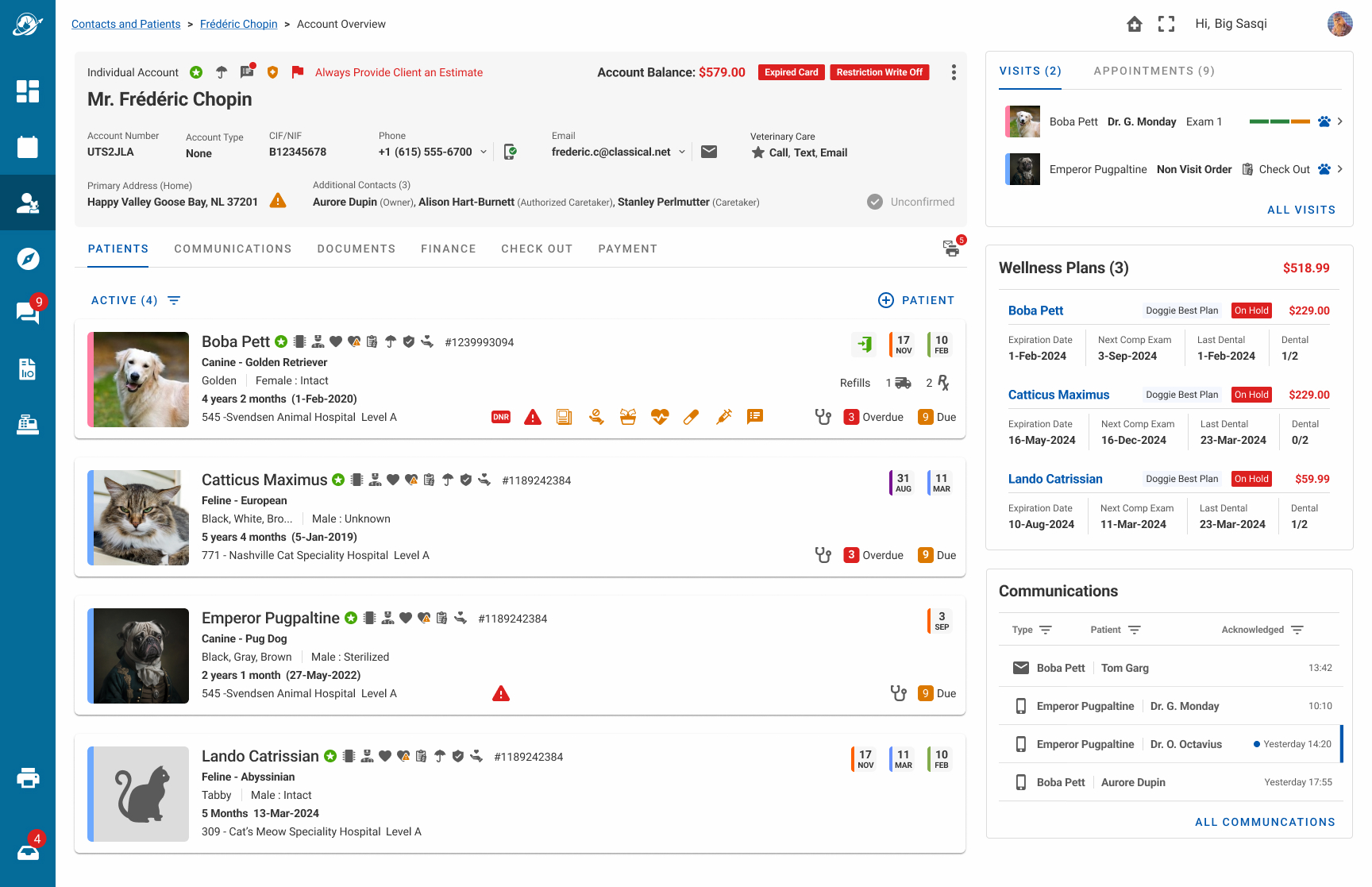
Right Column Widget and Simplifying Content (Iteration 5)
The Wellness Chart moved out of the progressive disclosure and into the right column. The patient card was freed up for other critical information.
Design Choices
Removed the Communications widget from the right column after UAT confirmed the full Communications tab was sufficient.
Moving the widget to the right column solved both problems at once: critical plan issues surfaced immediately, routine data stayed one click away.
Status icons on the patient card answered the question staff asked most in observation: is there a problem I need to handle right now?
Sorting by urgency first, then expiration date, served two goals at once: staff saw the most time-sensitive plan issues immediately, and the business saw renewal and upsell opportunities before they became lost revenue.
Designing the Wellness Plan widget with brand-level visibility, instead of five separate layouts, meant engineering could support it with a single feature flag.
Result
7 of 7 tested users and stakeholders preferred the widget's placement and status icons over Iteration 3's expandable cards.
Passive visibility outperformed the click-to-expand pattern from Iteration 3. Hospital staff saw plan status without taking any action.
Staff matched clients and patients to their Wellness Plans visually, within a single record, instead of manually cross-referencing two separate systems by name and account number.
Eliminating Banfield's separate third-party Wellness tracking tool meant one less license and one less system staff had to context-switch between.
Iteration 5: Wellness moved to a dedicated right column widget, sorted by urgency, showing plan status (On Hold/Active), balance due, and key dates per patient. Status icons on each patient card provide an at-a-glance signal without opening the patient record.
Visual Design Solution
Defining Problem 2: The Platform's Visual DNA
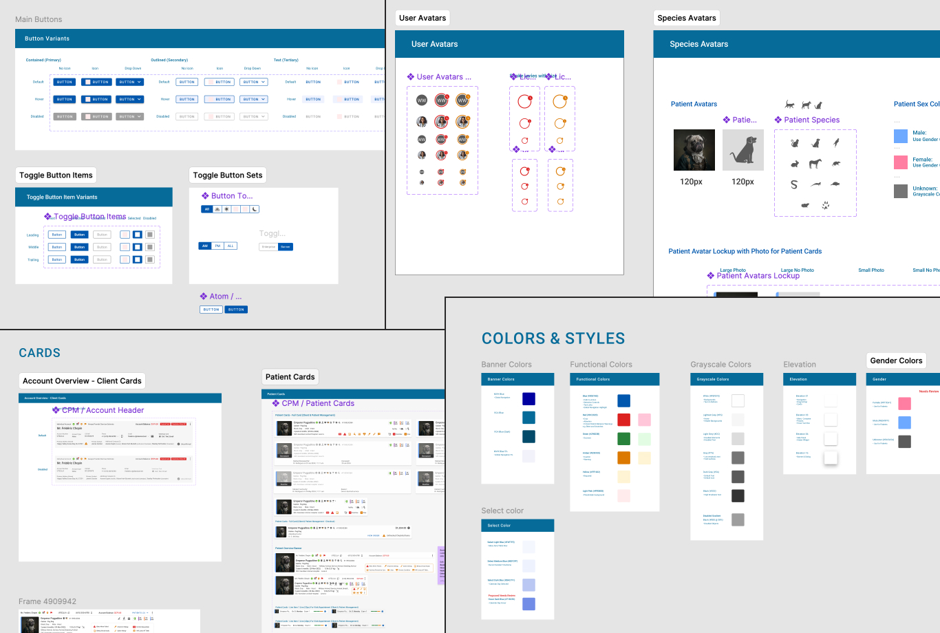
While the Design System, Components, and Visual Language were a team effort, I drove five main elements.
Base Visual Design Layout
Illustrated Patient Avatars
Icon Style Design
Key Components
Accessibility
1. The Base Visual Page Design
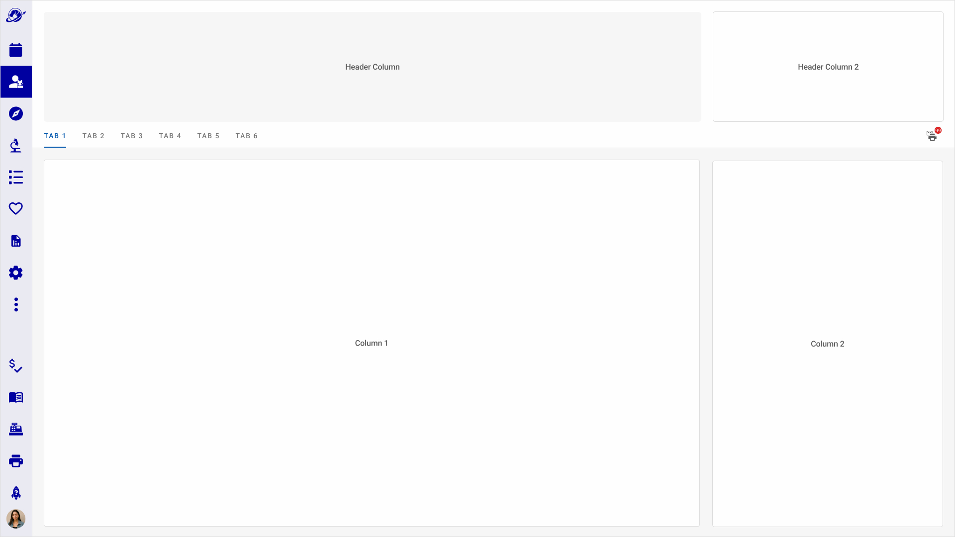
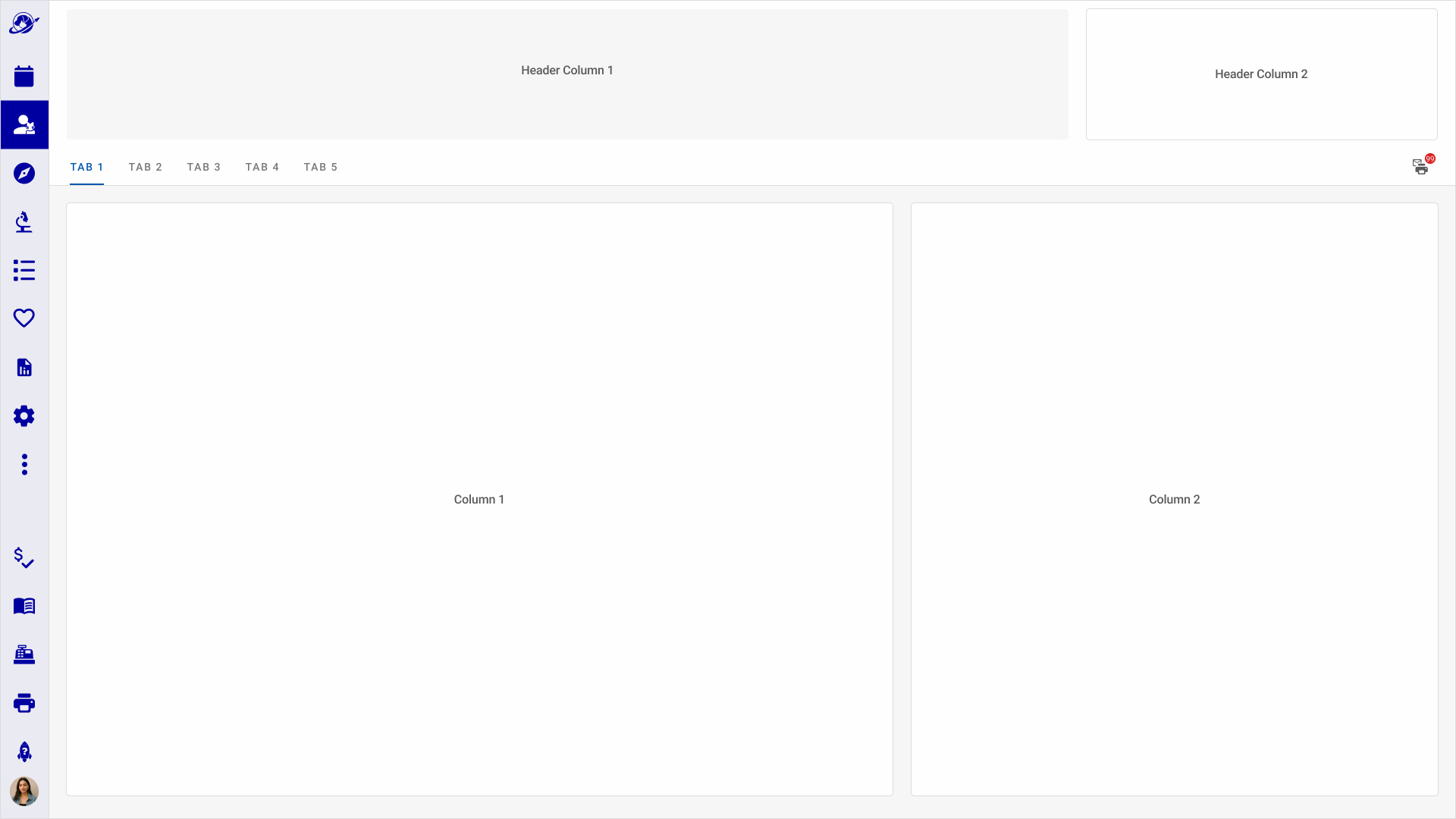
The base layout uses a header and columns grid covering 90% of the UI, with a light gray background and off-white cards.
The base 3 column grid was established early with engineering to align on page types and reduce layout decisions during development.
2 Column Body Layout (Skinny) - With Header
2 Column Body Layout (Wide) - With Header
2. Illustrated Patient Avatars for Quick Species Identification
The culture and user behavior encourages using photos of patients for identification and species. When it was not possible for a patient photo, we needed a solution. I designed a collection of illustrated animals to aid in quick species identification on the appointment or account record until a photo can be obtained.
Patient Avatars - Illustrations for Patient Components in Voyager Health
Illustration Evolution
Getting the emotional tone right for dogs and cats was the focus as user acceptance depended on it.
Dogs
Early feedback was the dog looked mean or too serious. The "anticipating" dog version won the vote.
Cats
I presented 3 ideas that I reviewed with the design team and then asked users to vote.
3. Icon Set and Style
Standardized the Icon Set and created a Design Ritual and Guidance Documentation for team to create new icons when needed.
Icon Guide On How To Create IconsIcon Set
4. Key Components
Used in multiple features across the application. The design challenge was surfacing the right information at the right level of detail.
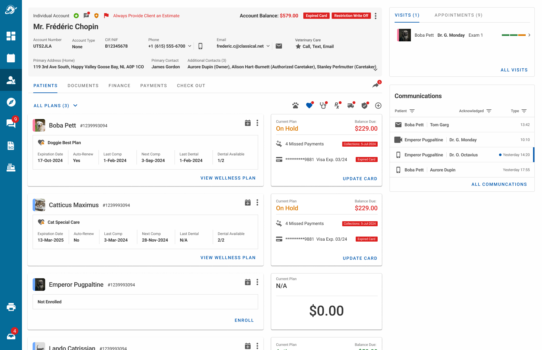
Client Cards
Used to identify clients and anchor the Accounts domain. I worked through a few versions of this with users and stakeholders.
Initial version with key contact details for the exploratory design. Discarded as requirements evolved.
Another version with CTAs on contact details and an expander for additional contacts. Discarded as requirements evolved.
Final version with finance details, client notifications and alerts.
Patient Cards
Used to identify patients. Photos provided joy to the staff in a potentially stressful environment and were a key client touchpoint.
Final version with full details for desktop web.
Final version for older tablets (responsive).
Final version for denoting a deceased patient. Inactive patients followed a similiar design pattern.
Final version for client check-out flow. I designed the card for a colleague who worked on the end of visit check-out experience.
Cards for use in visits, pharmacy, and EMR featuresCard used for visit tracking dashboard
Wellness Widget
Evolution of the Wellness Plan Widget
First widget exploration: two tabs (Wellness Plans / Services) with expanded rows showing plan status, missed payments, and card details. Sorted by urgency.The Services tab: utilization donut per patient showing service consumption across the subscription year, with plan status and key dates.
Second exploration: same two-tab structure, simplified to narrower rows showing only plan name, status, and amount due. A design ritual alternative exploring information density.The Services tab: utilization donut per patient showing service consumption across the subscription year, with plan status and key dates.
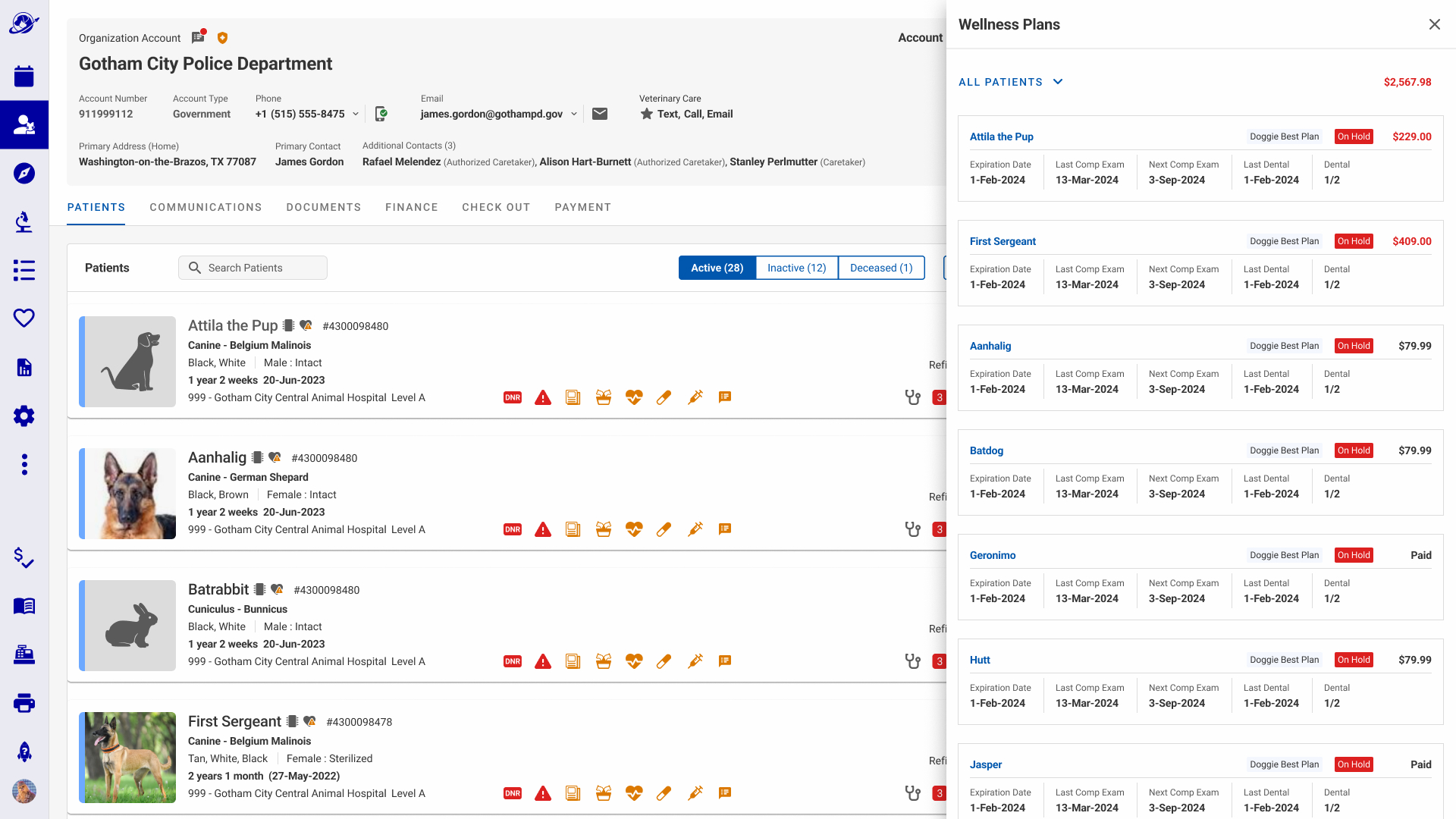
Final widget: three or fewer plans. Plan name, status label, balance due, and four key service dates per patient. Card data and utilization graphs removed.Final widget: more than three plans. Same layout as above with an 'ALL PLANS' link surfacing additional plans in a right-panel list without leaving the account screen.
5. Accessibility and WCAG Guidance
Established a Design Ritual around Accessibility Best Practices for design and engineering including testing
Worked with a teammate on Accessibility Documentation in Zeroheight. My contribution was the Perceivable, Operable, and Understandable pages.
Contributing to the Design System
Design Philosophy and Strategy: As part of the design team, I helped develop our visual and experience philosophy as Clear, Concise, Respectful, and Human.
Design System Elements Sampler
Localization and Globalization: With a focus on WCAG and ADA Guidelines and cultural/language support in 40 International markets. We regularly engaged in design rituals with cross-discipline and user feedback reviews to iterate on the Visual Brand and Voice. Our design strategy included adhering to local legal frameworks and agreements; e.g. GDPR, CCPA, CPRA, GLBA, EFTA.
Design Mechanics: The Design System was based on Material Design, constructed using the Atomic Design Model. Every designer on the team contributed components to the system.
What Shipped
As the sole designer on this feature, I led frequent design rituals and synthesized feedback from Product, Stakeholders, and End Users to ship Phase 1 of the Account and Patient Overview. Success of shipping this feature led to enhancing Voyager Health with the Hospital Dashboard feature.
-3 mins patient account identification and check-in
99% success rate in identifying wellness issues on account in under 1 minute
3x faster in discovery of all patient appointments in an account
+15% increase in success rate in discovering patient warnings
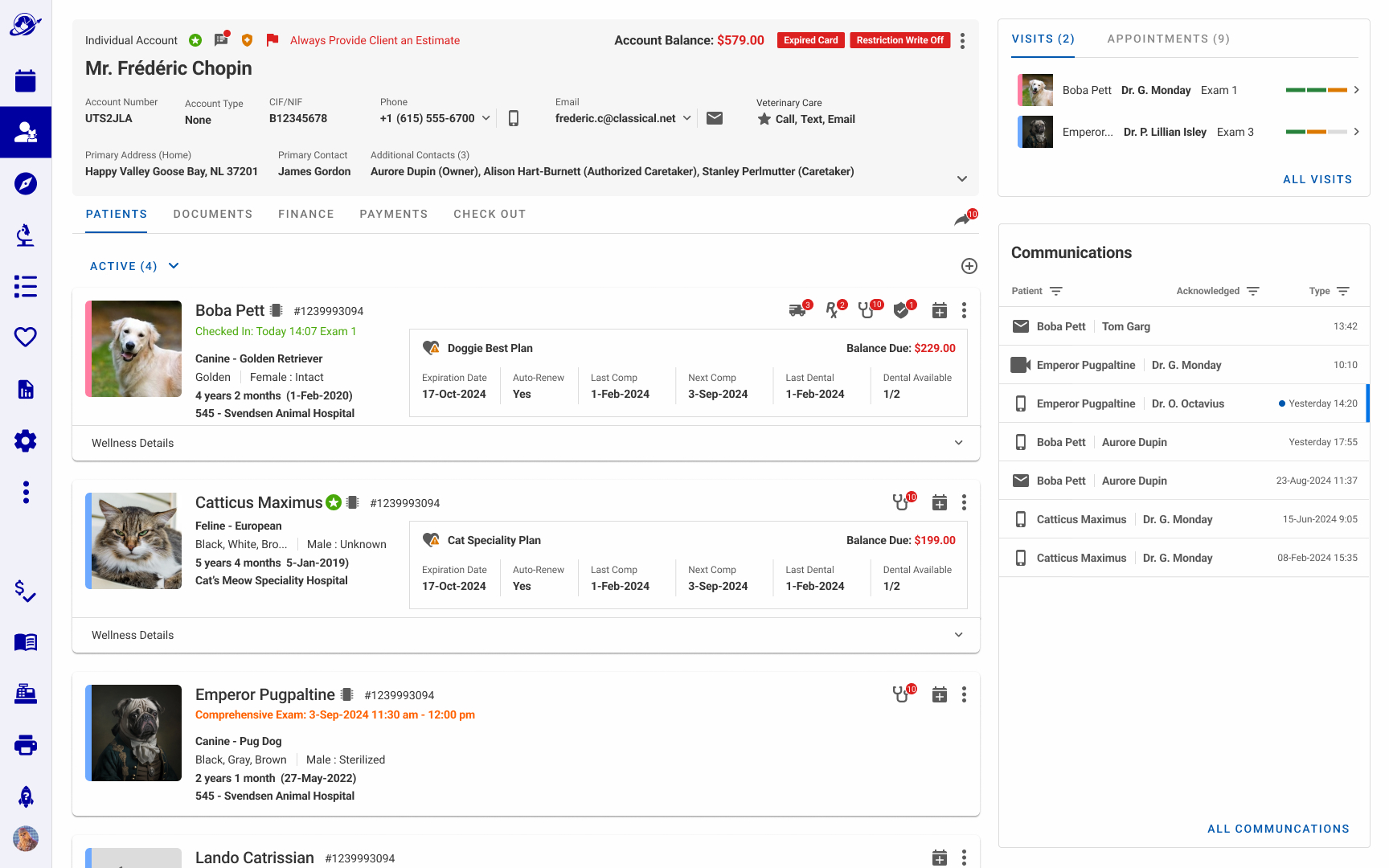
Phase 1 shipped: The Individual Account and Patient Overview in production.Phase 1 shipped: The Organization Account and Patient Overview in production.
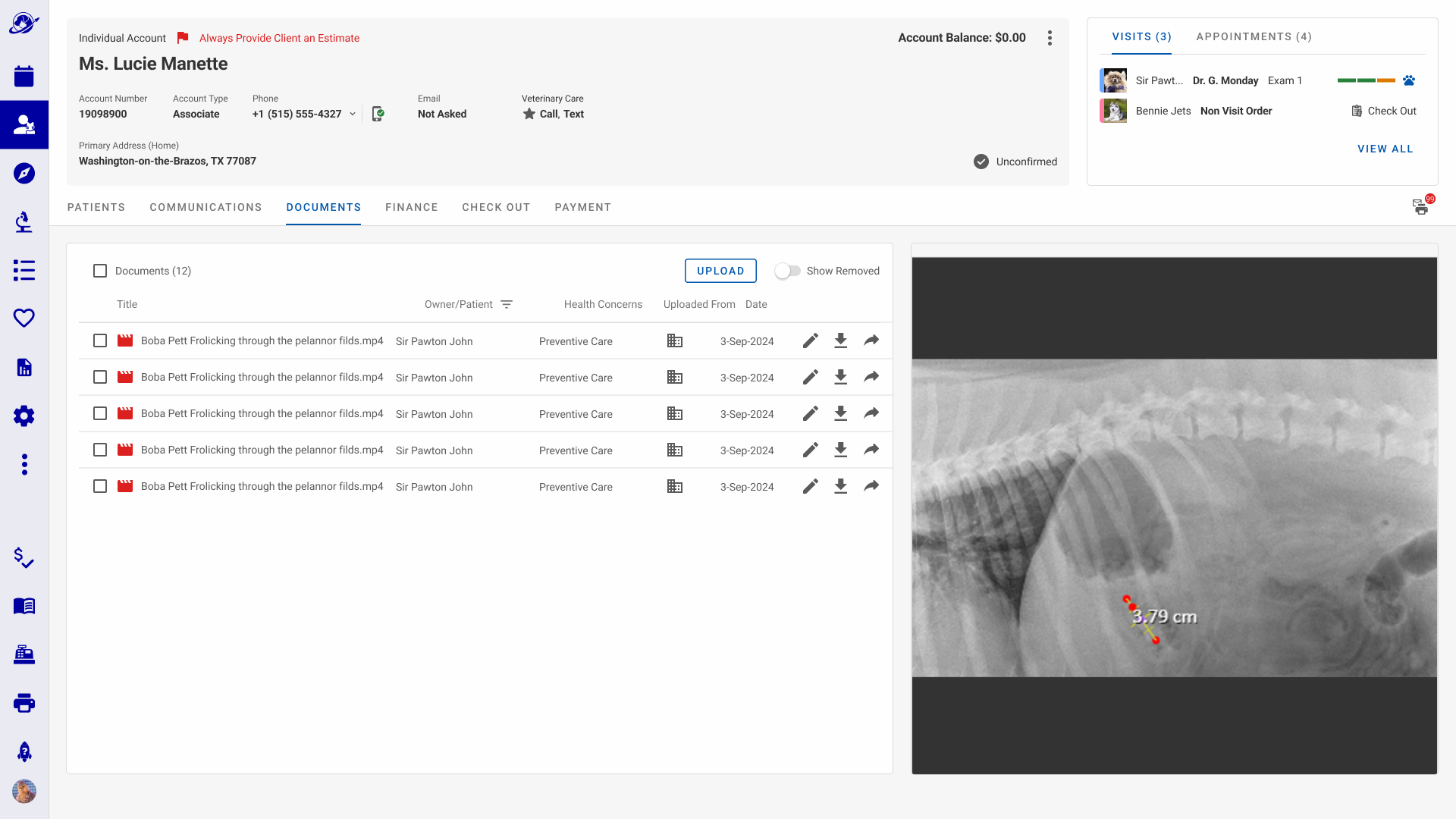
Phase 1 shipped: full Wellness Plan list, surfacing all plans across an account in a right panel without leaving the Account Overview.Phase 1 shipped: Individual Account consolidated view, with client and patient documents including medical imaging accessible from a single record.
Skills & Tools
Web SaaS Application
AI Strategy
UX Strategy
Product Design
Stakeholder Relationships
Visual Design
Responsive Adaptive
Accessibility
Generative Research
Evaluative Research
Practice Management
Agile
Electronic Medical Records (EMR)
Azure
Who I Designed With
Sole Designer (Team Support through Design Rituals)