Project Summary
What was asked?
I pitched the idea of redesigning the visual branding and align the feature set of the desktop and web portal to the feature improvements the org was making to the native mobile apps. A secondary objective was to create a branded experience for the DIGITS marketing and information subdomain that informed and enticed the customer to download DIGITS.
What I did?
- Bring feature parity between the native mobile apps and the desktop and web portal.
- Align and apply the visual design system to the product ecosystem.
- Create content strategy and a visual design style tot eh public facing product subdomain website
- Improve accessibility of the Desktop and Web portal towards Level AA guidelines to be more inclusive.
Challenge
DIGITS provides customers with the solution to the problem of managing multiple devices and phone numbers. DIGITS is a calling and messaging platform that offers users the ability to use multiple phone numbers on one device and is accessible across multiple platforms. The customer can take all their phone numbers with them everywhere.
The DIGITS EA/web platform fell behind the mobile apps in design and feature iteration, my challenge was to redesign and modernize the EA/web platform experience. I wanted to know if users think about using the desktop app in a different way from the mobile app, and what constraints they might find and what their expectations are. The product engineering team was given a tight time constraint to accomplish this, so I focused on what could make the biggest impact.
Current users of the app offered plenty of critique and pain points in using the current desktop/web platform. Most of the feedback dealt with the calling experience and understanding how to integrate their existing contacts into the app. Users also expressed how important it was to have the Web version as often they cannot download applications to their computers particularly in a corporate environment.
Finally, one of the key areas I wanted to improve was the product website that hosts the Web based version of DIGITS and offers a download for the Desktop App.
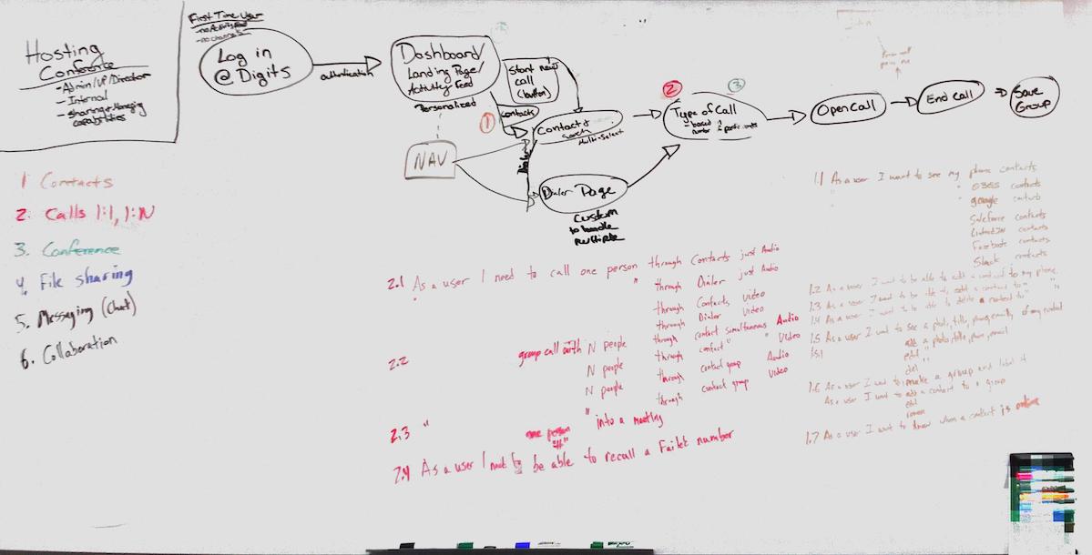
Approach
To keep this writeup brief I am limiting the focus to a few problems that I solved while working on DIGITS
What I learned
To start I wanted to understand the user's motivation for a product like DIGITS. I interviewed external users using Generative research techniques and discovered:
- Users like the idea of a second or third phone line if the price is right
- Users like the idea of being able to share a line with family or employees
- Users would like to set custom ringtones for each line
- Users would like a temporary phone number to give out to strangers and casual acquaintances
- There are potentials for unintended consequences
I also conducted an initial observational usability study with 10 internal users (5 DIGITS users, 5 people new to DIGITS) to uncover overlooked issues with the current EA/web platform. Through this process previously known and unknown opportunities for improvement arose:
- It is easy to add an additional participant to an ongoing call (10 out of 10 failure)
- It is easy to find previously shared media within a conversation chat (4 out of 10 failure)
- It is easy to remember which phone number the user is using (3 out of 10 failure)
- The Calendar (offered only in Web/Desktop) is a used or useful feature (1 out of 10)
- Multiple WCAG Level AA violations and extremely difficult to navigate the site with a keyboard
My research resulted in three rough persona archtypes:
- Needs a second line for a business or other professional reason; if the price is right (Mang)
- Likes the idea of a second line to share with family and friends. i.e. a party line; if the price is right (Ben)
- Dislikes the idea of the product, found out their significant other used it to cheat (Anti-persona) (Margaret)
Iteration and Design
Messaging Feature Improvement to Chat Structure
In the wireframe stage I wanted to align the information architecture and user workflows with the DIGITS mobile apps as platform uniformity was an easy win for customers and stakeholders.
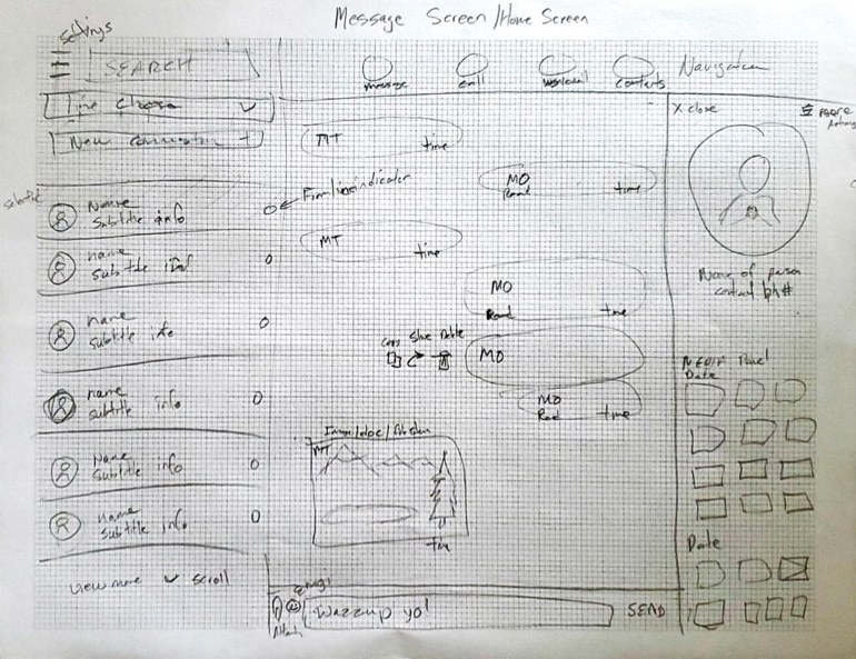
This included removing any unused features that could save development and testing time. One such feature was the calendar (meetings) feature. Analytics and customer interviews showed it was not used by 98% of the users. It was also not part of the mobile feature set.
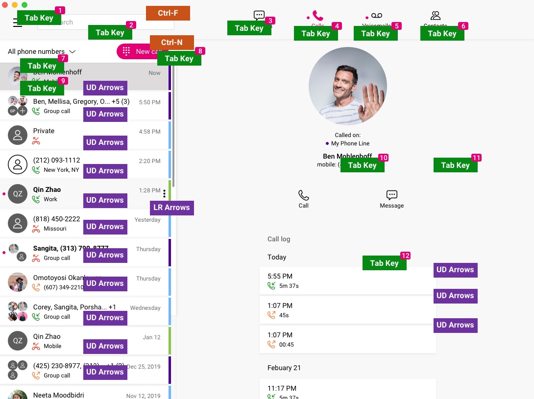
The first step was to improve the main navigation structure and make it the same as the mobile apps.
Final fidelity
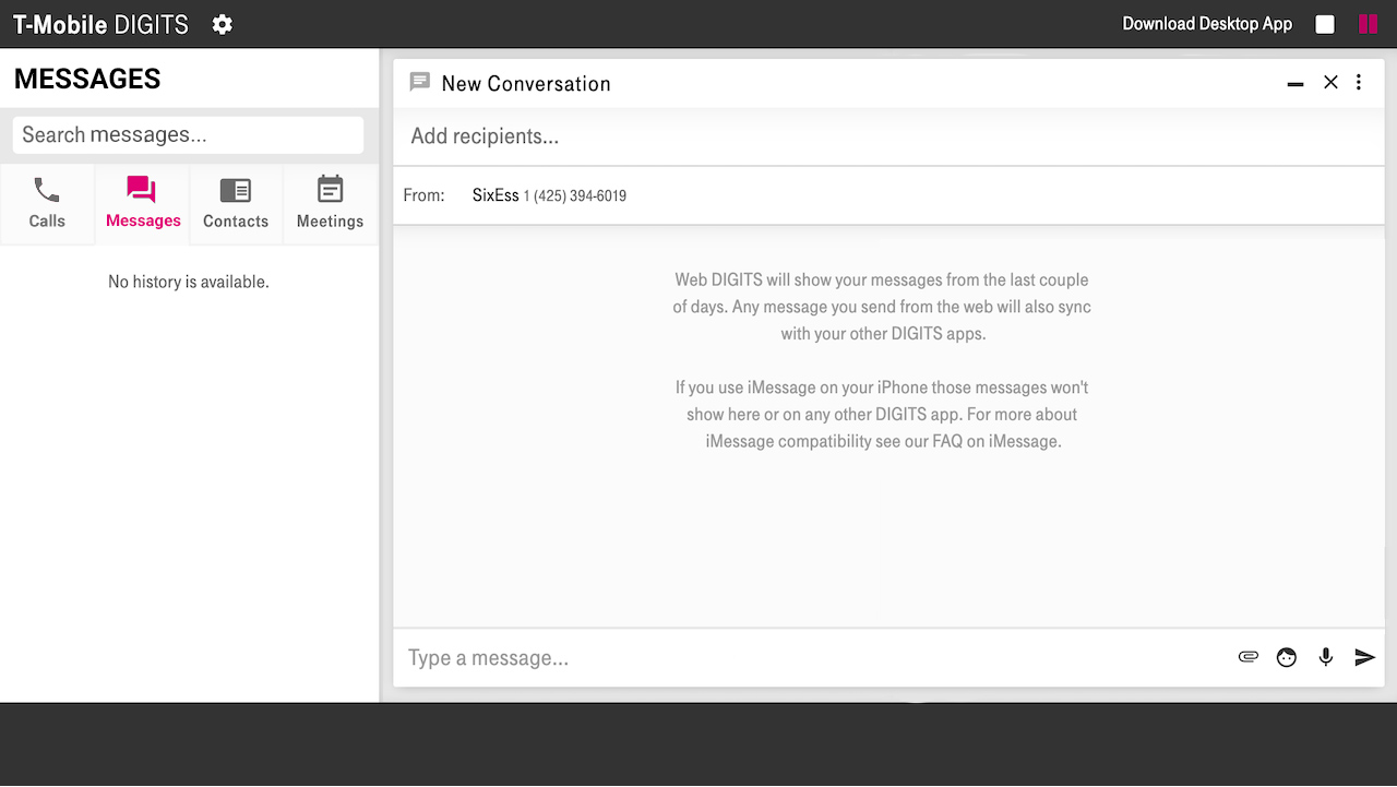
Shared Media Management
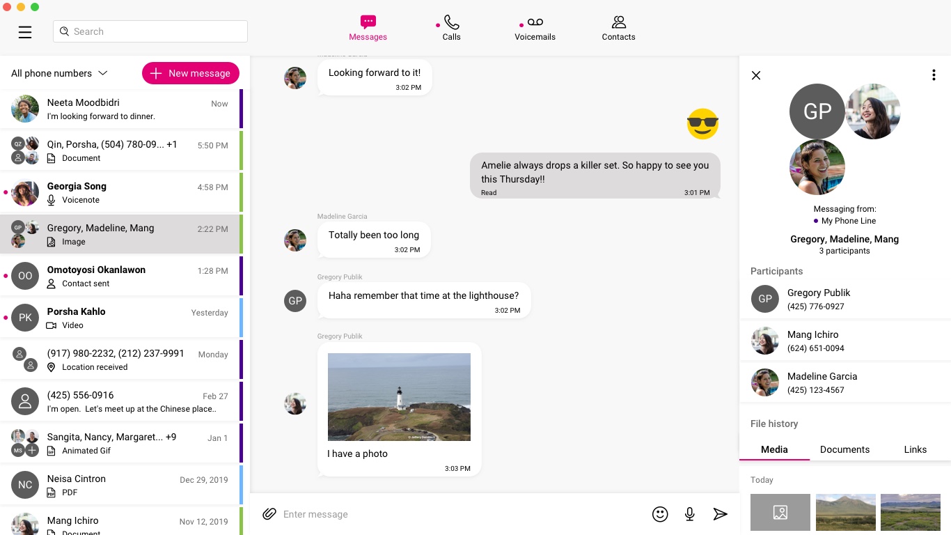
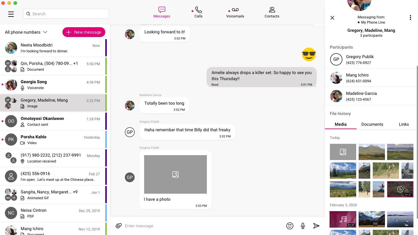
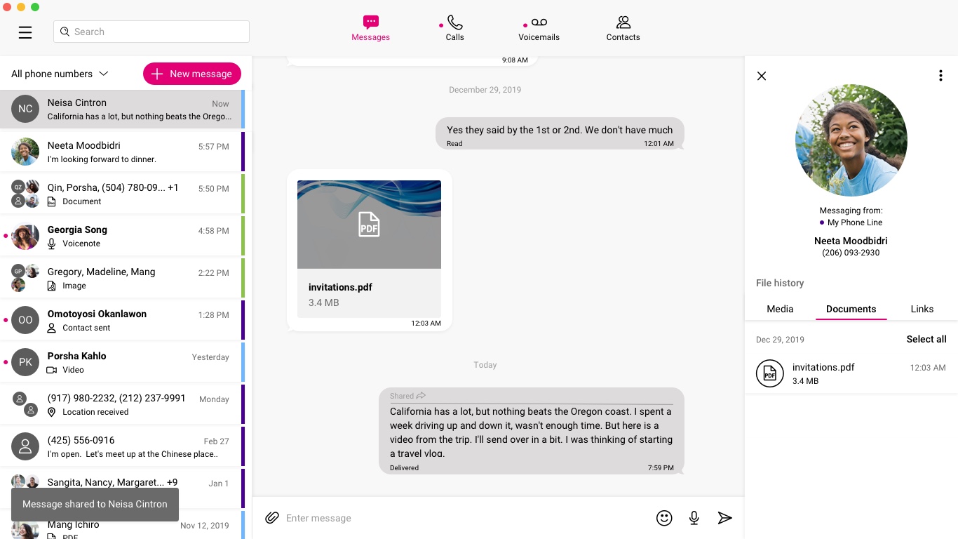
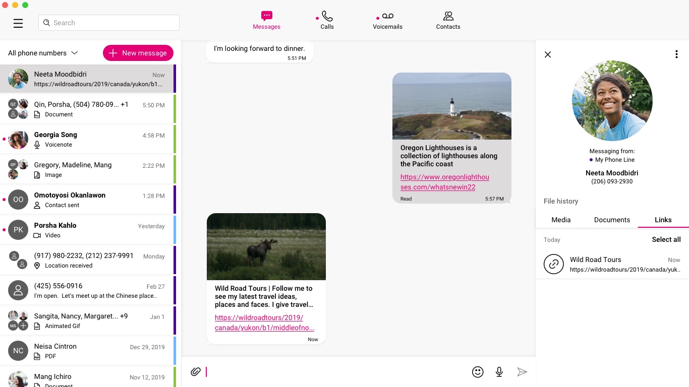
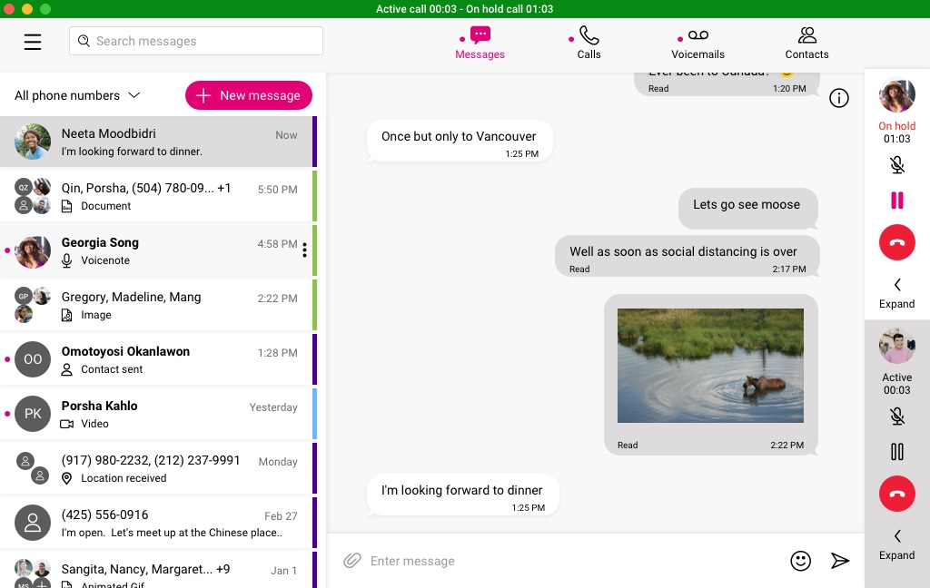
One of the other improvements to the messaging feature was considering how the user can manage their shared media. In the current version to find a file or image a user would have to scroll through their message history. It was cumbersome. The new media well experience was designed with three main features, but due to other priorities, only the first feature was developed and shipped.
- Media Well For Individual Chats
- Search Feature Within Chats
- Consolidated Files Well (Deprioritized)
Media Well For Individual Chats
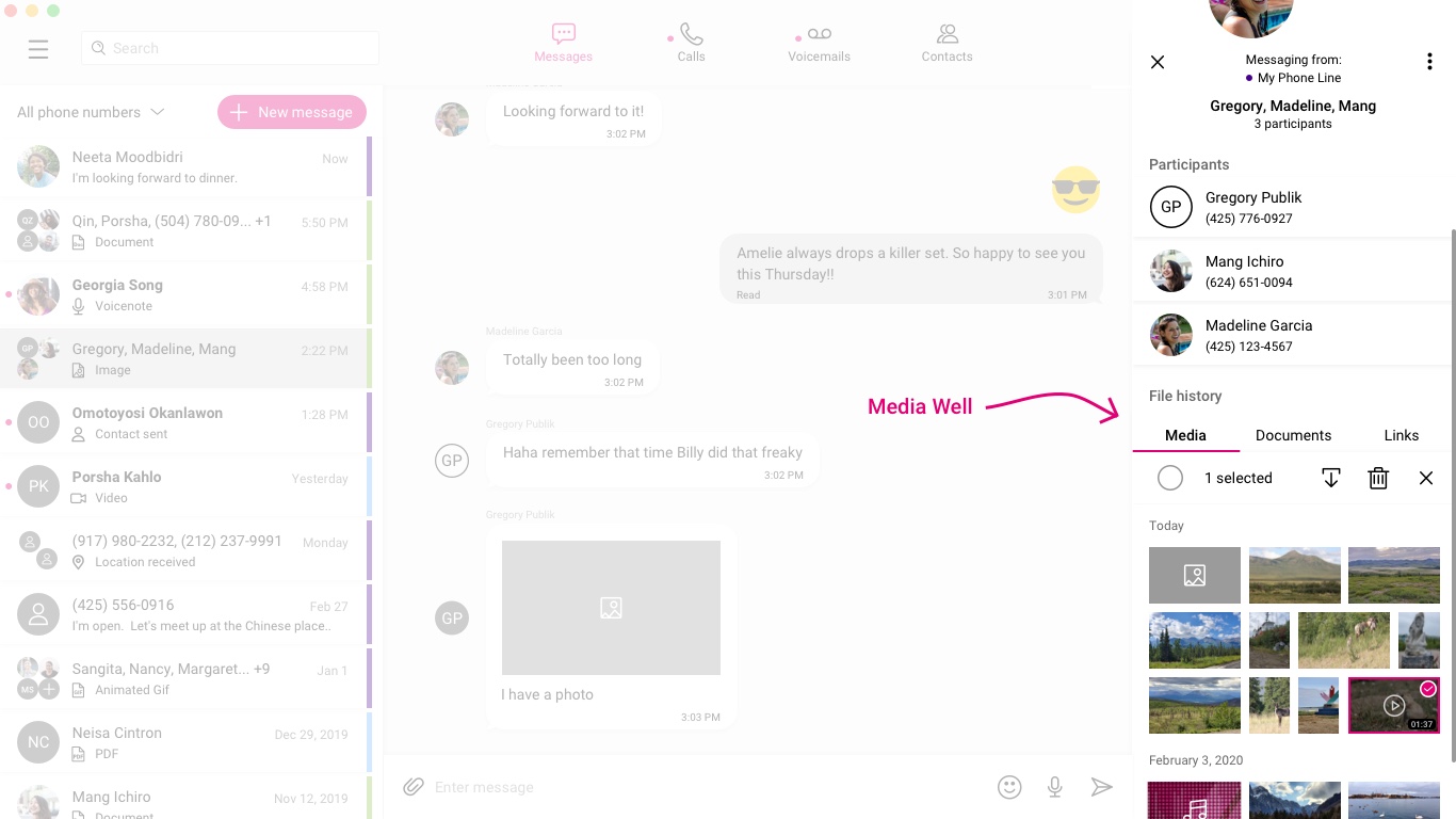
Media well organized by types of shared objects:
- Media: Images and Videos
- Documents: (.docx, .pptx, .xlsx, .pdf, etc..)
- Hyperlinks
The user could manage the shared objects directly by download, share, and deleting on command.
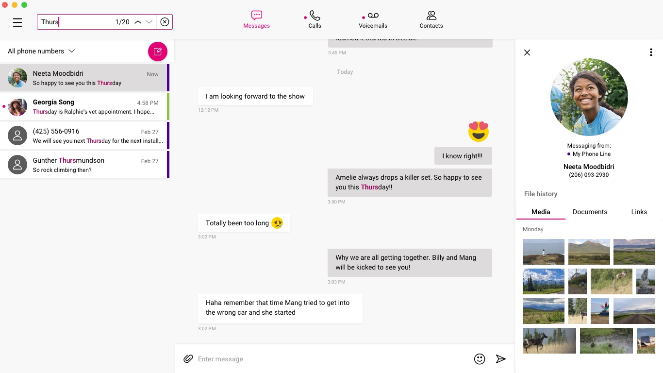
Search Feature Within Chats
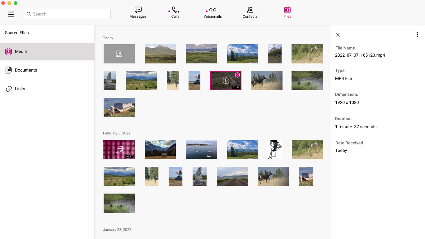
Consolidated Files Tab (Deprioritized)
I also had designed a comprehensive files tab that would contain all shared media across all chats in a single source location accessed from the main navigation. This was deprioritized for other requirements but I was able to get it placed into the product backlog pending further iterations.
A Calling Improvement
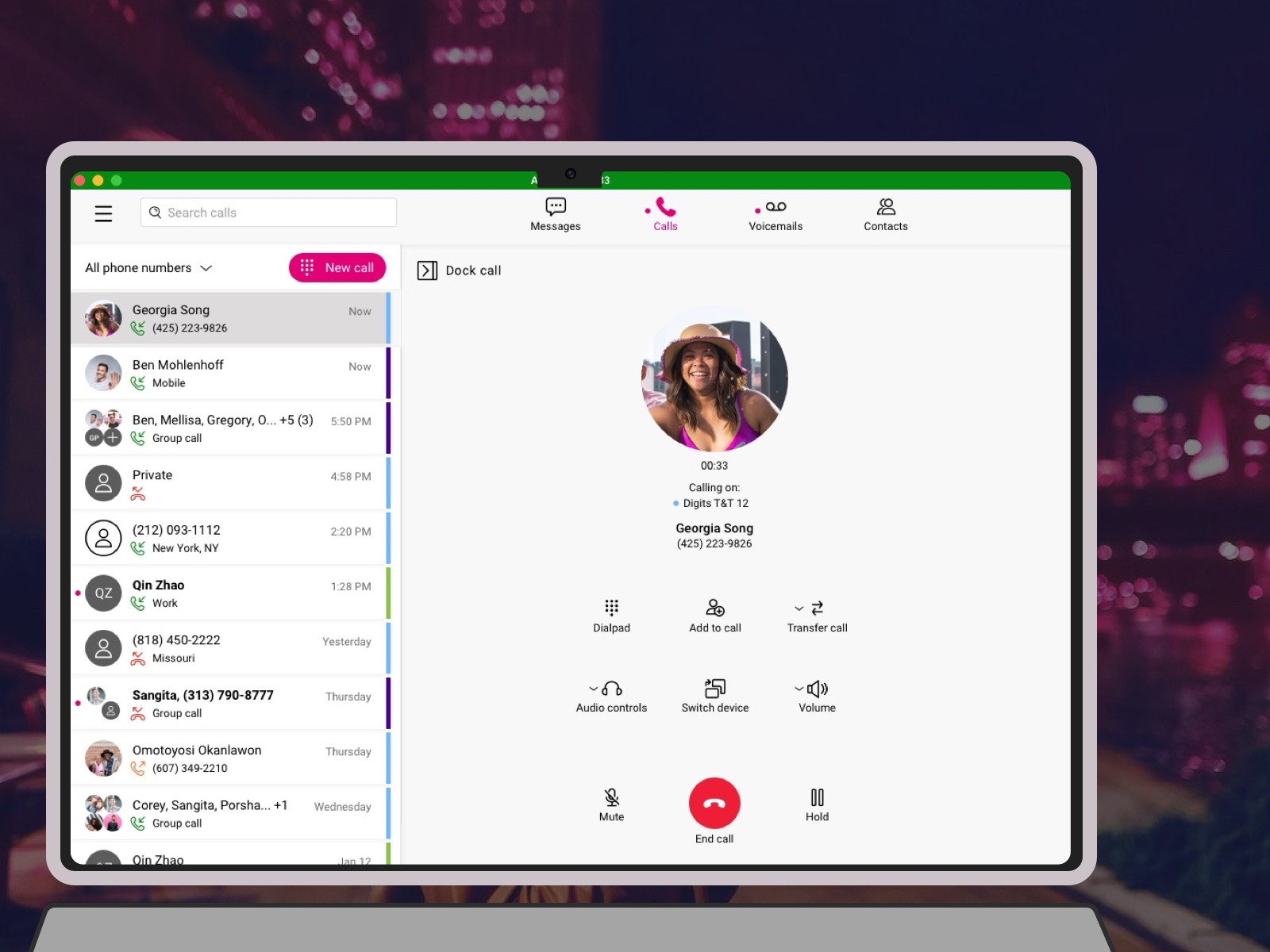
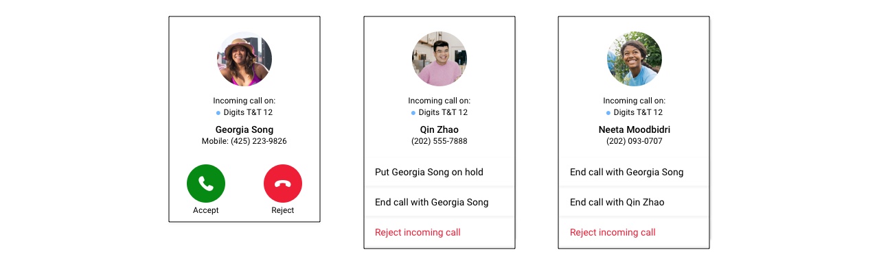
The opportunity with Calling was to iterate on the call management features and UI layout by aligning with the mobile app calling and make it more intuitive to add additional participants to an ongoing call.
In the current experience to add an additional participant to an active call; the user had to first put the call on hold, then start a new call, and finally while on the second call, merge the calls together by searching for the first call, then merge the calls together. Repeating the process for each additional participant.
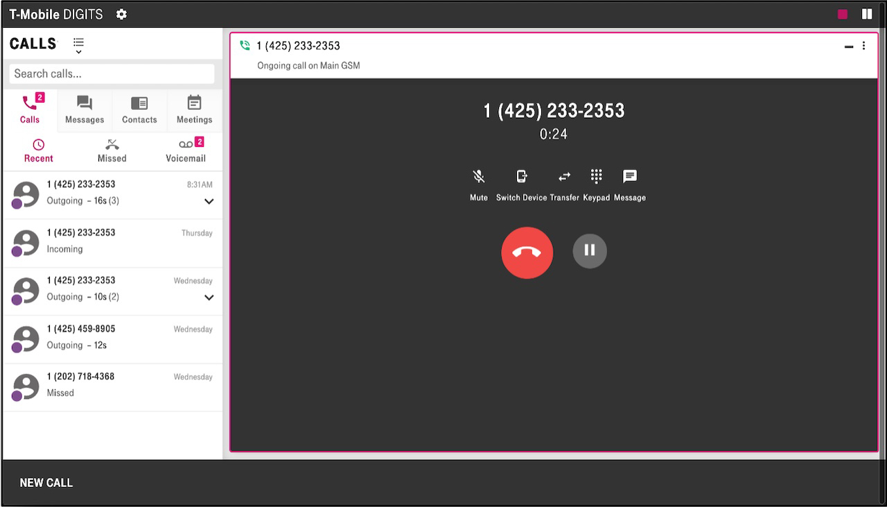
In the improved experience the user would select the 'Add to call' CTA; dial a number, or the user could add a contact and add the participants as chips, then select the ‘Merge’ CTA which would merge all the participants into the call in one go. The user would also get feedback if a call failed, or the participant did not answer.
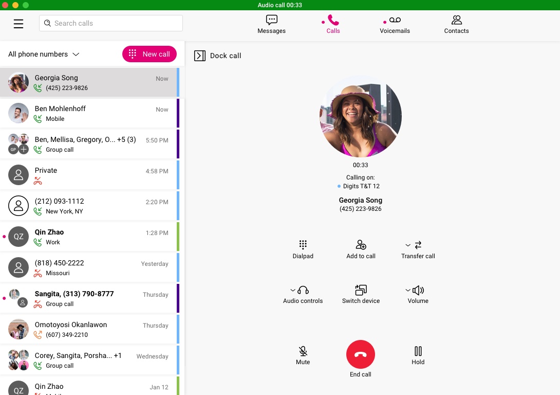
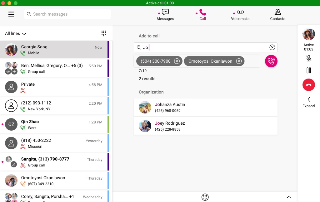
As part of the calling improvements, I added the ability to dock the first and second call to multitask and improved the way second and third calls are held and answered.
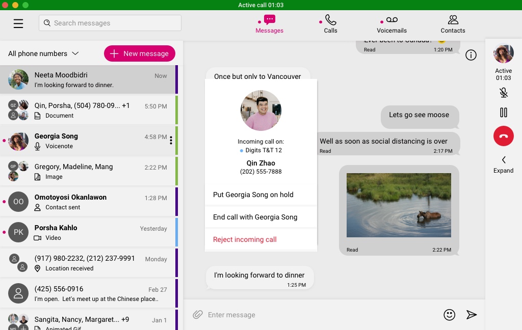
Users were experiencing friction in determining what to do with multiple call scenarios. Example: 1 Active call and a second Incoming Call; 1 Active call, a second call on hold, a third incoming call.
The familiar icons used in native mobile calling for 1 Active call and 1 incoming call was limiting as it only accounts for 2 calls, we needed a clear represenation to the user for the 3 call scenario. So the solution was to write CTAs that are a bit more clear. There was a conscious design decision to limit the calling feature to a max of 3 calls (1 Active, 1 Held, 1 Incoming) to keep the experience simpler for the user.
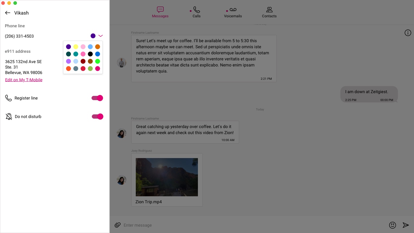
One of the issues that I addressed was to reenforce the cognitive understanding of which phone number a user was using in a particular conversation or call. Users had requested a way to quickly identify each of their phone numbers.
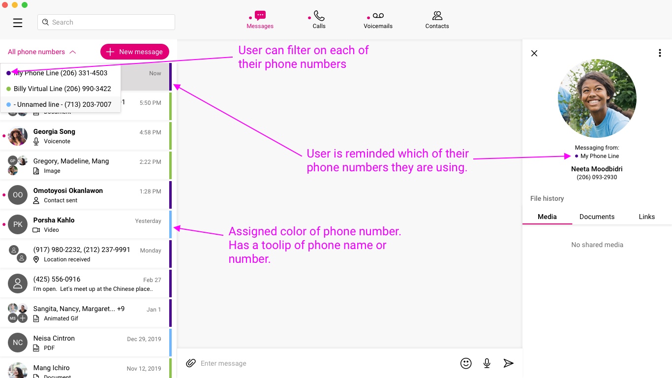
When a user activated a phone number it would be automatically be assigned a unique color. The user could then choose a more meaningful color in settings if they wished.
Accessibility
As part of my UX process I include accessibility artifacts for the development and quality assurance teams. A few example artifacts for DIGITS included aria labels, keyboard access dictation, and alt tag descriptions.
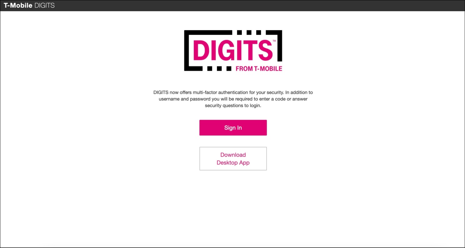
Product webpage
As part of the new version launch, I saw an opportunity to design a new website and layout that aligned with T-Mobile’s overall web branding language. Working with PM and Dev we agreed on this concept and content for the first phase given resourcing and time constraints. I also advocated that we change the product url from wrc.t-mobile.com to digits.t-mobile.com.
The old web page only contained call to action buttons to log into the website or download the desktop app
The improved version also included call to actions to increase awareness of the mobile apps and offered a small description of DIGITS. I added the organization standard website header with Log In button and footer, which is a familiar pattern for users and a part of the corporate branding for websites.
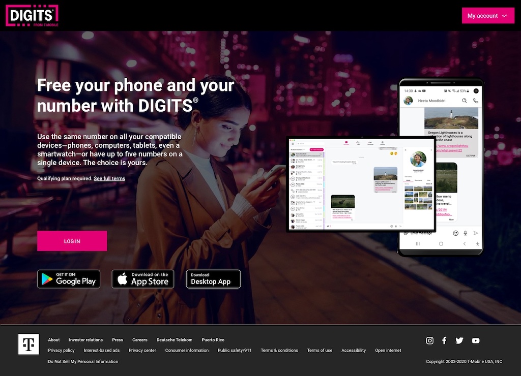
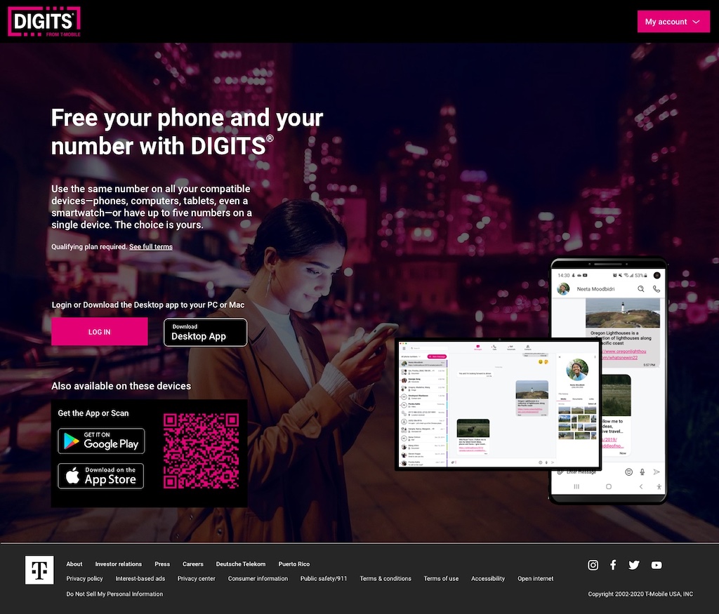
User feedback from the first hi-fidelity version revealed that many users confused the iOS Download on the Apple Store Mobile app button with the MacOS Desktop download button. To reduce friction, I separated the buttons visually and included a QR code for the mobile apps.
There are future opportunities for improvements by adding more product related content to this website which currently exists in other T-Mobile websites and adding new content to offer users more information about DIGITS.
Impact
The new version of the Web and Desktop apps and product website received positive reviews from customers and stakeholders. Users commented on how it was easier to make and manage phone calls and discover shared media. While the app has no obvious Accessibility violations at the time of writing; we are setting up a usability session with users who may be most impacted to understand and identify our next iteration of improvements.
 Website